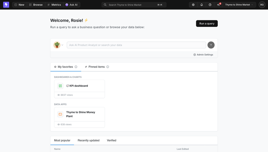
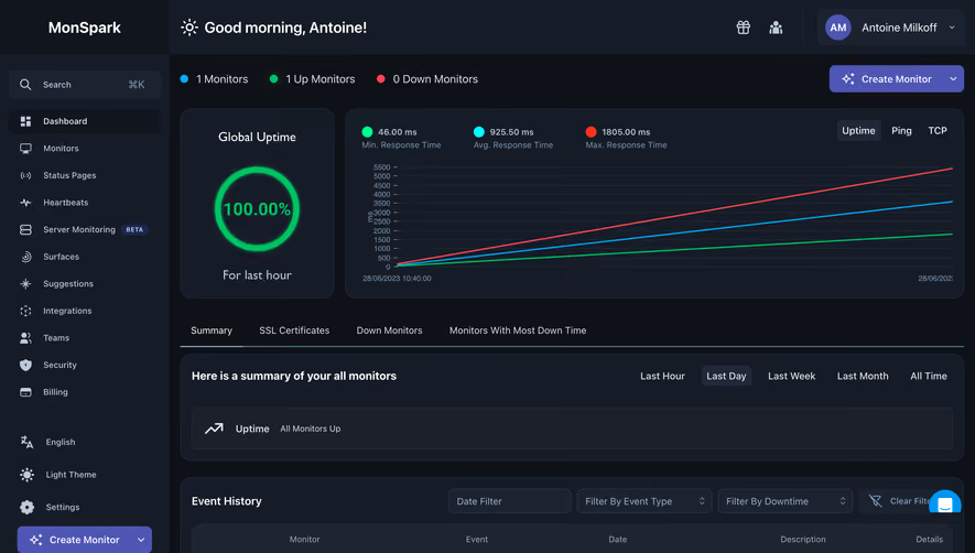
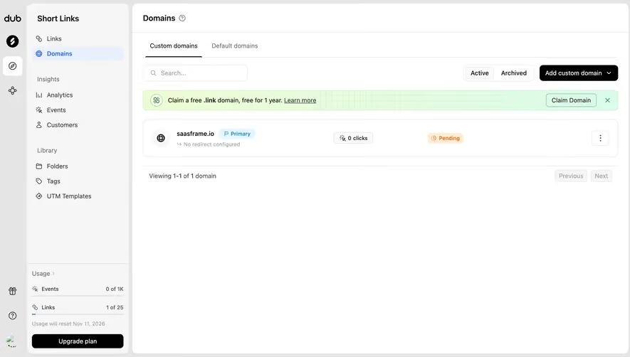
Generate a new design based on this screen using your own content.
Thank you! Your submission has been received!
Oops! Something went wrong while submitting the form.
# Design from Reference: Hume AI Dashboard
Create an original, high-fidelity visual design inspired by the reference. Prioritize composition, typography, colors, spacing, and component styling over technical implementation.
## Reference
- **Product:** Hume AI
- **Category:** Dashboard
- **Screenshot:** https://cdn.prod.website-files.com/5e9dc792e1210c5325f7ebbc/6acad408c910b3adf9e48c18_6acad19ab129c83afa2846b6_cms-618f283af2f2c2504ecc9a47.webp
Analyze the screenshot first. If inaccessible, request it rather than guessing.
## Content
{{content.instructions}}
{{content.data}}
Preserve essential messaging and factual accuracy. Adapt structure and copy length for visual balance; never invent product claims.
## Visual Design
Use this context to reproduce the reference's visual language: layout, typography, colors, spacing, borders, radii, and distinctive elements. The screenshot takes priority if descriptions conflict.
## Direction
{{preferences.fidelityInstructions}}
## Output
{{output.instructions}}
Deliver a polished, cohesive design with precise alignment, hierarchy, and spacing. Produce the requested visual artifact, not just a description. If unsupported, explain the limitation.
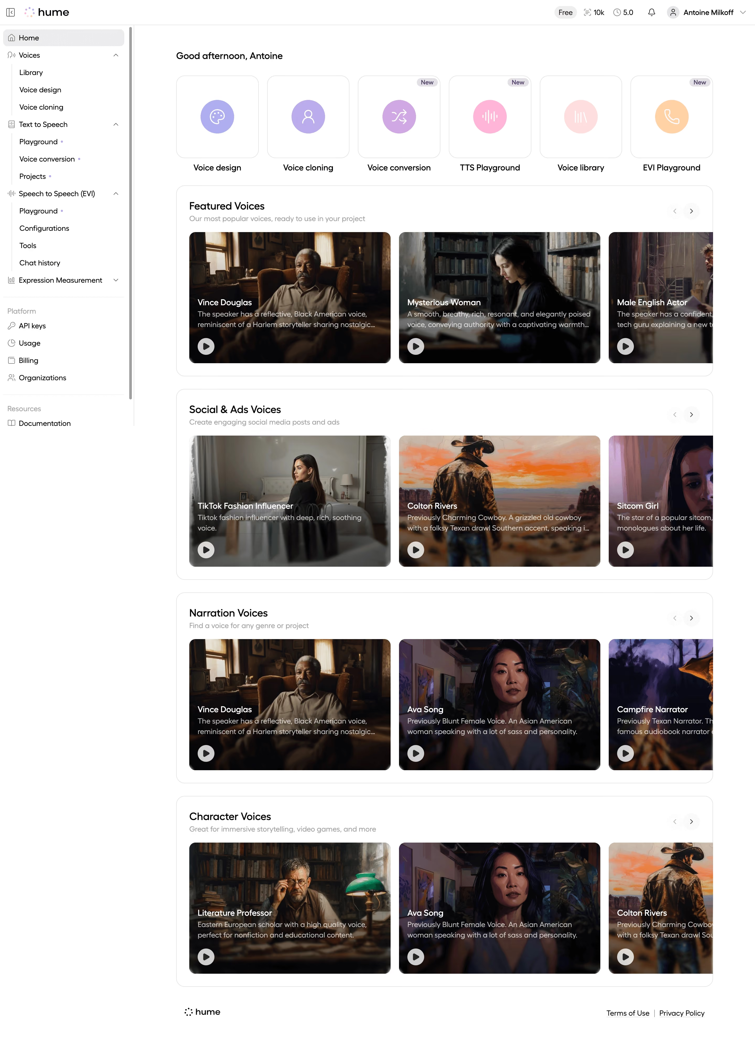
First thing you notice: those cinematic card images. Each voice gets a moody, atmospheric portrait that makes browsing feel more like scrolling Netflix than using a dev tool. That's a bold choice for a TTS platform and it works.
Layout Does the Heavy Lifting
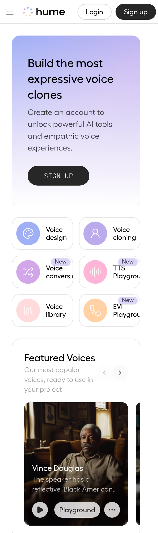
The page is organized into horizontal carousels grouped by use case. Featured Voices, Social & Ads, Narration, Character Voices. You immediately know where to look based on your project type. The top row of circular icons for core tools (voice design, cloning, conversion) keeps navigation tight without overwhelming. Smart hierarchy.
Restrained but Warm
Almost everything is white, light gray, and black type. The only color hits are those soft purple/pink icon circles up top and the "New" badges. Typography is clean and minimal. Nothing fights for attention, which lets those rich photography cards pop even harder.
What Makes It Stand Out
The personality descriptions on each card are surprisingly detailed and human. "A grizzled old cowboy with a folksy Texan drawl." That copy does real work. It turns a technical product into something you want to explore.