Design with AI
Generate a new design based on this screen using your own content.
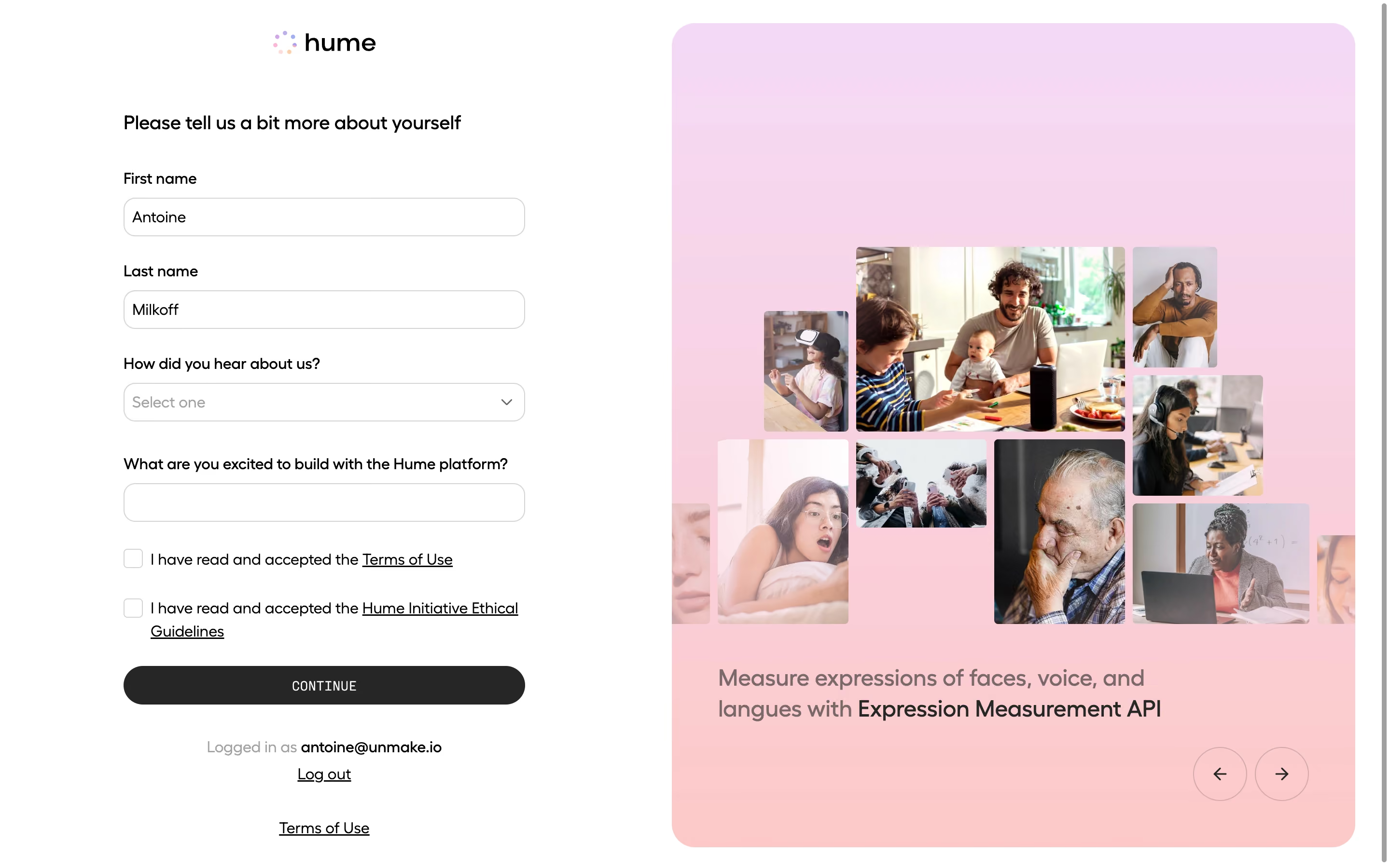
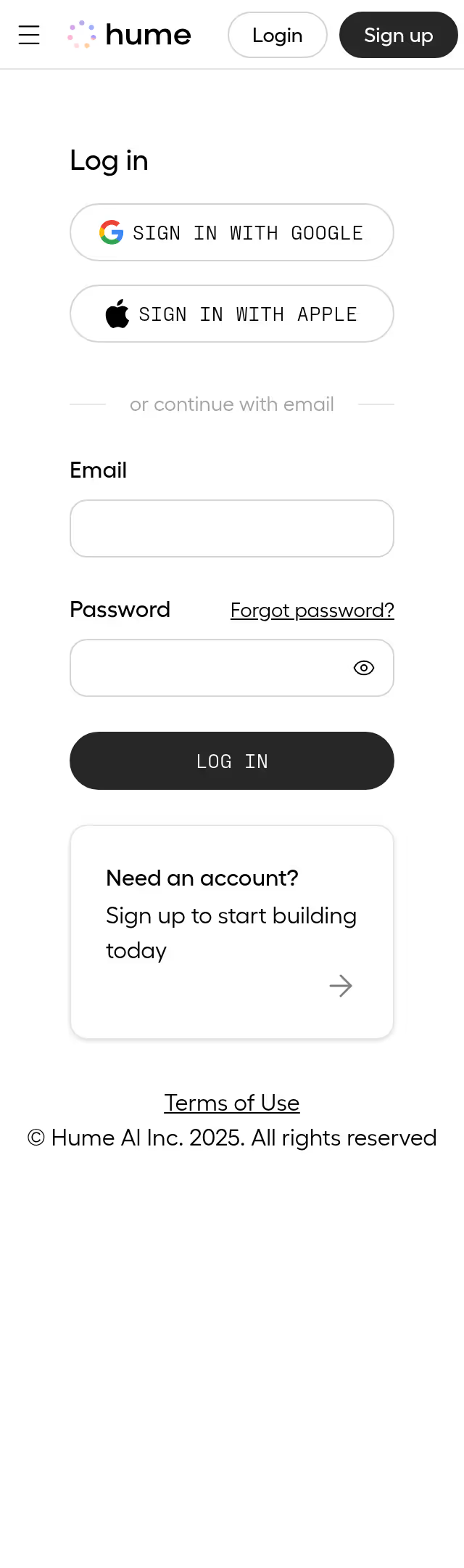
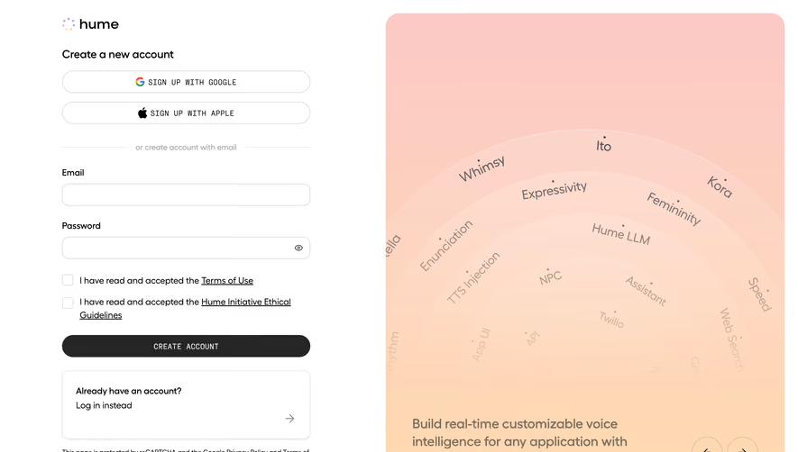
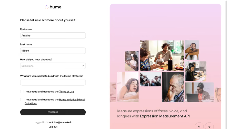
# Design from Reference: Hume AI Account Setup
Create an original, high-fidelity visual design inspired by the reference. Prioritize composition, typography, colors, spacing, and component styling over technical implementation.
## Reference
- **Product:** Hume AI
- **Category:** Account Setup
- **Screenshot:** https://cdn.prod.website-files.com/5e9dc792e1210c5325f7ebbc/6acad408c910b3adf9e48c1b_6acad196d5603a17eba52324_cms-57e943da274ab84924b4c66f.webp
Analyze the screenshot first. If inaccessible, request it rather than guessing.
## Content
{{content.instructions}}
{{content.data}}
Preserve essential messaging and factual accuracy. Adapt structure and copy length for visual balance; never invent product claims.
## Visual Design
### Overall aesthetic
- **Style:** Friendly account onboarding combining a restrained white form with a large pastel photographic brand panel.
- **Capture scale:** Source image 2880 × 1800px; sizes below estimate a 1440 × 900 CSS viewport at 2× scale.
### Page composition
- **Left column:** A roughly 416px form begins around x128, with the Hume logo centered above it. The form occupies the left half with broad surrounding white space.
- **Right panel:** A roughly 708 × 854px rounded panel begins near x696 and y24, leaving a narrow outer gutter. A lavender-to-peach vertical gradient surrounds an irregular photographic collage.
- **Lower regions:** A product caption sits beneath the collage, circular previous/next arrows sit at the lower right, and account/logout/legal links are centered under the left form.
### Information hierarchy
- **Form order:** A short introductory heading precedes first name, last name, acquisition-source select, and an open-ended build-interest field.
- **Consent and action:** Two unchecked consent boxes with underlined legal links precede a full-width dark Continue button.
- **Brand story:** Photographs show people across ages and situations, including family, headphones and laptop use; the caption emphasizes Expression Measurement API within a sentence about faces, voice and language.
### Typography
- **Family:** Geometric sans-serif with rounded shapes; font identity is unverified.
- **Form roles:** Estimated introductory heading 20px/28px medium; labels and body 16px/23px; inputs 16px; consent copy 16px with a two-line wrap in the second item.
- **Caption and action:** Panel caption approximately 24px/31px medium, with darker product-name emphasis. Continue uses small uppercase monospaced-looking lettering around 14px with light tracking.
### Colors & surfaces
- **Sampled colors:** White #FFFFFF and charcoal #262626 provide the base contrast. Gradient pixels include pink #FCCACA, lavender #F5D8F4 and #F4D9F6, rose #F6D6EC and #FACDD4.
- **Form surfaces:** White inputs have thin light-gray outlines; placeholders and secondary account labels use subdued gray. The gradient is soft and contains many intermediate colors.
- **Imagery:** Full-color photographs supply most visual complexity; there are no heavy card shadows or decorative outlines around the collage.
### Components
- **Fields:** Approximately 416 × 40px inputs/select with 12px corners and 1px gray borders, inset text and a right-hand select chevron.
- **Consent:** Approximately 20px square checkboxes, aligned to the first text line; the linked ethical-guidelines copy wraps beneath its own text edge.
- **Continue button:** Full form width, about 40px high, charcoal fill and pill-shaped ends; centered light label.
- **Brand carousel:** Large panel corners approximately 24px. Photo tiles have modest rounding and different sizes, with partial tiles clipped at the panel sides. Two approximately 56px circular outlined arrow controls sit below the caption.
### Visual rhythm
- **Vertical cadence:** Labels sit about 10px above controls, with roughly 28–32px between field groups. Consent rows are more compact, then a larger separation leads to the action and account information.
- **Asymmetry:** The compact form contrasts with the oversized right image region; the collage uses staggered edges while form controls maintain exact alignment.
### Responsive
- **Recommended adaptation:** Only desktop is observed. Collapse to a single form column on narrow screens and place the promotional panel afterward or omit it when space is limited.
- **Usability:** Keep consent text legible, inputs full width and the primary action visible without horizontal scrolling; allow legal copy to wrap naturally.
### Adaptation guidance
- **Preserve:** Retain the plain form, explicit consent hierarchy, dark pill action and soft gradient panel with human photography.
- **Adapt:** Use relevant licensed imagery and truthful product copy. Keep the collage visually varied while maintaining enough quiet space for the lower caption and carousel controls.
Use this context to reproduce the reference's visual language: layout, typography, colors, spacing, borders, radii, and distinctive elements. The screenshot takes priority if descriptions conflict.
## Direction
{{preferences.fidelityInstructions}}
## Output
{{output.instructions}}
Deliver a polished, cohesive design with precise alignment, hierarchy, and spacing. Produce the requested visual artifact, not just a description. If unsupported, explain the limitation.