Design with AI
Generate a new design based on this screen using your own content.
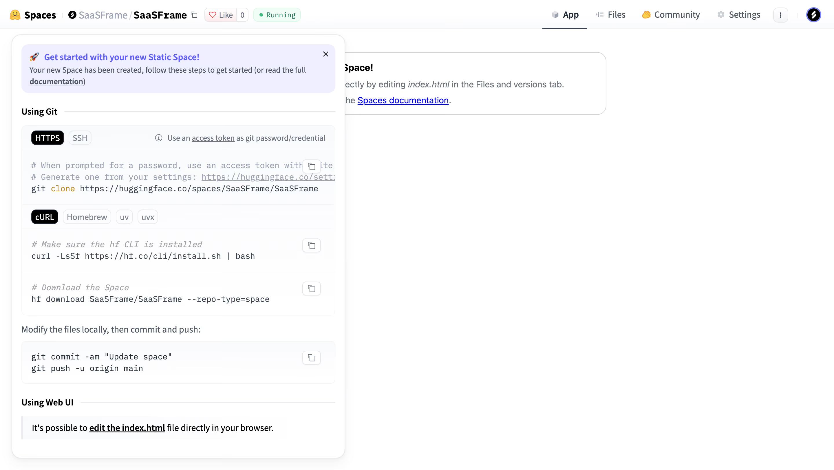
# Design from Reference: Hugging Face Static Space setup guide
Create an original, high-fidelity visual design inspired by the reference. Prioritize composition, typography, colors, spacing, and component styling over technical implementation.
## Reference
- **Product:** Hugging Face
- **Category:** User Onboarding
- **Screenshot:** https://cdn.prod.website-files.com/5e9dc792e1210c5325f7ebbc/6acad05134c900e8fc1b49c5_6acacfdfcf7be2f311929d51_cms-2796f3ae17d0aee05be0390c.webp
Analyze the screenshot first. If inaccessible, request it rather than guessing.
## Content
{{content.instructions}}
{{content.data}}
Preserve essential messaging and factual accuracy. Adapt structure and copy length for visual balance; never invent product claims.
## Visual Design
### Overall aesthetic
- **Character:** A light developer workspace with an instructional popover containing tabs and code blocks.
- **Evidence scale:** Original 2880 × 1624 pixels; CSS estimates assume an unverified 2× capture scale.
### Page composition
- **Header:** Space identity/status left, App/Files/Community/Settings tabs right.
- **App area:** Mostly empty white canvas with a welcome card behind the guide.
- **Guide:** Approximately 576 px wide rounded panel anchored near the upper-left, extending almost to the bottom.
- **Guide order:** Lavender welcome notice, Git section, protocol tabs, command blocks, local-change explanation and Web UI section.
### Information hierarchy
- **Notice:** Blue bold introductory line and short helper text lead the guide.
- **Methods:** Bold section labels and thin rules separate Git and browser-based editing paths.
- **Commands:** Monospaced blocks with copy icons make procedural examples distinct.
- **State:** Running badge is green; App tab is underlined.
### Typography
- **Workspace:** Unverified sans-serif around 14–16 px.
- **Guide headings:** Approximately 14 px bold.
- **Body:** Around 13–14 px regular, 20 px line height.
- **Code:** Monospaced approximately 13–14 px; comments muted and some syntax accented.
### Colors & surfaces
- **Base:** White #FFFFFF.
- **Notice:** Pale lavender #EFEFFF.
- **Controls:** Pale #FAFBFC and nearby cool whites.
- **Ink:** Dark slate with muted blue-gray comments.
- **States:** Black selected tabs, blue links and green Running badge.
### Components
- **Guide shell:** Roughly 18 px radius, fine border and soft shadow.
- **Notice:** Rounded lavender rectangle, rocket icon and close cross.
- **Tabbed code group:** HTTPS/SSH pills and four installation-method tabs; active tabs black with white text.
- **Code blocks:** Pale bordered rounded areas with copy controls at upper right and fine horizontal separators.
- **Web UI note:** Left-rule callout with underlined file-edit link.
- **Top utilities:** Like/count, status badge, overflow button and circular avatar.
### Visual rhythm
- **Padding:** Approximately 16 px guide inset.
- **Sections:** Around 20–24 px separates major method groups.
- **Code cadence:** Compact command rows contrast with explanatory text.
- **Context:** The guide overlaps the app welcome region while most canvas remains empty.
### Responsive
- **Observed limit:** Desktop only.
- **Recommendation:** Make the guide full-width within narrow gutters and allow internal scrolling.
- **Code handling:** Preserve monospaced size with horizontal scrolling rather than clipping commands.
### Adaptation guidance
- **Retain:** Offer code and browser workflows in clearly divided instructional groups.
- **Implement:** Use tabbed command blocks, explicit copy controls and a concise introductory notice.
- **Verify:** Confirm fonts, scale and guide behavior separately; no commands, repository edits or publication were performed.
Use this context to reproduce the reference's visual language: layout, typography, colors, spacing, borders, radii, and distinctive elements. The screenshot takes priority if descriptions conflict.
## Direction
{{preferences.fidelityInstructions}}
## Output
{{output.instructions}}
Deliver a polished, cohesive design with precise alignment, hierarchy, and spacing. Produce the requested visual artifact, not just a description. If unsupported, explain the limitation.