
Thank you! Your submission has been received!
Oops! Something went wrong while submitting the form.
Get SaaSFrame Pro
Monthly
$18
Quarterly
$48
Yearly
$180
Upgrade to access this feature
Browse all screens & flows
Filter and search screens & flows
Access Figma files
Access mobile versions
Bookmark screens & flows
Join now
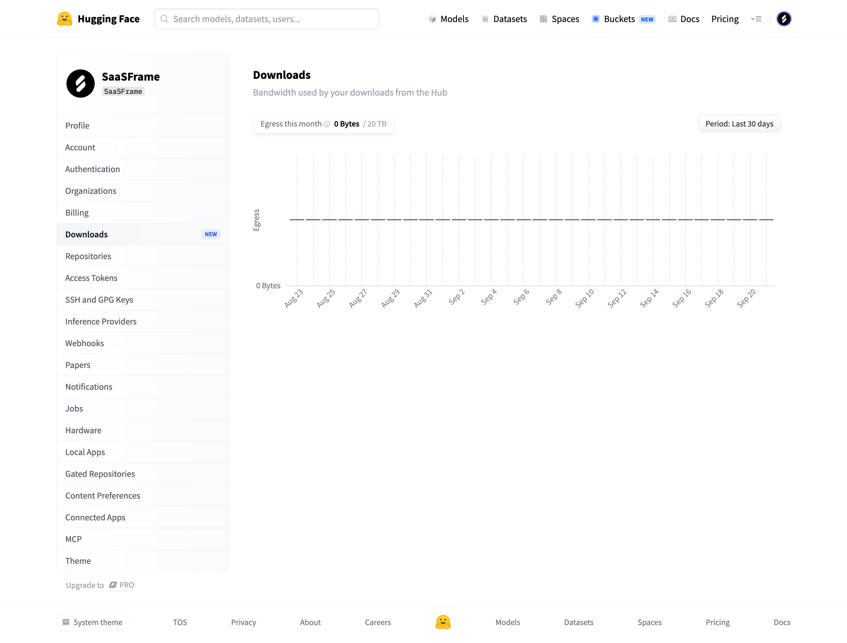
Hugging Face Download bandwidth usage

Hugging Face
The AI community building the future
Designed by
No items found.

Bookmark
Bookmark

Design with AI
Thank you! Your submission has been received!
Oops! Something went wrong while submitting the form.
# Design from Reference: Hugging Face Download bandwidth usage
Create an original, high-fidelity visual design inspired by the reference. Prioritize composition, typography, colors, spacing, and component styling over technical implementation.
## Reference
- **Product:** Hugging Face
- **Category:** Usage
- **Screenshot:** https://cdn.prod.website-files.com/5e9dc792e1210c5325f7ebbc/6acad09051f927271bf81dad_6ac5730bcfc10ce6d595debc_richtext-89e0d6b0f2bcfeaf347c.webp
Analyze the screenshot first. If inaccessible, request it rather than guessing.
## Content
{{content.instructions}}
{{content.data}}
Preserve essential messaging and factual accuracy. Adapt structure and copy length for visual balance; never invent product claims.
## Visual Design
### Overall aesthetic
- **Character:** A spare, light account-settings interface with a conventional global header, tall navigation card and a large low-density bandwidth chart.
- **Evidence scale:** The original is 2880 × 2186 pixels. CSS dimensions below assume an unverified 2× capture scale; measured colors refer to converted sRGB pixels.
### Page composition
- **Header:** A roughly 64 px global bar contains the yellow brand mark and wordmark, a wide search field, product links and a circular account avatar.
- **Settings frame:** Centered content spans approximately 1248 px. A roughly 294 px sidebar begins about 90 px below the page top, with a 40 px gutter before the main region.
- **Main region:** Downloads title and subtitle precede a compact usage summary, a right-aligned period selector and an approximately 900 × 270 px chart area.
- **Footer:** A full-width top divider anchors a horizontal footer containing theme selection, legal/company links, a small brand mark and product links.
### Information hierarchy
- **Current section:** Downloads is bold in both the content heading and the highlighted sidebar row; a small blue NEW badge adds emphasis to the selected item.
- **Metric:** The compact usage pill bolds the zero-byte value while the monthly label and 20 TB allowance are muted.
- **Chart:** A horizontal dashed trace, zero-byte baseline label, vertical dashed grid and angled date labels communicate the empty usage history.
- **Account context:** The sidebar's circular black avatar and bold workspace name establish identity above the settings list.
### Typography
- **Identity and heading:** Unverified sans-serif, approximately 20 px bold with a 26 px line height.
- **Navigation and subtitle:** Approximately 14–16 px regular with 20–24 px line height; active navigation uses a heavier weight.
- **Chart and utilities:** Approximately 12–13 px gray labels; rotated dates are compact and evenly spaced.
- **Tracking:** Mostly neutral, with visual hierarchy created through weight and gray values rather than decorative type.
### Colors & surfaces
- **Canvas:** White #FFFFFF dominates the screenshot.
- **Sidebar and controls:** Very pale cool surfaces include sampled #FAFBFC and #F3F4F6, bounded by fine gray edges.
- **Text:** Black and dark slate distinguish headings from muted blue-gray explanatory and axis text.
- **Accents:** Small yellow brand graphics and blue NEW badges provide nearly all chromatic emphasis; the chart remains neutral.
### Components
- **Search:** Approximately 384 × 36 px rounded field with a leading magnifier, pale border and slight inset/shadow effect.
- **Sidebar:** Roughly 884 px tall, 12 px corner radius and fine border. A roughly 104 px identity area sits above about 21 compact rows separated by pale rules.
- **Active row:** Light gray fill, bold label and a tiny blue status badge at the far right.
- **Usage control:** Compact white rounded pill with subtle shadow, inline information icon and mixed-weight metric text.
- **Period selector:** Small bordered, light-gray rounded rectangle aligned with the usage pill.
- **Chart:** Broad plotting region with no enclosing heavy card, thin baseline, dashed vertical guides and a long gray dashed horizontal series.
### Visual rhythm
- **Alignment:** Title, helper copy and usage pill share the main column's left edge; the chart spans nearly the full remaining width.
- **Spacing:** Approximately 16 px separates heading and secondary copy groups; the chart starts roughly 36 px below the controls.
- **Density contrast:** Closely spaced sidebar rows balance generous white space below and around the chart.
### Responsive
- **Observed limit:** Only desktop is visible; mobile navigation and chart interaction are unverified.
- **Recommendation:** Collapse the tall settings list into a compact navigation control and let the main chart use the available width.
- **Chart handling:** Reduce date-label frequency at small widths while preserving the metric, units and period selection.
### Adaptation guidance
- **Retain:** Put the usage value and allowance above a spacious chart and make the selected settings section unmistakable.
- **Implement:** Use pale surfaces, thin dividers and small restrained badges instead of large colorful dashboard cards.
- **Verify:** Confirm fonts, actual scale, chart value mapping and responsive behavior separately; only the displayed zero-usage snapshot is observed.
Use this context to reproduce the reference's visual language: layout, typography, colors, spacing, borders, radii, and distinctive elements. The screenshot takes priority if descriptions conflict.
## Direction
{{preferences.fidelityInstructions}}
## Output
{{output.instructions}}
Deliver a polished, cohesive design with precise alignment, hierarchy, and spacing. Produce the requested visual artifact, not just a description. If unsupported, explain the limitation.


Category
Patterns
Tech Stack

Added on
September 21, 2026
Similar screens
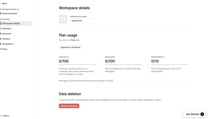



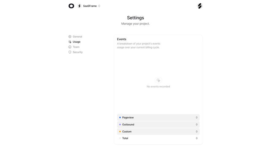

Upgrade to SaaSFrame Pro now to see similar examples.
Monthly
$18 /month
Billed $18 monthly
Browse all screens & flows
Filter and search screens & flows
Search text in screenshots
Access Figma files
Access mobile versions
Join now
Quarterly
$16 /month
Billed $48 quarterly
Browse all screens & flows
Filter and search screens & flows
Search text in screenshots
Access Figma files
Access mobile versions
Join now
Yearly
$15 /month
Billed $180 yearly
Browse all screens & flows
Filter and search screens & flows
Search text in screenshots
Access Figma files
Access mobile versions
Join now