
Thank you! Your submission has been received!
Oops! Something went wrong while submitting the form.
Get SaaSFrame Pro
Monthly
$18
Quarterly
$48
Yearly
$180
Upgrade to access this feature
Browse all screens & flows
Filter and search screens & flows
Access Figma files
Access mobile versions
Bookmark screens & flows
Join now
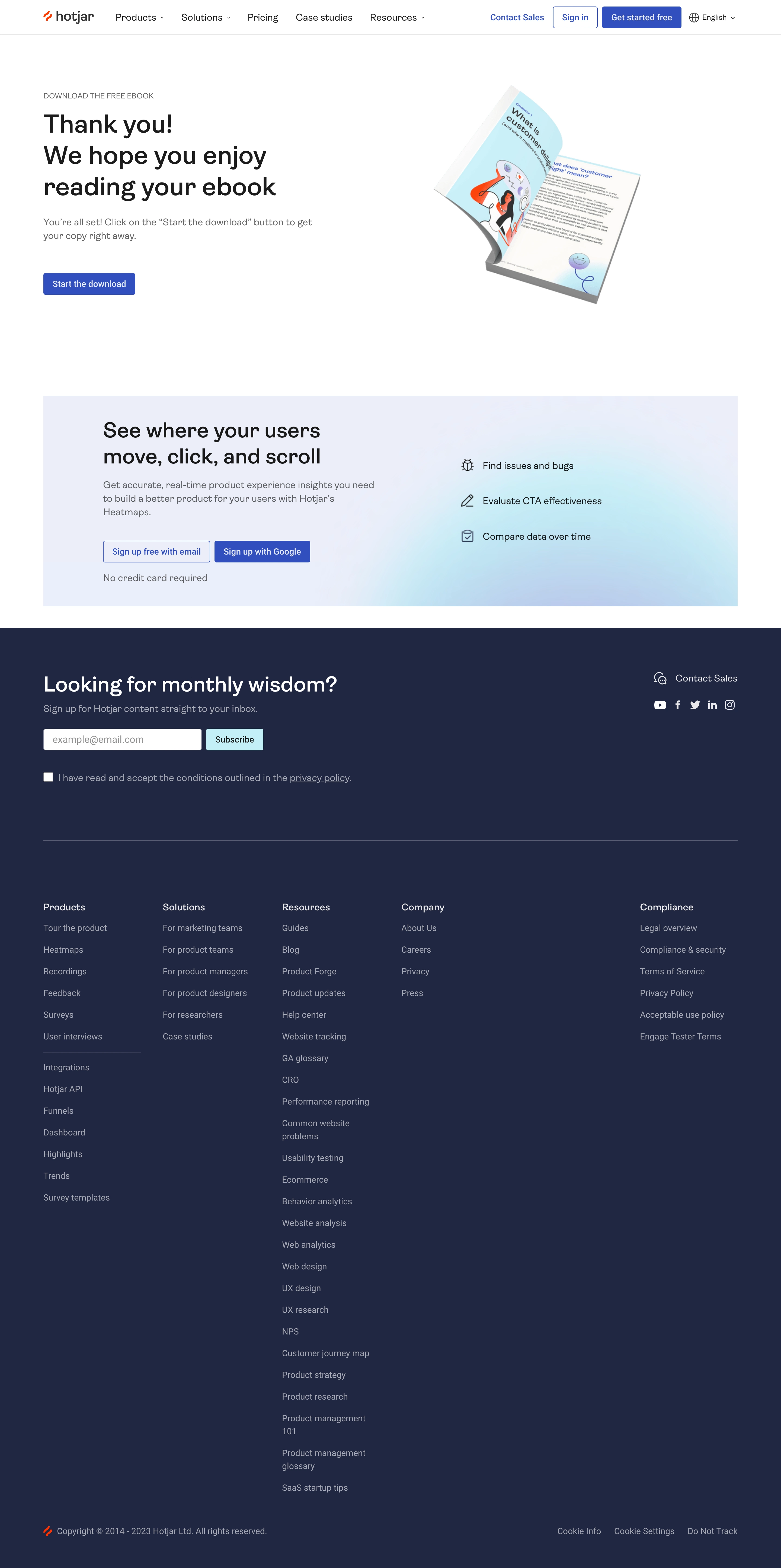

Hotjar Thank You Page

Hotjar
Website Heatmaps & Behavior Analytics Tools
Designed by


Bookmark
Bookmark

Design with AI
Thank you! Your submission has been received!
Oops! Something went wrong while submitting the form.
# Design from Reference: Hotjar Thank You Page
Create an original, high-fidelity visual design inspired by the reference. Prioritize composition, typography, colors, spacing, and component styling over technical implementation.
## Reference
- **Product:** Hotjar
- **Category:** Thank You Page
- **Screenshot:** https://cdn.prod.website-files.com/5e9dc792e1210c5325f7ebbc/6acad848b3daa04f542762f1_6acad7ccd63d2caea65ccfa3_cms-7100d9fe5b5fd8126dffe4e7.webp
Analyze the screenshot first. If inaccessible, request it rather than guessing.
## Content
{{content.instructions}}
{{content.data}}
Preserve essential messaging and factual accuracy. Adapt structure and copy length for visual balance; never invent product claims.
## Visual Design
### Overall aesthetic
- **Character:** An ebook-download confirmation page with a clean white hero, blue controls and a deep navy footer. A large open-book illustration and pale cyan promotional gradient make the page more expressive than a plain confirmation.
- **Image basis:** The 2880 × 5782 source was inspected throughout at approximately 1400 px wide in three crops. Dimensions below are inspection-pixel estimates; CSS scale and font identity are unverified.
### Page composition
- **Header:** A compact white navigation bar contains brand, product links, contact/sign-in/signup actions and language selection.
- **Confirmation hero:** A left text column starts around x78, y166 with an uppercase eyebrow, three-line heading, explanation and download action. A large angled open-book mockup occupies the right.
- **Product promotion:** A broad approximately 1244 × 378 px pale gradient panel pairs a heading, paragraph and two signup actions left with three icon-led benefits right.
- **Newsletter:** The navy footer opens with a large newsletter prompt, email field, cyan Subscribe action and consent checkbox. Contact/social controls align right.
- **Link footer:** A divider precedes five link groups, including a particularly long resources column. Copyright and cookie controls occupy the final row.
### Information hierarchy
- **Primary outcome:** The large thank-you heading confirms success; the blue download action provides the immediate next step.
- **Secondary conversion:** Product benefits and signup choices follow after substantial whitespace.
- **Footer:** Newsletter signup leads the dark region; grouped navigation and legal links are subordinate.
- **Observed state:** The confirmation message is visible, but actual file-download completion is not verified. Newsletter input is empty and consent is unchecked.
### Typography
- **Hero:** Approximately 46 px medium sans-serif with around 56 px line-height.
- **Section headings:** Promotional/newsletter headings are around 38–40 px.
- **Body:** Approximately 17–18 px with 25–26 px line-height; benefit labels are around 17 px.
- **Utility:** Eyebrow is around 14 px uppercase; navigation, controls and footer links are around 15–16 px. Exact family identity and CSS metrics remain unverified.
### Colors & surfaces
- **Measured foundations:** White #FFFFFF and navy #1F2643 define the main contrast.
- **Measured promotion:** Pale #EAEEFA and #E9EEFA form the promotional panel family, with a cyan glow on the right.
- **Measured action/text:** Blue #2750C5 marks primary controls; muted #A4A8B4 supports footer text. Dark #1C1C1C and warm #FCFBF8 appear among hero/artwork details.
- **Depth:** The book uses perspective and soft shadow; page sections remain mostly flat and rectilinear.
### Components
- **Download button:** Approximately 165 × 40 px, blue filled, modest roughly 3 px corners and white label.
- **Book artwork:** A large tilted open ebook with curled page, cyan illustration and visible text texture sits within generous white space.
- **Promotion actions:** Two compact adjacent controls distinguish outlined email signup from filled Google signup.
- **Benefit rows:** Three vertically spaced outline icons and labels align in the right half of the promotional panel.
- **Newsletter controls:** A roughly 283 × 39 px white email field sits beside a roughly 103 px cyan action. A checkbox and policy text appear below.
- **Footer groups:** Five columns use pale headings, muted links and generous roughly 39 px row spacing in long lists.
- **States:** No hovered links, input focus or submission feedback is shown.
### Visual rhythm
- **Container:** Hero, promotion and footer content share approximately 78 px side gutters.
- **Macro spacing:** Large gaps separate confirmation from promotion, and the navy transition clearly marks the footer.
- **Alignment:** Left-aligned hero contrasts with the angled right artwork; promotional and newsletter blocks use balanced two-column arrangements.
- **Density:** Sparse confirmation content gives way to dense footer navigation.
### Responsive
- **Evidence limit:** Only the wide page is observed.
- **Recommended hero:** Stack book artwork below confirmation text and keep download access prominent.
- **Recommended promotion:** Stack benefits below signup copy and allow paired actions to wrap.
- **Recommended footer:** Reduce link columns, wrap newsletter controls and keep consent text readable.
- **Recommended accessibility:** Provide meaningful book-image alternative text only where needed and explicit form labels.
### Adaptation guidance
- **Preserve:** Keep clear success messaging, direct download access and a visually separate secondary signup offer.
- **Build:** Reuse confirmation-hero, benefit-row, newsletter and footer-group components.
- **State design:** Define download fallback and newsletter success/error states separately.
- **Validate:** Confirm font metrics, footer contrast, consent interaction and narrow-screen form layout.
Use this context to reproduce the reference's visual language: layout, typography, colors, spacing, borders, radii, and distinctive elements. The screenshot takes priority if descriptions conflict.
## Direction
{{preferences.fidelityInstructions}}
## Output
{{output.instructions}}
Deliver a polished, cohesive design with precise alignment, hierarchy, and spacing. Produce the requested visual artifact, not just a description. If unsupported, explain the limitation.


Category
Patterns
No items found.
Tech Stack


Added on
October 25, 2023
Similar screens





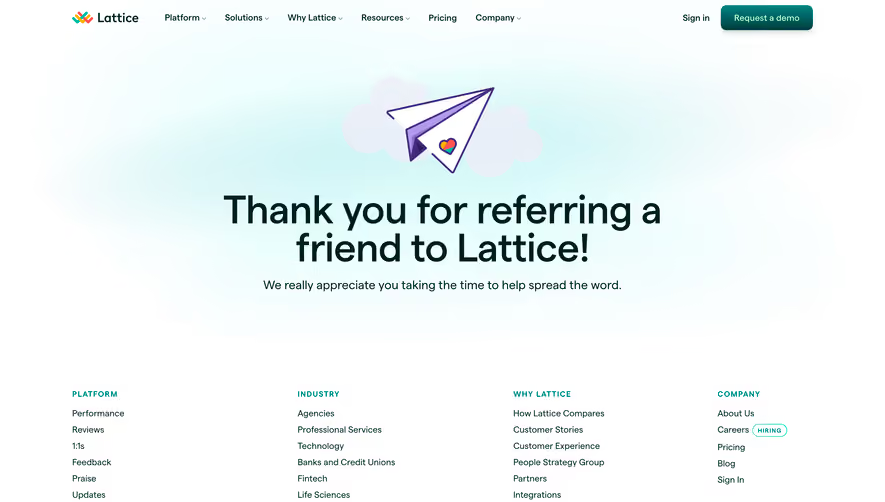

Upgrade to SaaSFrame Pro now to see similar examples.
Monthly
$18 /month
Billed $18 monthly
Browse all screens & flows
Filter and search screens & flows
Search text in screenshots
Access Figma files
Access mobile versions
Join now
Quarterly
$16 /month
Billed $48 quarterly
Browse all screens & flows
Filter and search screens & flows
Search text in screenshots
Access Figma files
Access mobile versions
Join now
Yearly
$15 /month
Billed $180 yearly
Browse all screens & flows
Filter and search screens & flows
Search text in screenshots
Access Figma files
Access mobile versions
Join now