Design with AI
Generate a new design based on this screen using your own content.
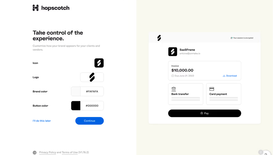
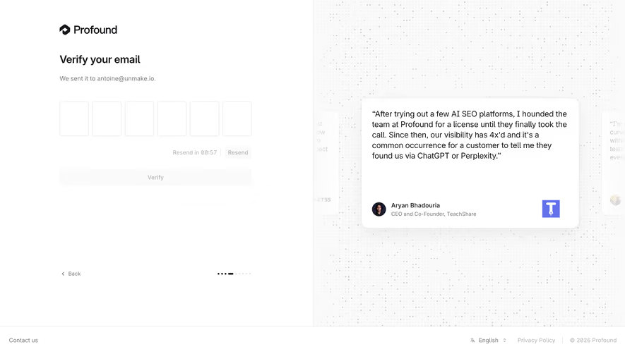
# Design from Reference: Hopscotch Verification
Create an original, high-fidelity visual design inspired by the reference. Prioritize composition, typography, colors, spacing, and component styling over technical implementation.
## Reference
- **Product:** Hopscotch
- **Category:** Verification
- **Screenshot:** https://cdn.prod.website-files.com/5e9dc792e1210c5325f7ebbc/6acb65d9b206c0d3f8f0f988_6acb655e93f403582dfcf864_cms-3735f4c21964791cac505fad.webp
Analyze the screenshot first. If inaccessible, request it rather than guessing.
## Content
{{content.instructions}}
{{content.data}}
Preserve essential messaging and factual accuracy. Adapt structure and copy length for visual balance; never invent product claims.
## Visual Design
### Overall aesthetic
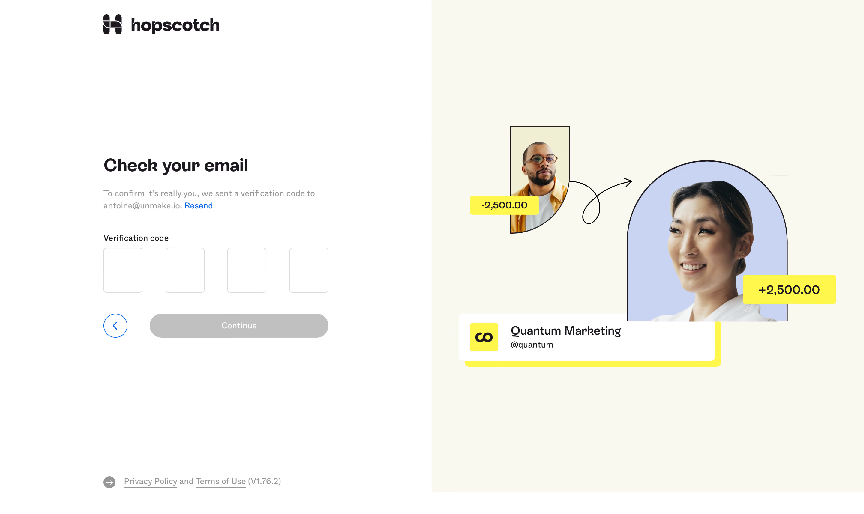
- **Character:** A split verification screen with a quiet white form and a warm illustrated transfer scene.
- **Evidence scale:** Original 2880 × 1714 pixels; CSS estimates assume an unverified 2× capture scale.
### Page composition
- **Left half:** Brand near top, verification content centered vertically in a roughly 376 px column and legal links at bottom.
- **Right half:** Pale-cream background with two portrait cutouts, curved arrow, yellow amount labels and a white company identity card.
- **Form:** Heading, helper/resend link, label, four code boxes and back/continue row.
### Information hierarchy
- **Task:** Bold Check your email heading leads.
- **Code:** Four empty boxes are the main input focus.
- **State:** Continue is gray and low-emphasis; actual enabled behavior is unverified.
- **Support:** Blue Resend and circular back control provide secondary paths.
### Typography
- **Heading:** Unverified sans-serif around 30 px bold.
- **Body:** Approximately 14 px regular, 20 px line height.
- **Labels/buttons:** Around 14 px medium.
- **Illustration:** Amount labels around 20 px and company identity around 20 px semibold.
### Colors & surfaces
- **Base:** White #FFFFFF and cream #F9F9EE.
- **Artwork:** Pale blue #C8D4F2, vivid yellow #FFF84B and warm #F1EFD3.
- **Ink:** Dark #1E1920.
- **Controls:** Gray #C0C0C0 action, blue links/back outline and thin pale borders.
### Components
- **Code boxes:** Four approximately 64 × 74 px outlined rectangles, 4 px radii.
- **Continue:** Approximately 298 × 40 px gray pill.
- **Back:** Roughly 40 px blue outlined circle with chevron.
- **Portraits:** Small rectangular/curved crop and larger arch-shaped portrait with thin dark outlines.
- **Identity card:** White rounded rectangle with yellow offset backing and small logo tile.
- **Legal:** Underlined text links and small version label.
### Visual rhythm
- **Form spacing:** Roughly 36 px between helper copy and code label; 34 px before action row.
- **Box rhythm:** Equal input widths and broad consistent gaps.
- **Balance:** Symmetrical halves separate task from brand storytelling.
### Responsive
- **Observed limit:** Desktop only.
- **Recommendation:** Prioritize verification form and move or hide decorative artwork on narrow screens.
- **Code entry:** Support paste/autofill and accessible per-digit or grouped labeling.
### Adaptation guidance
- **Retain:** Clear verification task, visible resend option and simple four-box entry.
- **Implement:** Use restrained form styling and vivid brand artwork in a separate region.
- **Verify:** Confirm fonts, scale and verification behavior separately; no code was requested or entered.
Use this context to reproduce the reference's visual language: layout, typography, colors, spacing, borders, radii, and distinctive elements. The screenshot takes priority if descriptions conflict.
## Direction
{{preferences.fidelityInstructions}}
## Output
{{output.instructions}}
Deliver a polished, cohesive design with precise alignment, hierarchy, and spacing. Produce the requested visual artifact, not just a description. If unsupported, explain the limitation.