Design with AI
Generate a new design based on this screen using your own content.
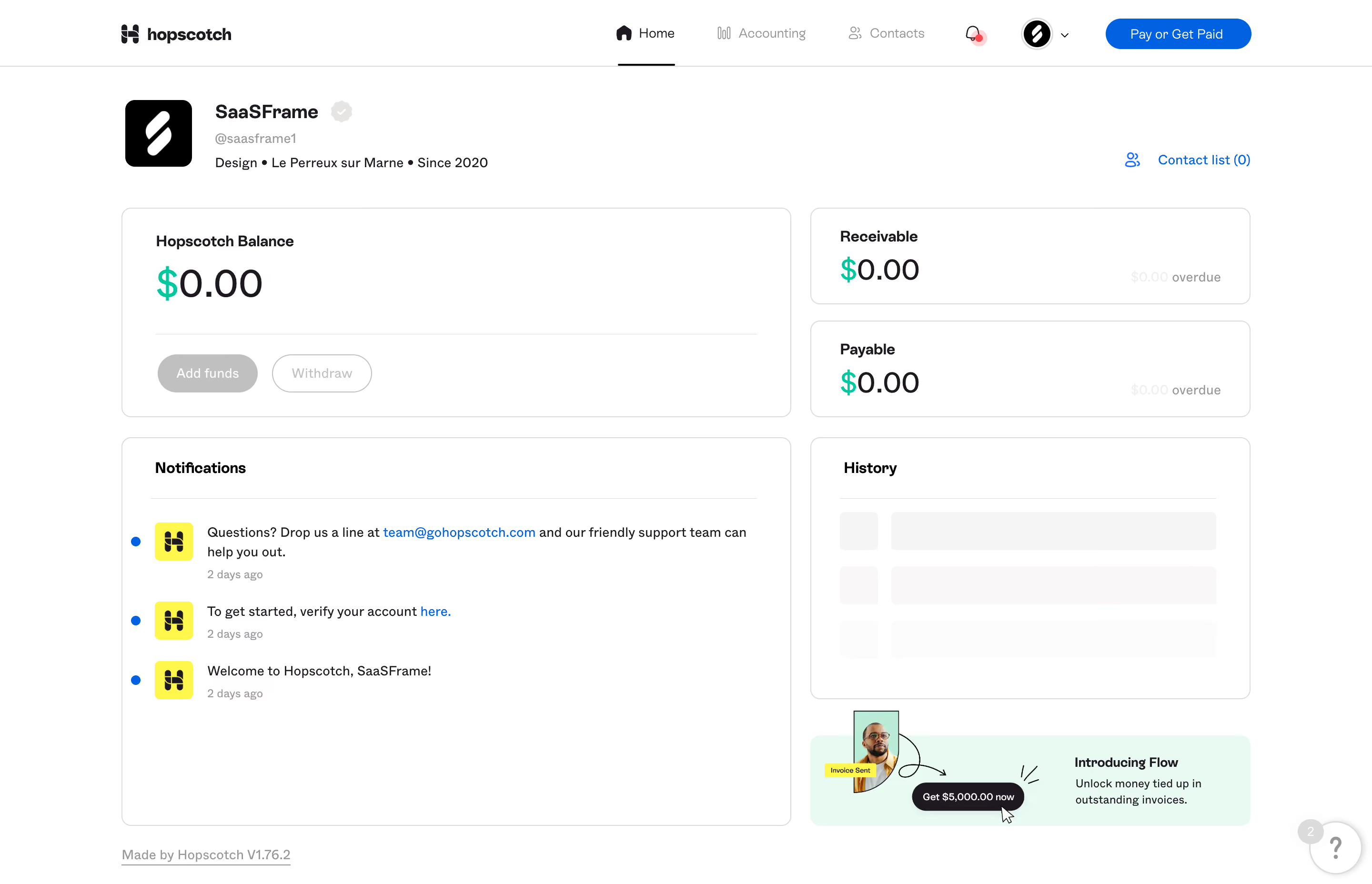
# Design from Reference: Hopscotch Dashboard
Create an original, high-fidelity visual design inspired by the reference. Prioritize composition, typography, colors, spacing, and component styling over technical implementation.
## Reference
- **Product:** Hopscotch
- **Category:** Dashboard
- **Screenshot:** https://cdn.prod.website-files.com/5e9dc792e1210c5325f7ebbc/6acb65d7b206c0d3f8f0f951_6acb65575e515b69c7957361_cms-a286ebf6eaed07ef9db2b714.webp
Analyze the screenshot first. If inaccessible, request it rather than guessing.
## Content
{{content.instructions}}
{{content.data}}
Preserve essential messaging and factual accuracy. Adapt structure and copy length for visual balance; never invent product claims.
## Visual Design
### Overall aesthetic
- **Character:** Minimal business-payments dashboard with generous white surfaces, thin card outlines and small playful brand accents.
### Page composition
- **Canvas:** 2880 × 1856 screenshot px; CSS estimates assume 2× capture.
- **Structure:** Horizontal navigation; organization identity strip; two-column grid with large balance card left and stacked receivable/payable cards right; notifications below left, history and promotional banner right.
### Information hierarchy
- **Priority:** Balance and monetary summaries use the largest text. Notification rows support initial account setup; Pay or Get Paid is the main top-bar action.
### Typography
- **Family:** Clean sans serif, exact font unverified.
- **Scale:** Estimated CSS money values 38–40 px, organization title 20 px, card headings 16 px, body 14 px and timestamps 12 px.
### Colors & surfaces
- **Sampled palette:** White #FFFFFF; mint banner #E8FAF2; pale loading surfaces #F5F5F5 and #F9F8F8; borders #DBDBDB; dark text #1E1920.
- **Accents:** Blue links/actions, mint currency symbols and yellow notification-logo tiles.
### Components
- **Cards:** Approximately 10 CSS px corners, fine gray outlines, internal divider lines and 30–36 px padding.
- **Balance actions:** Rounded muted Add funds and outlined Withdraw buttons appear inactive in this capture.
- **Notifications/history:** Blue unread dots and yellow icons accompany short messages; history contains pale skeleton bars. Bottom-right promotional banner combines a cutout portrait, doodles and dark pill action.
### Visual rhythm
- **Spacing:** Approximately 20 CSS px grid gaps; broad white card interiors emphasize sparse account data.
### Responsive
- **Observed:** Desktop only.
- **Adaptation:** Stack monetary cards, notifications and history; retain large numerical hierarchy and visible setup actions. Compress top navigation into a mobile pattern.
### Adaptation guidance
- **Preserve:** Calm outlined grid, strong monetary hierarchy and restrained colored accents.
- **Replace:** Use actual account state and verified figures; preserve the distinction between loading placeholders and real history.
Use this context to reproduce the reference's visual language: layout, typography, colors, spacing, borders, radii, and distinctive elements. The screenshot takes priority if descriptions conflict.
## Direction
{{preferences.fidelityInstructions}}
## Output
{{output.instructions}}
Deliver a polished, cohesive design with precise alignment, hierarchy, and spacing. Produce the requested visual artifact, not just a description. If unsupported, explain the limitation.