
Thank you! Your submission has been received!
Oops! Something went wrong while submitting the form.
Get SaaSFrame Pro
Monthly
$18
Quarterly
$48
Yearly
$180
Upgrade to access this feature
Browse all screens & flows
Filter and search screens & flows
Access Figma files
Access mobile versions
Bookmark screens & flows
Join now
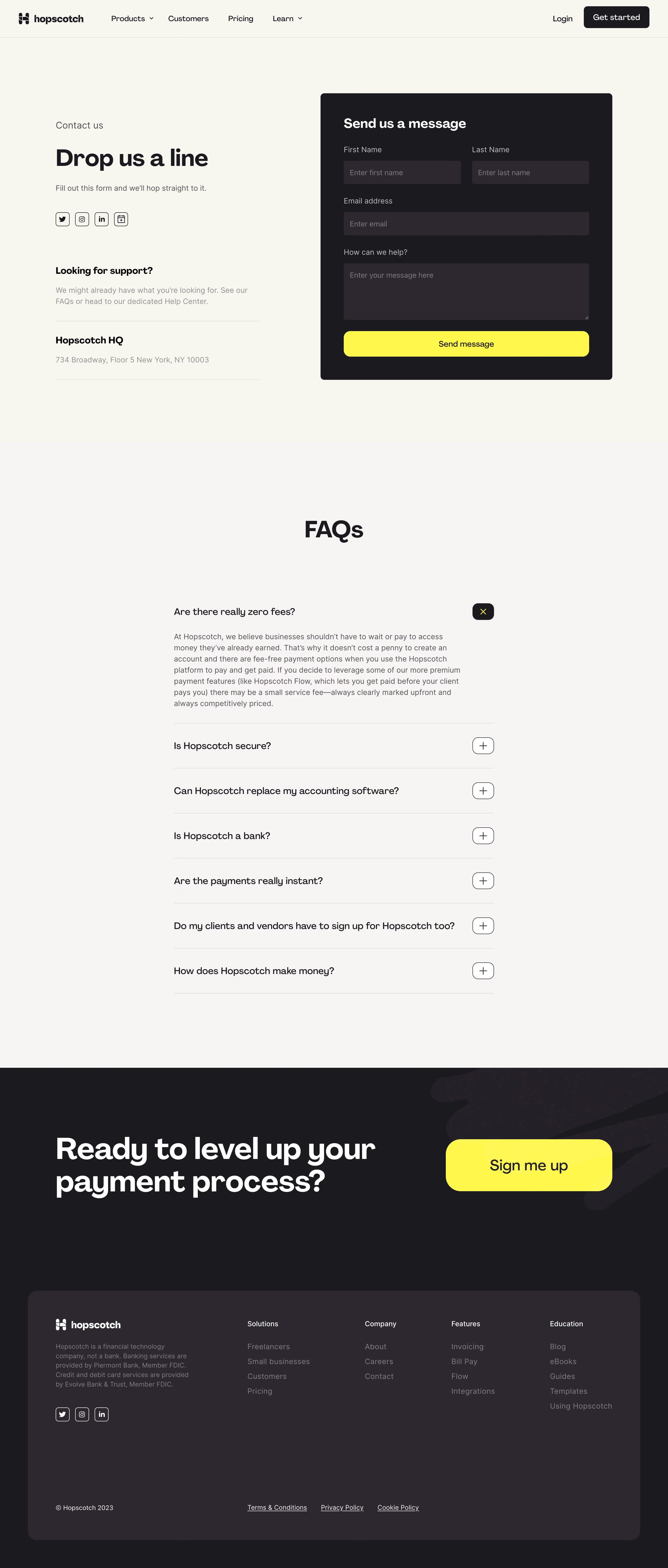

Hopscotch Contact Page

Hopscotch
All-in-one payments platform
Designed by
No items found.

Bookmark
Bookmark

Design with AI
Thank you! Your submission has been received!
Oops! Something went wrong while submitting the form.
# Design from Reference: Hopscotch Contact Page
Create an original, high-fidelity visual design inspired by the reference. Prioritize composition, typography, colors, spacing, and component styling over technical implementation.
## Reference
- **Product:** Hopscotch
- **Category:** Contact Page
- **Screenshot:** https://cdn.prod.website-files.com/5e9dc792e1210c5325f7ebbc/6acb65d9b206c0d3f8f0f978_6acb655fc2d837f8f41f9825_cms-3d098290b70d058f1c8a30f4.webp
Analyze the screenshot first. If inaccessible, request it rather than guessing.
## Content
{{content.instructions}}
{{content.data}}
Preserve essential messaging and factual accuracy. Adapt structure and copy length for visual balance; never invent product claims.
## Visual Design
### Overall aesthetic
- **Style:** Warm, high-contrast contact page pairing cream editorial content with a charcoal form and vivid yellow actions.
- **Capture scale:** Source 2880 × 6758px. Sizes below refer to the 1200px-wide inspection rendering; underlying CSS scale is unverified.
### Page composition
- **Header:** A cream navigation bar places Hopscotch branding left, product/customer/pricing/learning links across the middle and Login/Get started right.
- **Contact region:** A broad two-column section uses a roughly 367px text column at left and a 525px dark form at right, with generous outer margins.
- **FAQ:** A pale-gray full-width region contains a centered heading and a narrower accordion list.
- **Conversion/footer:** A dark band pairs an oversized white headline with a large yellow signup action. A rounded raised charcoal footer panel contains brand/legal copy and four link columns.
### Information hierarchy
- **Contact information:** Contact us introduces Drop us a line, a short explanation and social/calendar icons. Support guidance and headquarters address follow beneath.
- **Form:** Send us a message precedes first/last name fields, email, message textarea and Send message.
- **FAQ state:** Seven questions are visible. The first is expanded with a paragraph answer; remaining rows are collapsed.
- **Final action:** Ready to level up your payment process? and Sign me up provide a separate signup path after the contact/FAQ content.
### Typography
- **Family:** Rounded modern sans-serif with heavy display headings; exact font identity is unverified.
- **Roles:** Contact title about 40px bold, form title 24px bold, section labels 16–18px and body/field labels around 14px/20px at inspection scale.
- **Lower display:** FAQ heading around 42px bold; conversion headline approximately 52px/58px bold, with a 28px signup label.
- **Footer:** Link headings around 13px, links/body about 13–14px, muted against charcoal.
### Colors & surfaces
- **Sampled palette:** ICC-aware sRGB samples include pale #F6F5F4, warm cream #F8F6F0, charcoal #1C1A1F, raised dark #2D282F, yellow #FFF84B and white #FFFFFF.
- **Form contrast:** White heading, muted light labels and darker gray input surfaces sit inside the charcoal card.
- **Accent restraint:** Yellow is concentrated in Send message, the open FAQ close glyph and the final signup action.
### Components
- **Contact form:** Roughly 525 × 515px dark card with 6px corners and about 42px internal padding.
- **Fields:** First/last names share a row; email and textarea span the inner width. Inputs are around 42px high with 3–4px corners; message area about 100px high.
- **Submit:** Full-width yellow action around 46px high with 12px corners and dark centered label.
- **Social controls:** Small outlined rounded-square icons form a short horizontal row beneath the introduction.
- **Accordion:** Roughly 575px-wide list, fine horizontal dividers and right-aligned rounded-square plus controls. Expanded first row uses a dark control with yellow X.
- **Footer panel:** Approximately 1100px wide with 18px corners, large padding and a broad lower gap before copyright/legal links.
### Visual rhythm
- **Spacing:** Generous top/bottom padding surrounds the contact region; the FAQ adds a large pause before its first question.
- **Alignment:** Contact labels, support copy and address share one left edge. Form labels and fields follow a consistent internal grid.
- **Contrast cadence:** Cream contact, pale FAQ and dark conversion/footer create three clear tonal stages.
### Responsive
- **Recommended adaptation:** Only desktop is observed. Stack contact copy above the form, convert paired name inputs to one column and make FAQ width fluid.
- **Footer:** Stack the conversion headline/action and reduce footer columns, retaining readable legal copy and accessible accordion controls.
### Adaptation guidance
- **Preserve:** Keep support guidance separate from the message form, explicit labels, one strong submit action and helpful FAQ content.
- **Adapt:** Use actual contact details, support destinations and approved financial/legal copy. Preserve the visible expanded/collapsed hierarchy without inventing additional answers.
Use this context to reproduce the reference's visual language: layout, typography, colors, spacing, borders, radii, and distinctive elements. The screenshot takes priority if descriptions conflict.
## Direction
{{preferences.fidelityInstructions}}
## Output
{{output.instructions}}
Deliver a polished, cohesive design with precise alignment, hierarchy, and spacing. Produce the requested visual artifact, not just a description. If unsupported, explain the limitation.


Category
Patterns
Tech Stack
No items found.
Added on
June 23, 2023
Similar screens
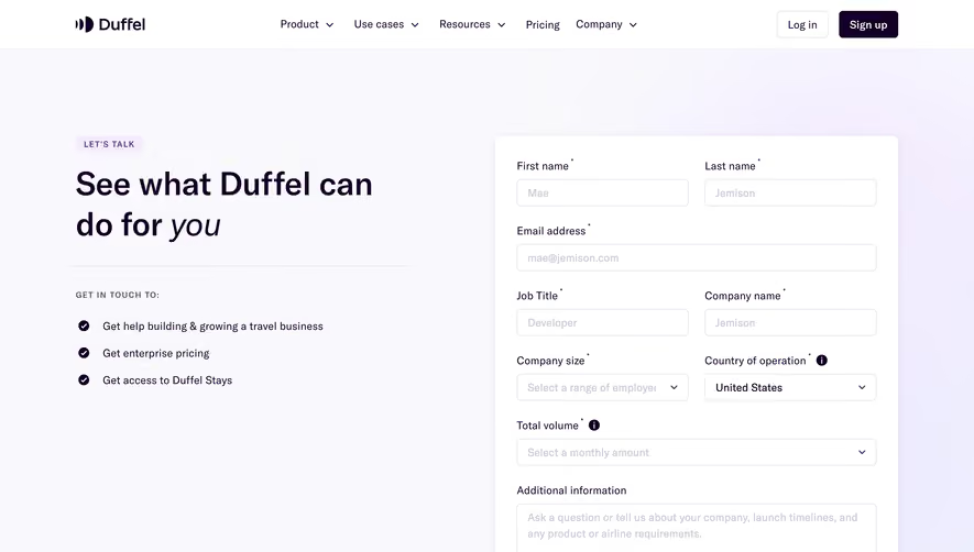


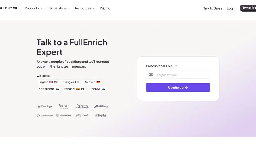

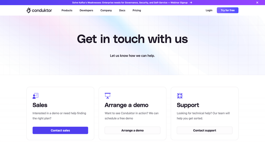

Upgrade to SaaSFrame Pro now to see similar examples.
Monthly
$18 /month
Billed $18 monthly
Browse all screens & flows
Filter and search screens & flows
Search text in screenshots
Access Figma files
Access mobile versions
Join now
Quarterly
$16 /month
Billed $48 quarterly
Browse all screens & flows
Filter and search screens & flows
Search text in screenshots
Access Figma files
Access mobile versions
Join now
Yearly
$15 /month
Billed $180 yearly
Browse all screens & flows
Filter and search screens & flows
Search text in screenshots
Access Figma files
Access mobile versions
Join now