Overall Style and Aesthetic
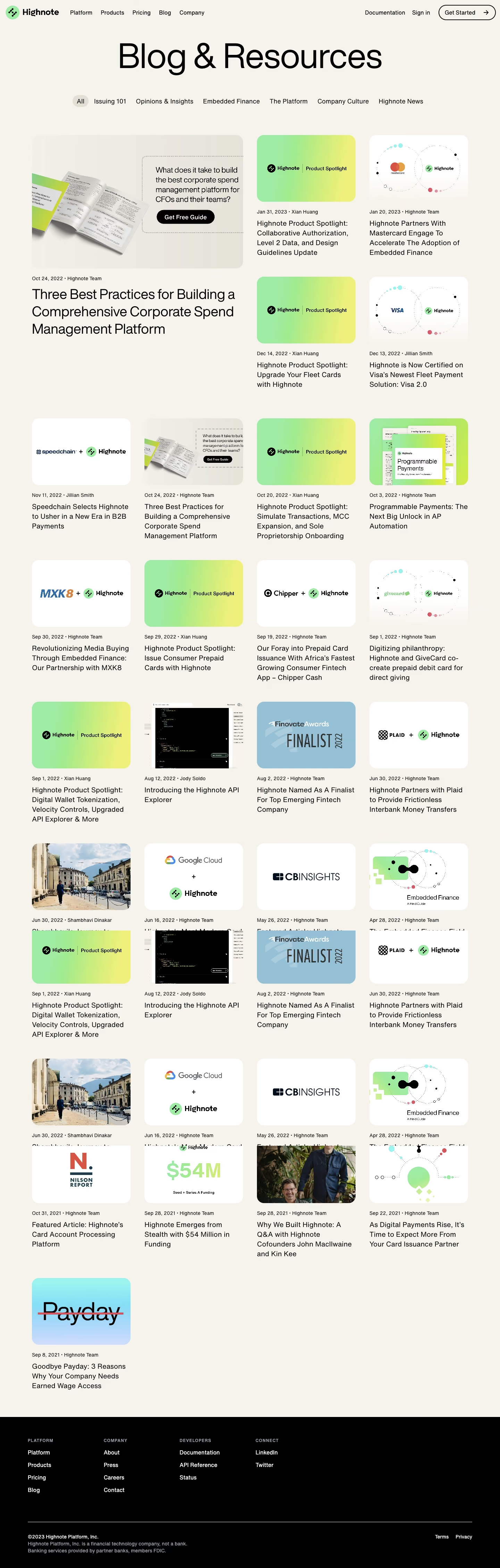
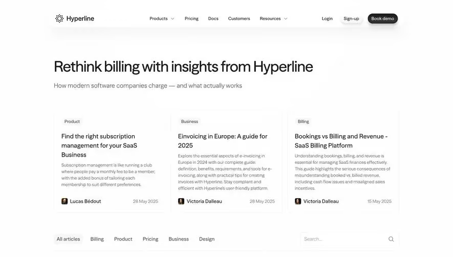
Highnote’s blog embodies a modern, minimalist approach with a professional yet approachable tone. Clean lines, generous white space, and subtle shadows create a relaxing environment that feels both polished and inviting. The visual restraint amplifies the sense of trust and clarity, letting the content and key visuals shine without distraction. Layout and Structure
The page adopts a streamlined, grid-based structure, immediately presenting featured and recent articles in neat, digestible cards. There is no traditional hero section; instead, the blog leads with content, reflecting a user-focused intent. Content categorization and a persistent, slim top navigation keep exploration intuitive and efficient. A simple, condensed footer ties off the experience with essential links, maintaining focus on the content. Visual Elements
Custom illustrations accompany select article thumbnails, adding playful character without overwhelming the design. The mix of abstract graphics, minimalist icons, and clean card layouts injects vibrancy while retaining simplicity. Subtle animation effects on hover guide interaction and enrich the tactile feel. The imagery balances professionalism with creativity, appealing to modern SaaS audiences. Color Palette and Typography
A cool, contemporary palette of soft off-white backgrounds and dark charcoal text anchors the site, accented by deep blues and warm gradients in illustrations and CTAs. The typography features a geometric sans-serif for headings and clean, readable body text, establishing visual hierarchy and effortless readability. User Experience Patterns & Notable Choices
Navigation remains persistent yet unobtrusive, while bold CTA buttons punctuate the page without distraction. Cards and category filters support content discovery, and microinteractions add a responsive touch. Highnote’s seamless blend of clarity, elegance, and approachable visuals makes this blog page stand out for SaaS design inspiration.