
Thank you! Your submission has been received!
Oops! Something went wrong while submitting the form.
Get SaaSFrame Pro
Monthly
$18
Quarterly
$48
Yearly
$180
Upgrade to access this feature
Browse all screens & flows
Filter and search screens & flows
Access Figma files
Access mobile versions
Bookmark screens & flows
Join now
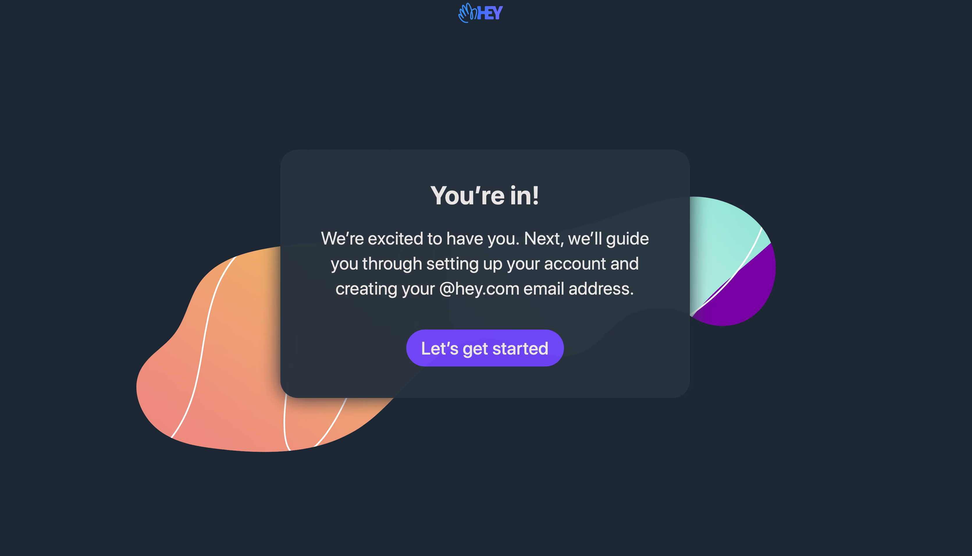
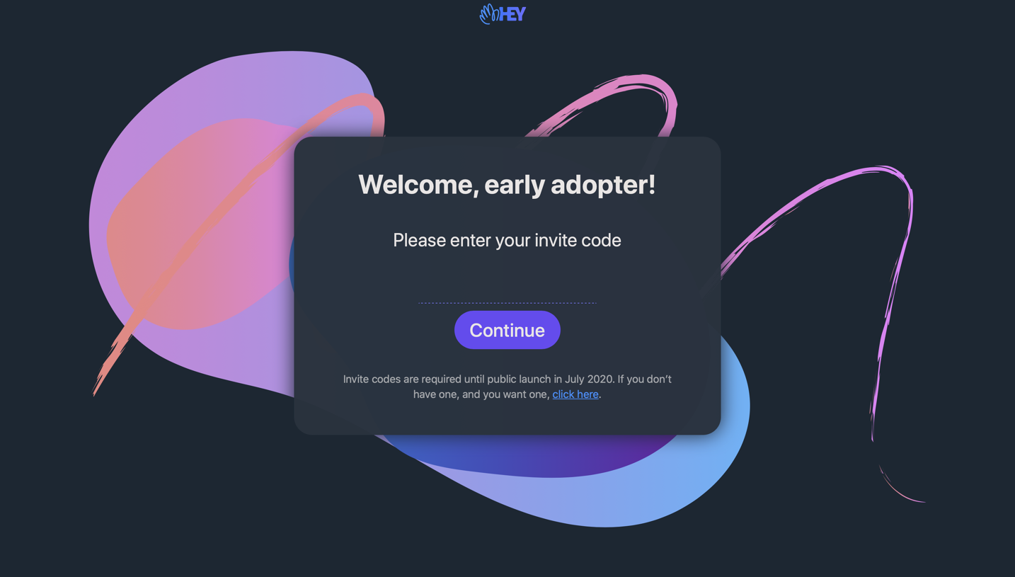
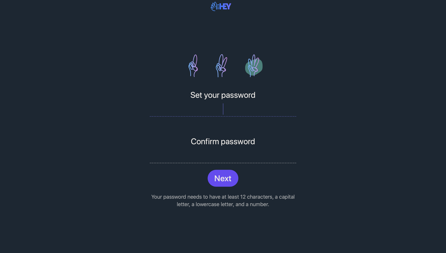
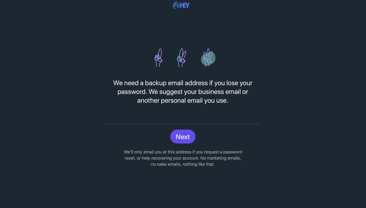
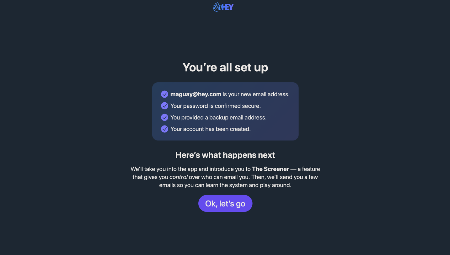
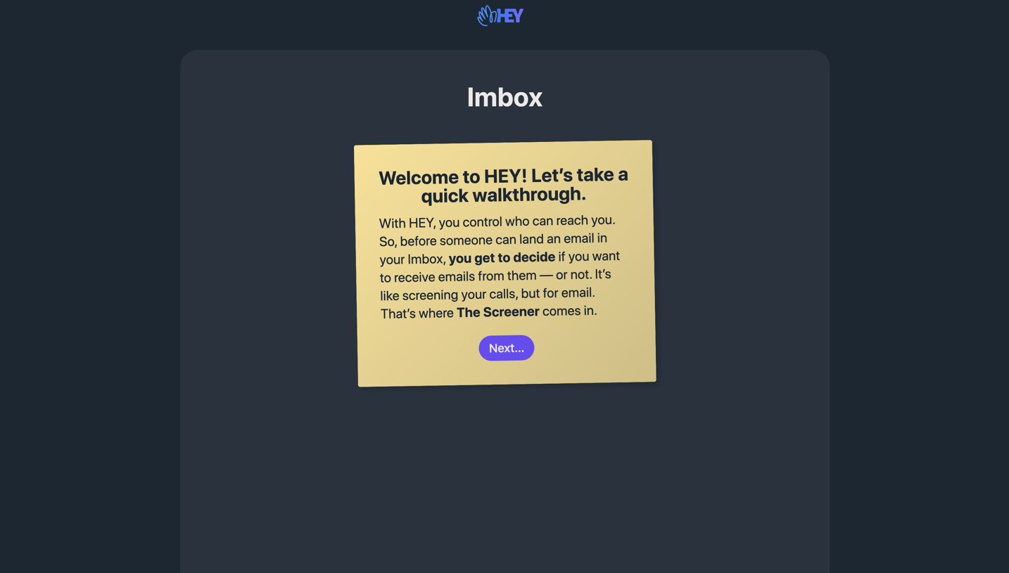
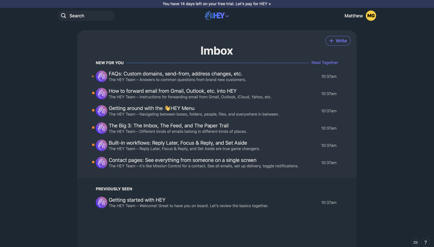
Hey Sign Up Flow

Hey
Email at its best, new from Basecamp.
Designed by
No items found.

Bookmark
Bookmark

Design with AI
Thank you! Your submission has been received!
Oops! Something went wrong while submitting the form.
# Design from Reference: Hey Sign Up Flow
Create an original, high-fidelity visual design inspired by the reference. Prioritize composition, typography, colors, spacing, and component styling over technical implementation.
## Reference
- **Product:** Hey
- **Category:** Account Setup
- **Screenshot:** https://cdn.prod.website-files.com/5e9dc792e1210c5325f7ebbc/6acbc9351790037d3e058f22_6acbc6468892d3072b72e50d_cms-ad23edf02f5c1012303296da.webp
Analyze the screenshot first. If inaccessible, request it rather than guessing.
## Content
{{content.instructions}}
{{content.data}}
Preserve essential messaging and factual accuracy. Adapt structure and copy length for visual balance; never invent product claims.
## Visual Design
### Overall aesthetic
- **Character:** A dark signup-success screen combines a translucent slate panel, bright purple action and colorful abstract shapes.
- **Capture evidence:** The image measures 3342 × 1910 pixels. Layout proportions are observed; approximate CSS sizes assume a roughly 1671px-wide viewport at 2× density, which is unverified.
- **Tone:** A short celebratory message and one action create a focused transition into account setup.
### Page composition
- **Brand:** A small blue-violet HEY logo sits centered near the top.
- **Central panel:** A wide rounded slate rectangle occupies the middle of the page.
- **Message stack:** A bold success heading, three-line explanation and purple pill action are centered inside the panel.
- **Background shapes:** A large peach/coral organic form extends behind the panel at lower left, while a mint-and-purple rounded form appears at right.
- **Outer canvas:** Dark blue-gray fills the remaining page, with no visible navigation or footer.
### Information hierarchy
- **Success:** The short bold heading establishes completion of the preceding signup step.
- **Next step:** Supporting text explains that account setup and email-address creation come next.
- **Action:** Let's get started is the only visible interactive action and uses the strongest saturated fill.
- **Decoration:** Abstract shapes frame the message without carrying essential information.
### Typography
- **Family:** A rounded sans-serif is visible; exact identity is unverified.
- **Heading:** Approximately 44–46px CSS at the estimated scale, bold, with compact line-height.
- **Supporting copy:** Approximately 32px with 42–44px line-height and centered alignment.
- **Action:** Approximately 30px medium, white, centered within the pill.
- **Brand:** A compact custom wordmark and hand symbol remain much smaller than the main message.
### Colors & surfaces
- **Canvas:** Sampled #1B2733 supplies the dark blue-gray background.
- **Panel:** Sampled #27323E supplies the dominant slate panel, with nearby #2A3641 and #2B343F in layered/translucent areas.
- **Primary action:** Sampled #6A42F2 supplies the bright violet button.
- **Shape accent:** Sampled #7700A2 supplies the saturated purple segment of the right decoration.
- **Other decoration:** Peach/coral and mint gradients provide warm/cool balance behind the panel.
- **Text:** Soft near-white text contrasts with the dark surfaces.
### Components
- **Message panel:** Roughly 700px CSS wide and 425px tall at the estimated scale, with around 30px radii and a strong soft shadow.
- **Action pill:** Approximately 270 × 64px at that scale, fully rounded, with white text and no visible border.
- **Organic artwork:** Large smooth shapes use gradient fills and fine white contour curves, partially concealed by the panel.
- **Layering:** The panel retains subtle background-shape visibility, suggesting translucency or a layered visual treatment rather than a flat solid fill.
### Visual rhythm
- **Centered axis:** Logo, heading, body and action share the page center.
- **Panel spacing:** Generous top/bottom padding and roughly 36–48px gaps separate the message roles.
- **Asymmetric decoration:** The larger warm shape at lower left balances the smaller cool shape at upper right.
- **Negative space:** Broad dark margins keep the composition focused on the central transition.
### Responsive
- **Evidence limit:** Only one wide desktop state is observed; subsequent setup and mobile behavior are unverified.
- **Panel recommendation:** Use a fluid card with 20–24px outer margins and reduce internal padding on narrow screens.
- **Typography recommendation:** Scale supporting copy down to a readable mobile size and allow natural line breaks.
- **Artwork recommendation:** Crop or simplify background forms without obscuring text or action.
- **Action recommendation:** Maintain a generous touch target and visible keyboard focus.
### Adaptation guidance
- **Transition template:** Reuse a concise success heading, explicit next-step explanation and one primary action.
- **Visual system:** Keep slate, violet and soft abstract gradients consistent with surrounding onboarding.
- **Content clarity:** State what the next action begins without implying setup is already complete.
- **Accessibility:** Keep decorative shapes out of the reading order and ensure strong text/action contrast.
- **Scope:** The screenshot shows a welcome transition, not the subsequent account-creation fields.
Use this context to reproduce the reference's visual language: layout, typography, colors, spacing, borders, radii, and distinctive elements. The screenshot takes priority if descriptions conflict.
## Direction
{{preferences.fidelityInstructions}}
## Output
{{output.instructions}}
Deliver a polished, cohesive design with precise alignment, hierarchy, and spacing. Produce the requested visual artifact, not just a description. If unsupported, explain the limitation.


Category
Patterns
No items found.
Tech Stack

Added on
February 4, 2023
Found in 1 flow


Similar screens
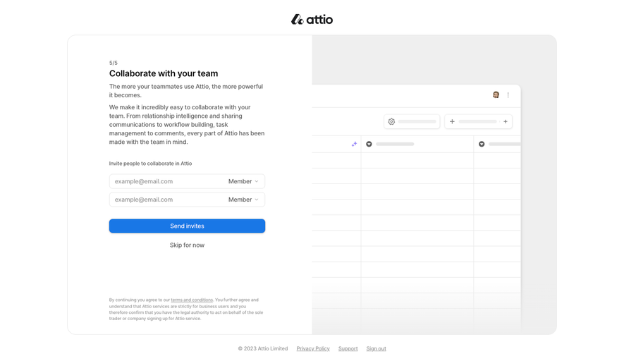



Upgrade to SaaSFrame Pro now to see similar examples.
Monthly
$18 /month
Billed $18 monthly
Browse all screens & flows
Filter and search screens & flows
Search text in screenshots
Access Figma files
Access mobile versions
Join now
Quarterly
$16 /month
Billed $48 quarterly
Browse all screens & flows
Filter and search screens & flows
Search text in screenshots
Access Figma files
Access mobile versions
Join now
Yearly
$15 /month
Billed $180 yearly
Browse all screens & flows
Filter and search screens & flows
Search text in screenshots
Access Figma files
Access mobile versions
Join now