
Thank you! Your submission has been received!
Oops! Something went wrong while submitting the form.
Get SaaSFrame Pro
Monthly
$18
Quarterly
$48
Yearly
$180
Upgrade to access this feature
Browse all screens & flows
Filter and search screens & flows
Access Figma files
Access mobile versions
Bookmark screens & flows
Join now
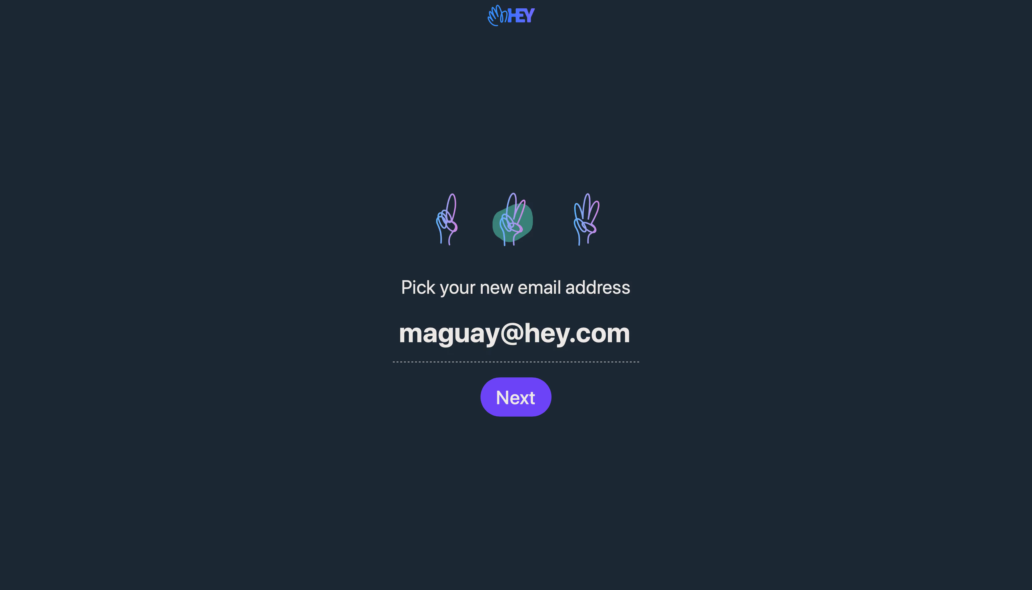
Hey Sign Up Flow

Hey
Email at its best, new from Basecamp.
Designed by
No items found.

Bookmark
Bookmark

Design with AI
Thank you! Your submission has been received!
Oops! Something went wrong while submitting the form.
# Design from Reference: Hey Sign Up Flow
Create an original, high-fidelity visual design inspired by the reference. Prioritize composition, typography, colors, spacing, and component styling over technical implementation.
## Reference
- **Product:** Hey
- **Category:** Account Setup
- **Screenshot:** https://cdn.prod.website-files.com/5e9dc792e1210c5325f7ebbc/6acbc8686b0a1061299bac0a_6acbc607c2a55c243f9a1387_cms-f655819e725457d1f6a2f101.webp
Analyze the screenshot first. If inaccessible, request it rather than guessing.
## Content
{{content.instructions}}
{{content.data}}
Preserve essential messaging and factual accuracy. Adapt structure and copy length for visual balance; never invent product claims.
## Visual Design
### Overall aesthetic
- **Style:** Extremely minimal signup step on a flat dark blue-slate background, with a centered address choice and vivid violet progression action.
- **Character:** Hand-drawn finger-count illustrations and a small colorful HEY mark add playful identity without additional decoration.
- **Capture:** The image measures 3344 × 1912 pixels. CSS estimates assume a 2× capture, equivalent to approximately 1672 × 956 CSS pixels; actual scale and font identity are unverified.
### Page composition
- **Brand:** A small HEY mark is centered at the very top.
- **Main stack:** Three illustrated step markers sit above a centered instruction, a large email-address field and a Next pill.
- **Placement:** The main interaction occupies a narrow region around the horizontal center, beginning roughly one-third of the way down the canvas.
- **Field width:** The address underline spans approximately 400 CSS pixels.
- **Whitespace:** Broad empty dark margins surround the task; no sidebar, footer or secondary navigation is visible.
### Information hierarchy
- **Instruction:** A medium-large centered line asks the user to select a new address.
- **Address:** The prefilled address is the largest and boldest text, making the chosen value the main focus.
- **Progress:** Three finger-count drawings communicate a sequence, with the middle marker distinguished by a teal backdrop.
- **Primary action:** A violet Next button sits directly beneath the underlined field.
- **State scope:** Only this address-selection step is shown; no availability feedback or subsequent step is visible.
### Typography
- **Family:** A clean sans-serif is visible; exact font identity is unverified.
- **Instruction:** Approximately 30-pixel CSS size, regular-to-medium weight, with around 38-pixel line height.
- **Address value:** Approximately 44 pixels, bold, centered.
- **Next label:** Approximately 30 pixels, medium weight.
- **Brand:** The small logo is artwork rather than a reliable reference for the interface's text family.
### Colors & surfaces
- **Measured canvas:** Dark blue-slate #1B2733 fills nearly the entire screenshot.
- **Measured text:** Warm near-white #EDE9E6 carries the instruction, address and action label.
- **Measured action:** Violet #6C43F6 fills the Next pill.
- **Measured progress backdrop:** Teal #3A817A highlights the middle step marker.
- **Illustration colors:** Blue-to-lilac strokes define the finger-count drawings and brand artwork.
- **Depth:** No cards, borders or shadows are visible apart from the field's dotted underline.
### Components
- **Progress artwork:** Three separated hand illustrations show increasing finger counts; the middle one sits over an irregular teal rounded shape.
- **Address input:** A large centered value is presented above a dotted horizontal underline, without a conventional outlined box.
- **Primary button:** Approximately 116 × 64 CSS pixels, fully rounded, violet-filled and centered.
- **Logo:** A compact hand-and-wordmark treatment sits above the otherwise open page.
- **Interaction scope:** The screenshot shows a populated address field and enabled-looking Next control, but no focus caret, error or dropdown.
### Visual rhythm
- **Vertical sequence:** Progress markers, instruction, address and button form a clear top-to-bottom path.
- **Spacing:** Larger gaps separate illustration from instruction; the address and underline remain tightly grouped.
- **Centering:** All principal elements share the same vertical axis.
- **Scale contrast:** The small logo and illustrations frame a much larger address value.
- **Negative space:** The empty lower and side regions keep attention on a single decision.
### Responsive
- **Recommendation — field:** Use a fluid maximum width and scale long addresses without overflow.
- **Recommendation — typography:** Reduce the address and instruction sizes on narrow viewports while preserving their hierarchy.
- **Recommendation — height:** Allow the main stack to move upward or scroll when a mobile keyboard is open.
- **Recommendation — progress:** Keep all three markers visible and provide an accessible step description.
- **Recommendation — action:** Preserve a comfortable Next touch target. No mobile state is evidenced.
### Adaptation guidance
- **Keep one task per step:** Preserve the focused address choice without adding unrelated navigation.
- **Retain input emphasis:** Use strong typography for the address and a restrained underline treatment.
- **Reuse identity sparingly:** Keep the hand-drawn progress artwork, teal active marker and violet action as the main accents.
- **Make progress explicit:** Pair decorative markers with semantic current-step information.
- **Define validation separately:** Availability, invalid-address and loading feedback are outside the captured state.
- **Avoid copying personal content:** Treat the displayed address as example data rather than a reusable design detail.
Use this context to reproduce the reference's visual language: layout, typography, colors, spacing, borders, radii, and distinctive elements. The screenshot takes priority if descriptions conflict.
## Direction
{{preferences.fidelityInstructions}}
## Output
{{output.instructions}}
Deliver a polished, cohesive design with precise alignment, hierarchy, and spacing. Produce the requested visual artifact, not just a description. If unsupported, explain the limitation.


Category
Patterns
No items found.
Tech Stack

Added on
February 4, 2023
Found in 1 flow
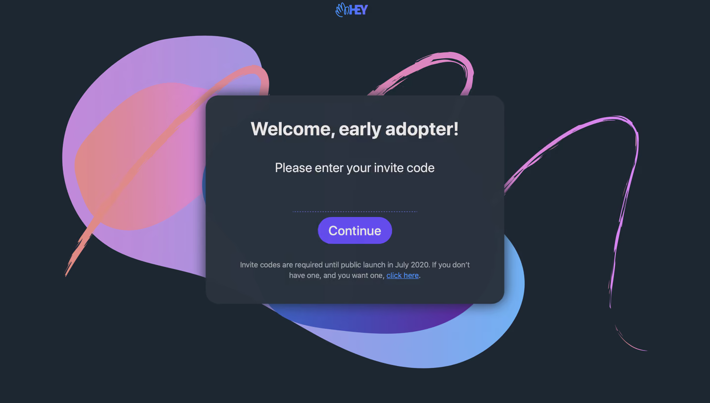


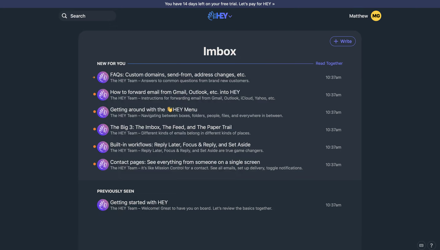
Similar screens
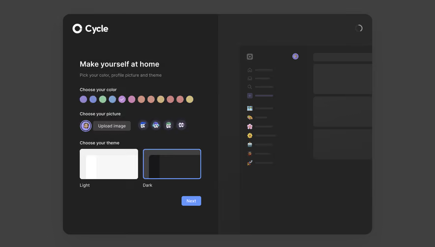





Upgrade to SaaSFrame Pro now to see similar examples.
Monthly
$18 /month
Billed $18 monthly
Browse all screens & flows
Filter and search screens & flows
Search text in screenshots
Access Figma files
Access mobile versions
Join now
Quarterly
$16 /month
Billed $48 quarterly
Browse all screens & flows
Filter and search screens & flows
Search text in screenshots
Access Figma files
Access mobile versions
Join now
Yearly
$15 /month
Billed $180 yearly
Browse all screens & flows
Filter and search screens & flows
Search text in screenshots
Access Figma files
Access mobile versions
Join now