Design with AI
Generate a new design based on this screen using your own content.
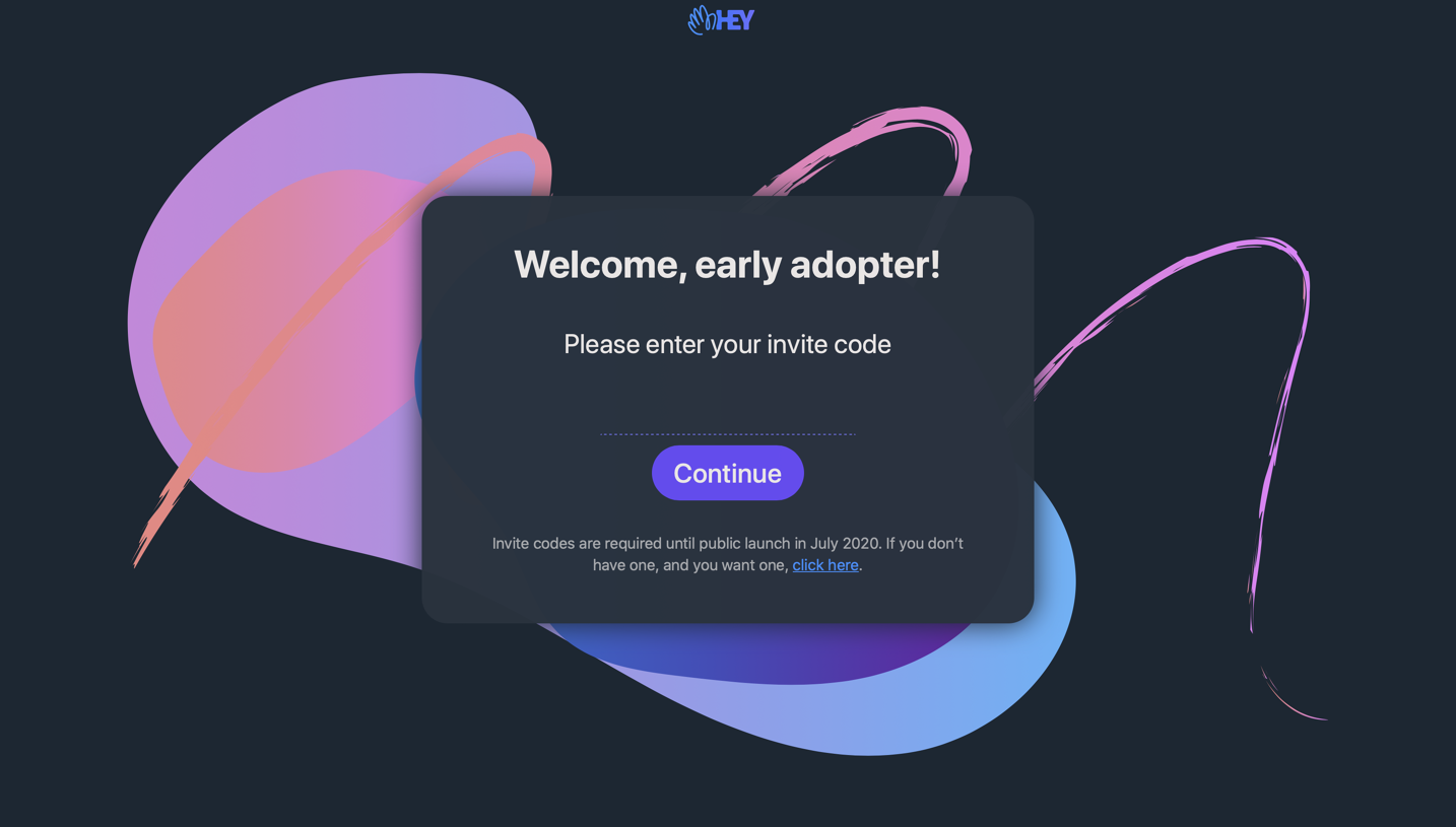
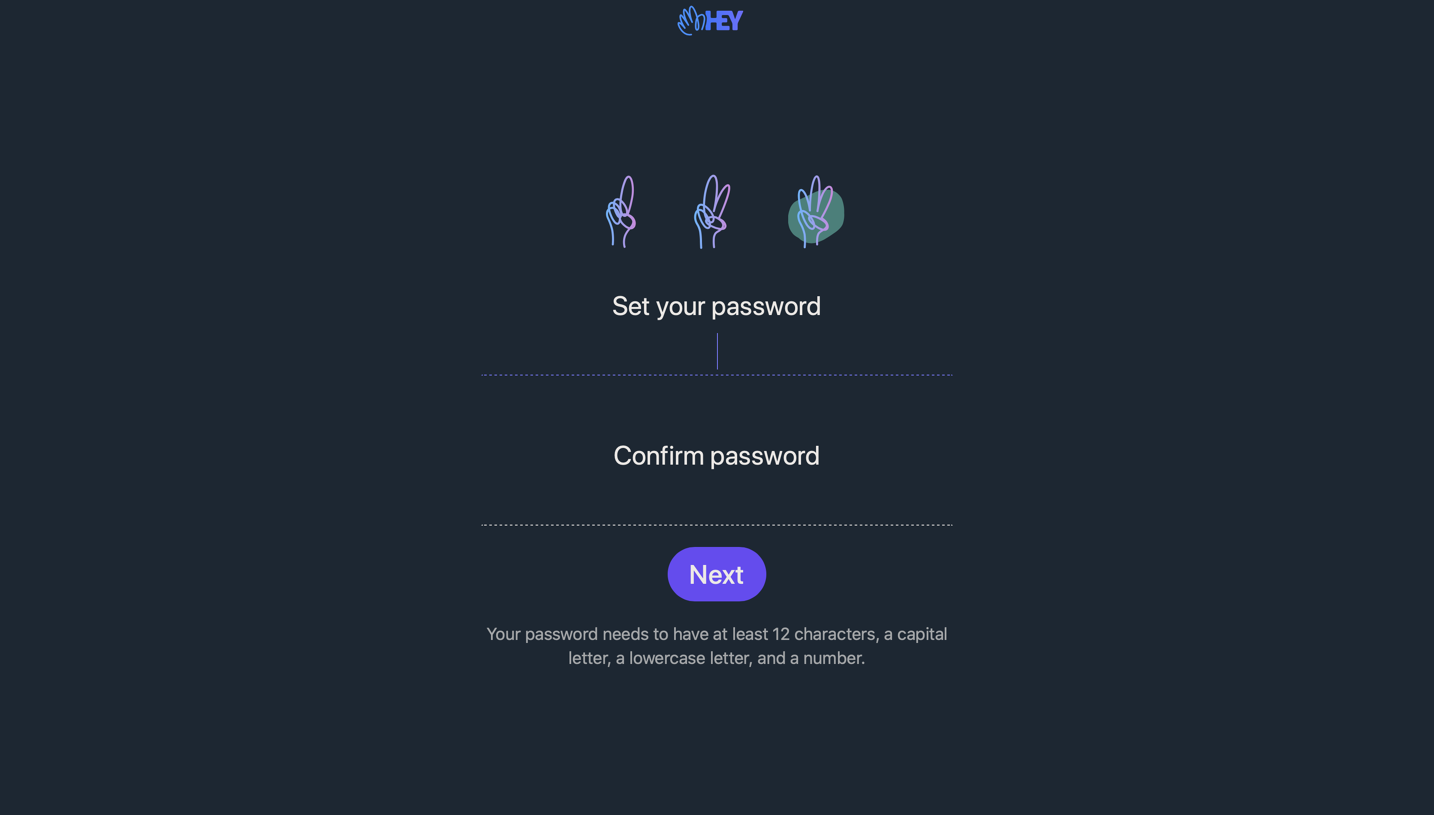
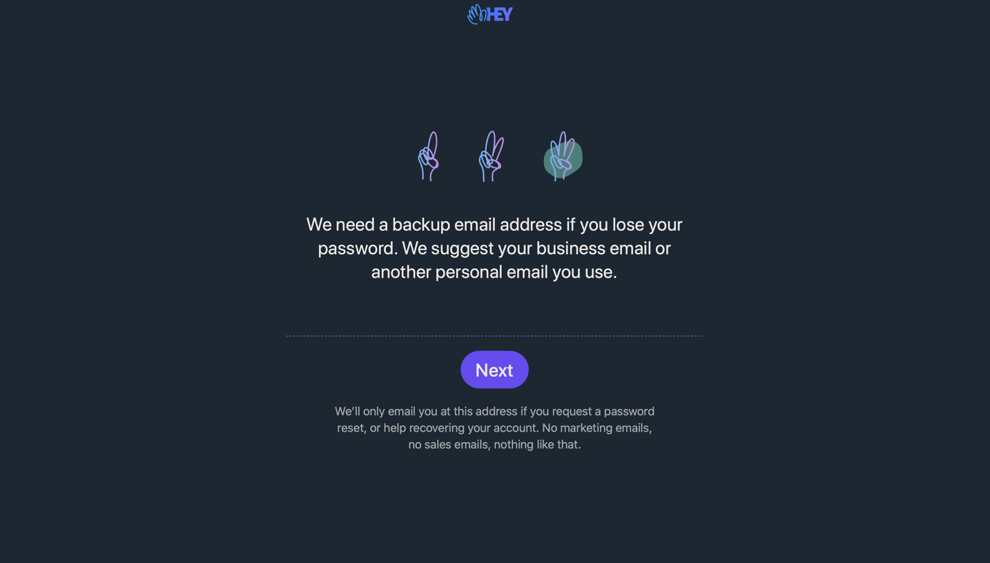
# Design from Reference: Hey Sign Up Flow
Create an original, high-fidelity visual design inspired by the reference. Prioritize composition, typography, colors, spacing, and component styling over technical implementation.
## Reference
- **Product:** Hey
- **Category:** Account Setup
- **Screenshot:** https://cdn.prod.website-files.com/5e9dc792e1210c5325f7ebbc/6acbbf6e4d71070f5fd413a1_6acbbe94d6be908889c55a96_cms-c10de5a9bf9fd558ee02d5db.webp
Analyze the screenshot first. If inaccessible, request it rather than guessing.
## Content
{{content.instructions}}
{{content.data}}
Preserve essential messaging and factual accuracy. Adapt structure and copy length for visual balance; never invent product claims.
## Visual Design
### Overall aesthetic
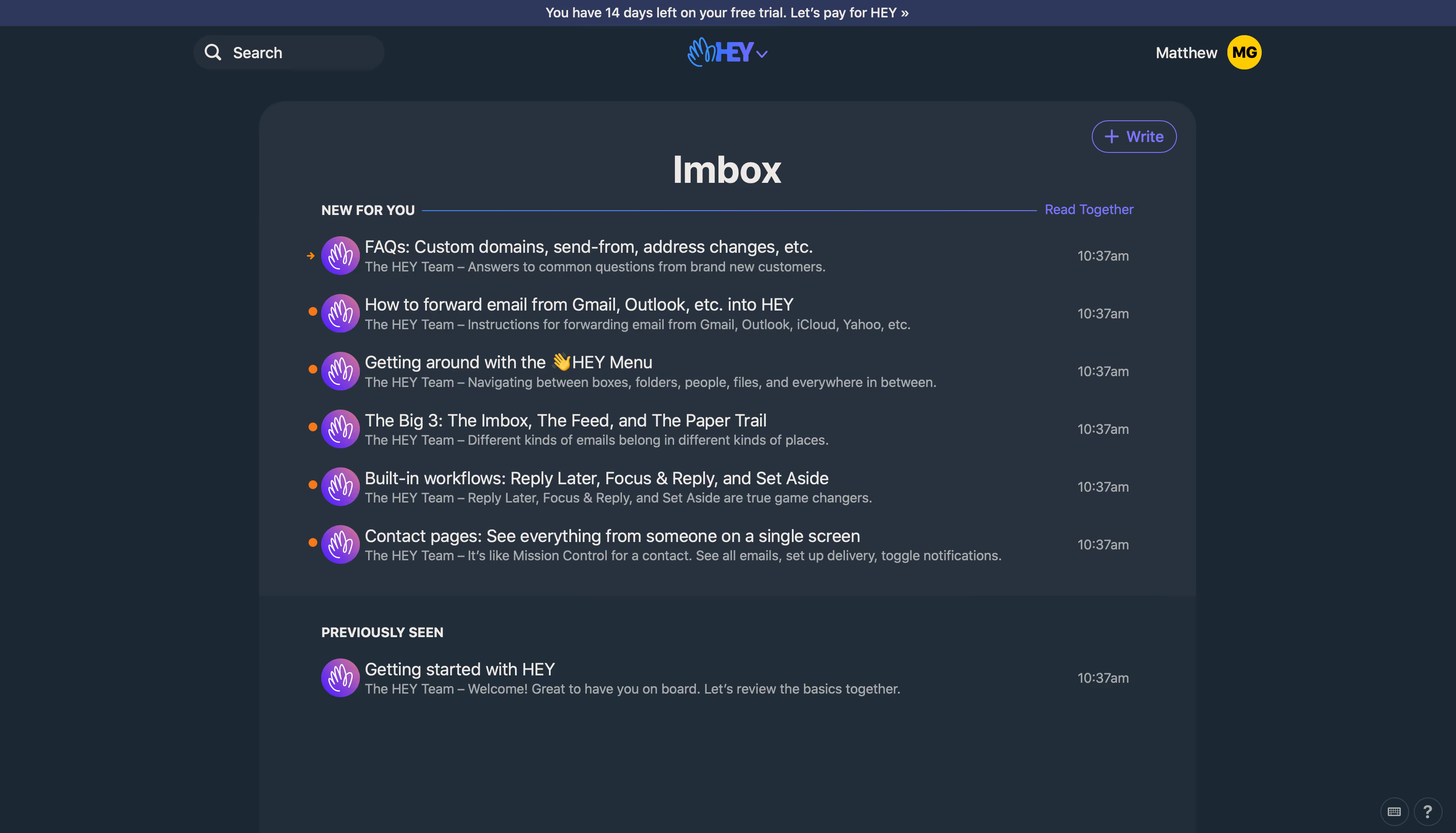
- **Character:** Dark email inbox with rounded navy surfaces, off-white text and violet/blue brand controls.
- **Evidence and scale:** Screenshot measures 3350 × 1918 image pixels. CSS capture ratio is unverified; layout estimates describe relative proportions and approximate scale rather than a confirmed viewport.
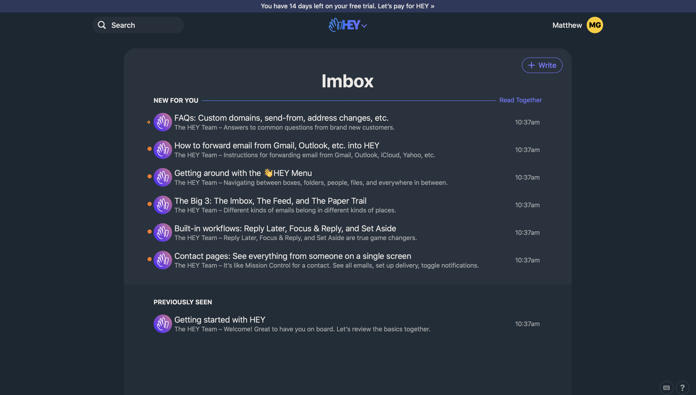
- **Observed screen:** The image shows an inbox populated with introductory messages, not a signup form.
### Page composition
- **Top region:** Slim trial strip spans the width; search sits left, centered brand/menu mark and account/avatar right.
- **Inbox shell:** A large centered rounded panel occupies roughly two-thirds of the width, with centered title and upper-right Write control.
- **Message groups:** New for you contains six messages; Previously seen contains one. The lower group uses a slightly darker surface.
- **Corner utilities:** Small keyboard/help circles sit near the lower-right page edge.
### Information hierarchy
- **Inbox title:** Large bold centered heading establishes the main view.
- **Group labels:** Small uppercase labels divide unread/new and previously viewed content, with a thin rule and Read Together link in the upper group.
- **Message rows:** Bright subjects sit above muted sender/summary lines; circular purple sender marks align left and times right.
- **Status:** Small orange dots or arrow mark new items; no opened-message content is shown.
### Typography
- **Title:** Approximately 80px in the original raster, bold sans-serif.
- **Subjects:** Around 38px original pixels, regular; summaries/timestamps around 30px.
- **Utilities:** Group labels around 28px bold uppercase, top/account/control text similar compact raster scale.
- **Scale caveat:** These are approximate image-pixel sizes, not verified CSS values; exact font family and weights are unverified.
### Colors & surfaces
- **Measured darks:** #1B2733 forms the outer canvas; #27323E supports the main inbox and #212D38 the lower grouping.
- **Measured foreground:** Warm off-white #EDE9E6 supports primary text; gray #A9ABAD supports summaries.
- **Measured accents:** Yellow #FFCC00 appears in the account avatar; violet #7A75FF supports controls and orange #F97918 marks new-message status.
- **Top strip:** Muted blue #2D385C distinguishes the trial notice from the rest of the dark shell.
### Components
- **Search:** Rounded dark pill with magnifier and label; no typed query visible.
- **Write:** Thin violet outlined pill with plus icon and label, aligned to the inbox's upper-right.
- **Message rows:** Repeated circular purple hand/brand avatars, two-line text stacks and right-aligned timestamps; no heavy row borders.
- **Inbox shell:** Broad top corner radii, generous inner padding and a subtle surface change between groups.
- **Account:** Bright yellow circular initials badge beside account name.
- **Utilities:** Small outlined circles with keyboard/help glyphs at the page corner.
### Visual rhythm
- **Centered frame:** Broad outer margins keep the message list focused despite the wide screenshot.
- **Row cadence:** Even vertical spacing and repeated avatar/text/time alignment support rapid scanning.
- **Group spacing:** Upper and lower groups have separate headings and a surface boundary, with larger padding than individual rows.
- **Color restraint:** Most of the screen is dark neutral; bright dots and violet controls remain small.
### Responsive
- **Observed limit:** Only desktop inbox is visible; writing, message opening, trial actions and mobile layout are unobserved.
- **Recommended layout:** Use a full-width inbox on phones, reduce outer padding and preserve subject/sender hierarchy.
- **Recommended metadata:** Let timestamps compress or move below subjects while keeping unread cues accessible.
- **Recommended controls:** Keep search, compose and account navigation reachable without crowding.
### Adaptation guidance
- **Preserve the pattern:** Distinguish new and previously viewed messages through labels, status marks and subtle surface shifts.
- **Keep reading priority:** Use bright subjects, muted summaries and stable avatar/time columns.
- **Implementation:** Provide accessible message links, unread state, keyboard navigation and visible focus. Trial wording and welcome-message subjects are captured content, not verified current account facts.
Use this context to reproduce the reference's visual language: layout, typography, colors, spacing, borders, radii, and distinctive elements. The screenshot takes priority if descriptions conflict.
## Direction
{{preferences.fidelityInstructions}}
## Output
{{output.instructions}}
Deliver a polished, cohesive design with precise alignment, hierarchy, and spacing. Produce the requested visual artifact, not just a description. If unsupported, explain the limitation.