Design with AI
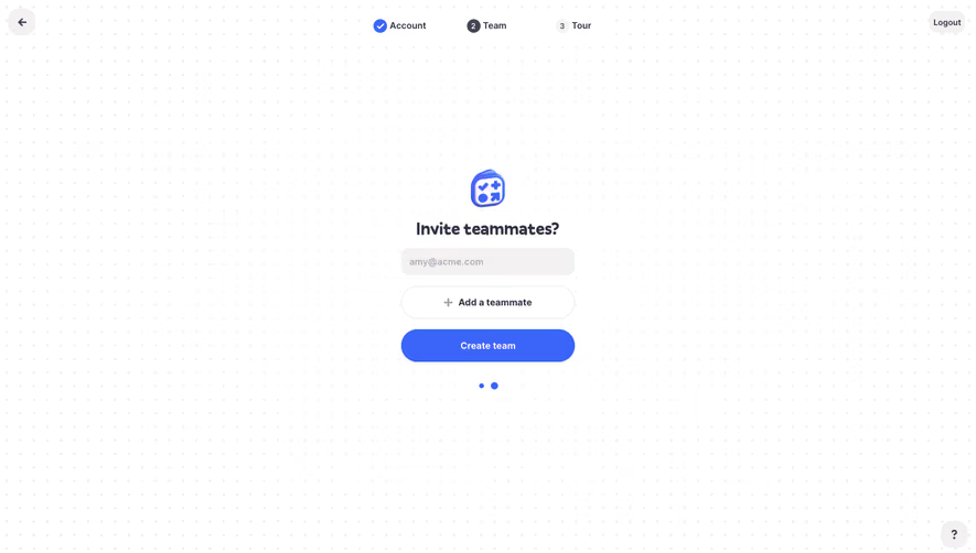
Generate a new design based on this screen using your own content.
# Design from Reference: Hey Sign Up Flow
Create an original, high-fidelity visual design inspired by the reference. Prioritize composition, typography, colors, spacing, and component styling over technical implementation.
## Reference
- **Product:** Hey
- **Category:** Account Setup
- **Screenshot:** https://cdn.prod.website-files.com/5e9dc792e1210c5325f7ebbc/6acbc137b7ca13cf70095a65_6acbc02c1d2516508748b8f9_cms-cafed7ded35d3631c0960886.webp
Analyze the screenshot first. If inaccessible, request it rather than guessing.
## Content
{{content.instructions}}
{{content.data}}
Preserve essential messaging and factual accuracy. Adapt structure and copy length for visual balance; never invent product claims.
## Visual Design
### Overall aesthetic
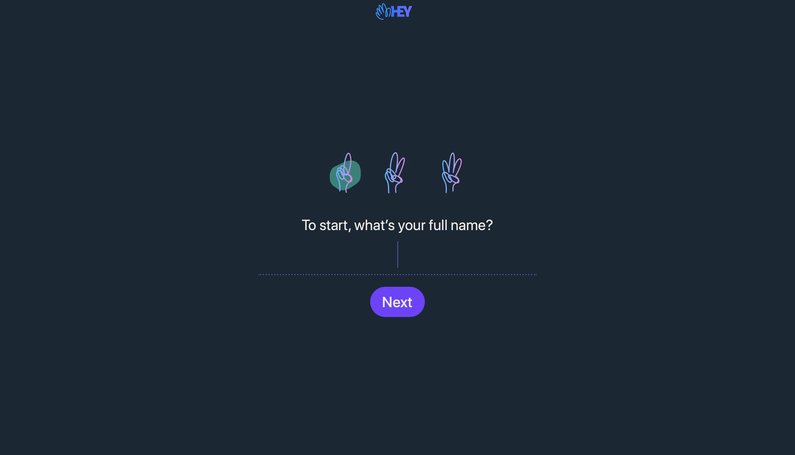
- **Character:** Dark, conversational signup step with a single question, hand-gesture progress illustrations and vibrant violet action.
### Page composition
- **Canvas:** 3344 × 1912 screenshot px; capture-to-CSS scale is unverified.
- **Structure:** Small centered brand at top; three outlined hand gestures above the central question; one underline-only input and Next pill. Broad empty space surrounds the compact interaction.
### Information hierarchy
- **Priority:** Full-name question and active input carry the task. First hand has a teal circular highlight, indicating current progress.
### Typography
- **Family:** Clean humanist sans serif, exact font unverified.
- **Scale:** Suggested CSS adaptation from relative proportions: question 24–28 px, input 24 px and Next label 24 px; these are estimates, not measured CSS.
### Colors & surfaces
- **Sampled palette:** Dark blue-gray #1B2733, action violet #6C43F6, light text #EDE9E6, progress teal #3A817A and gesture accent #7A75FF.
### Components
- **Input:** No box, only dotted violet baseline with thin visible caret; center-aligned entry.
- **Progress:** Three gradient-outline hand gestures count stages; first gesture sits over a translucent teal disc.
- **Action:** Compact fully rounded violet Next button; no surrounding card, visible back link or secondary form fields.
### Visual rhythm
- **Spacing:** Large vertical gap below the logo; approximately 24–40 CSS px suggested gaps within the question/input/action stack.
### Responsive
- **Observed:** Desktop only.
- **Adaptation:** Keep the question above the keyboard, use a fluid underline width and preserve visible focus; maintain a touch-sized Next button.
### Adaptation guidance
- **Preserve:** One-question focus, dark canvas and illustrated stage progression.
- **Replace:** Use the correct signup field and actual progression logic; avoid adding unnecessary fields to this screen.
Use this context to reproduce the reference's visual language: layout, typography, colors, spacing, borders, radii, and distinctive elements. The screenshot takes priority if descriptions conflict.
## Direction
{{preferences.fidelityInstructions}}
## Output
{{output.instructions}}
Deliver a polished, cohesive design with precise alignment, hierarchy, and spacing. Produce the requested visual artifact, not just a description. If unsupported, explain the limitation.