Design with AI
Generate a new design based on this screen using your own content.
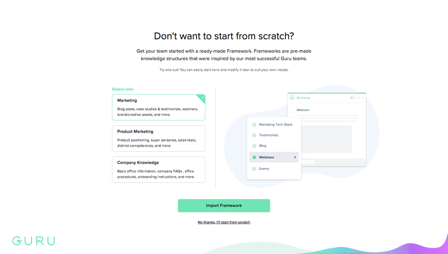
# Design from Reference: Guru Sign Up Flow
Create an original, high-fidelity visual design inspired by the reference. Prioritize composition, typography, colors, spacing, and component styling over technical implementation.
## Reference
- **Product:** Guru
- **Category:** Account Setup
- **Screenshot:** https://cdn.prod.website-files.com/5e9dc792e1210c5325f7ebbc/6acbbf774d71070f5fd414db_6acbbe9f5c8937341a55b835_cms-e8d420fde2710ab12fa65aae.webp
Analyze the screenshot first. If inaccessible, request it rather than guessing.
## Content
{{content.instructions}}
{{content.data}}
Preserve essential messaging and factual accuracy. Adapt structure and copy length for visual balance; never invent product claims.
## Visual Design
### Overall aesthetic
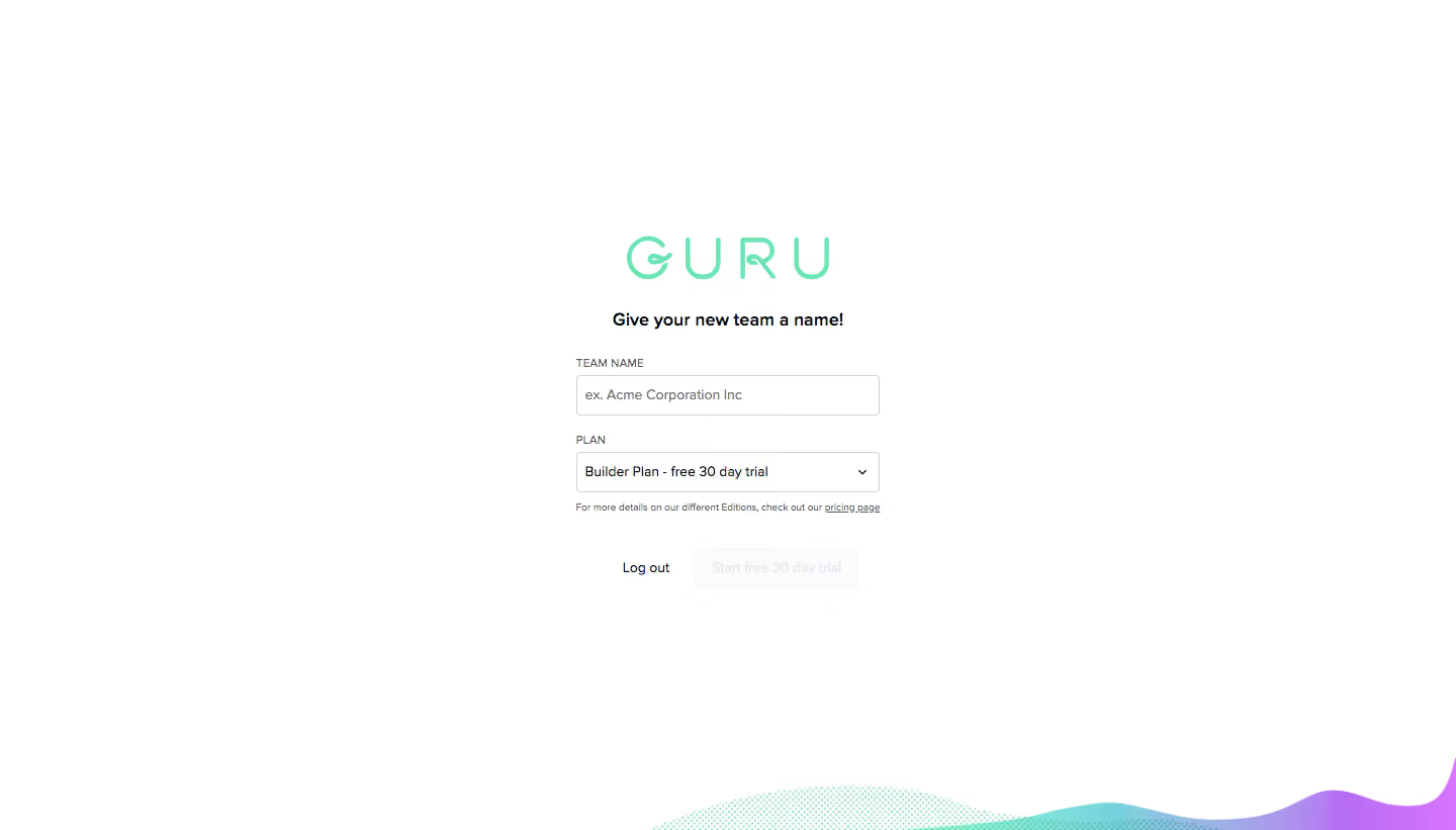
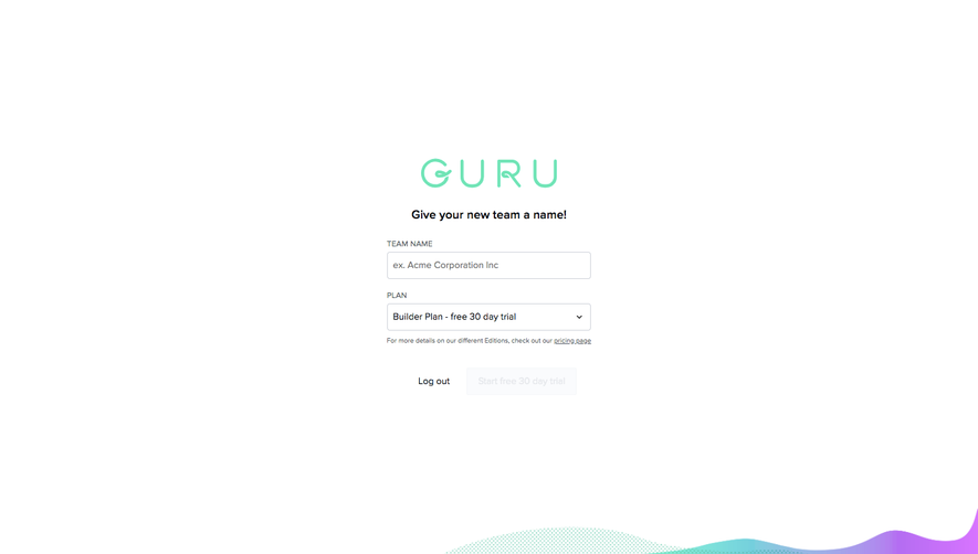
- **Character:** Minimal centered team-creation screen with a white canvas, mint outlined wordmark and a tiny form.
- **Decoration:** A low wave of mint/cyan-to-purple color and dotted texture appears only along the bottom-right edge.
- **Scale:** The screenshot measures 1440 × 821 image px. Measurements below are image estimates; CSS scale is unverified.
### Page composition
- **Center block:** A roughly 300 px-wide form sits near the horizontal center, starting around y235 with the wordmark.
- **Title:** A short bold invitation to name the team sits below the logo.
- **Fields:** Team Name input and Plan dropdown stack vertically, followed by a small pricing-detail line.
- **Actions:** Log out appears as a plain text action beside a very pale trial-start button.
- **Whitespace:** Most of the viewport is blank; there is no sidebar, header navigation or enclosing card.
### Information hierarchy
- **Brand:** The large mint wordmark is the first visual anchor.
- **Task:** A compact bold line introduces team naming; uppercase labels identify the two controls.
- **Plan context:** The dropdown shows a builder-plan trial selection; a tiny pricing link supplies secondary information.
- **State:** Team name is empty with an example placeholder, and the trial action appears disabled. Exact validation rules are unverified.
### Typography
- **Family:** Neutral sans-serif; exact identity is unverified.
- **Task heading:** Approximately 17–18 image px, bold and centered.
- **Field text:** Around 13–14 px; labels are small uppercase text near 11–12 px.
- **Helper:** The pricing sentence is very small, approximately 9–10 px.
- **Wordmark:** Thin custom mint lettering with wide spacing is a graphic identity rather than verified body font.
### Colors & surfaces
- **Measured background:** ICC-aware sRGB sampling yields #FFFFFF as the dominant canvas.
- **Measured accent:** Mint #71E4B5 occurs in the brand/decorative treatment.
- **Measured neutrals:** #CED2D9 appears in borders and #090B0E in dark text; #FAFBFD and #F5F7F9 occur in pale interface areas.
- **Bottom art:** Cyan and violet gradients accent the wave, without spreading into form controls.
- **Depth:** Controls are flat with fine outlines and small corners; no substantial shadow is visible.
### Components
- **Team input:** Approximately 300 × 40 image px with a thin cool-gray border, small radius and example-company placeholder.
- **Plan select:** Matching width/height with a small down chevron at the right.
- **Pricing link:** Tiny underlined inline destination sits directly below the dropdown.
- **Action row:** Plain Log out text sits left of an approximately 160 × 40 px very pale trial button.
- **Decorative wave:** Cropped organic shape at the lower edge combines dotted mint texture and smooth multicolor fill.
### Visual rhythm
- **Vertical stack:** Logo, task title and fields use compact, deliberate gaps.
- **Form alignment:** Both controls and helper text share the same left edge and width.
- **Action separation:** A larger gap below helper copy separates the action row.
- **Whitespace:** The small form occupies only a fraction of the wide viewport, emphasizing a single task.
### Responsive
- **Evidence limit:** Only desktop is shown; these are recommendations.
- **Form width:** Keep a fluid maximum-width column with 20–24 px margins.
- **Controls:** Retain visible labels and increase small helper text for readability.
- **Decoration:** Let the bottom wave crop independently without overlapping inputs or actions.
### Adaptation guidance
- **Reusable pattern:** Use a small centered team-name/plan form for a focused workspace-creation step.
- **State clarity:** Explain disabled-action requirements and show validation feedback in implementation.
- **Accessibility:** Label controls, preserve keyboard select behavior and ensure pale disabled styling is not the only state cue.
- **Visual restraint:** Keep brand color in the wordmark/decorative edge while leaving the form neutral.
Use this context to reproduce the reference's visual language: layout, typography, colors, spacing, borders, radii, and distinctive elements. The screenshot takes priority if descriptions conflict.
## Direction
{{preferences.fidelityInstructions}}
## Output
{{output.instructions}}
Deliver a polished, cohesive design with precise alignment, hierarchy, and spacing. Produce the requested visual artifact, not just a description. If unsupported, explain the limitation.