
Thank you! Your submission has been received!
Oops! Something went wrong while submitting the form.
Get SaaSFrame Pro
Monthly
$18
Quarterly
$48
Yearly
$180
Upgrade to access this feature
Browse all screens & flows
Filter and search screens & flows
Access Figma files
Access mobile versions
Bookmark screens & flows
Join now

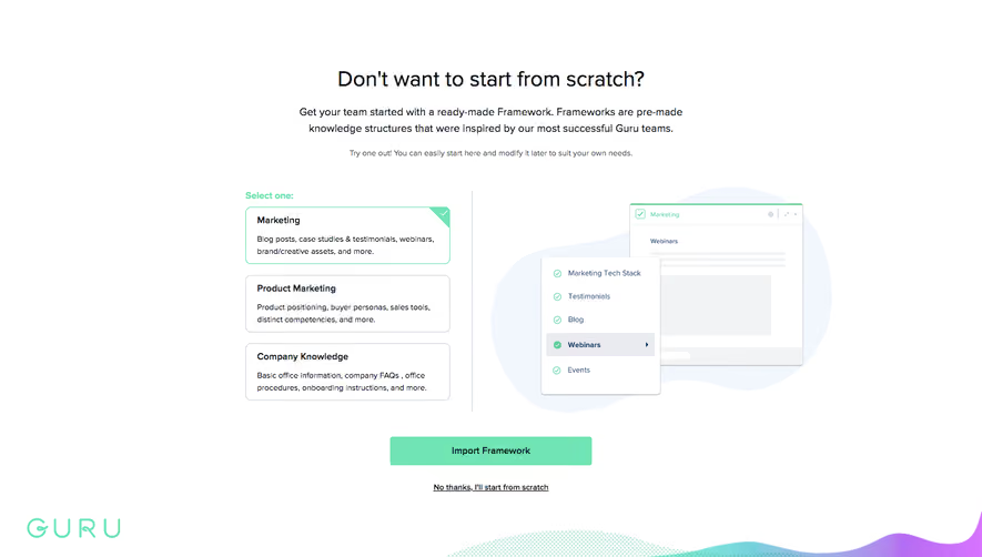
Guru Signup Page

Guru
Knowledge Base Software
Designed by
No items found.

Bookmark
Bookmark

Design with AI
Thank you! Your submission has been received!
Oops! Something went wrong while submitting the form.
# Design from Reference: Guru Signup Page
Create an original, high-fidelity visual design inspired by the reference. Prioritize composition, typography, colors, spacing, and component styling over technical implementation.
## Reference
- **Product:** Guru
- **Category:** Signup
- **Screenshot:** https://cdn.prod.website-files.com/5e9dc792e1210c5325f7ebbc/6acbcecb75891049b1840460_6acbcd15d6be908889c90629_cms-137c88d722f984b6047a21f0.webp
Analyze the screenshot first. If inaccessible, request it rather than guessing.
## Content
{{content.instructions}}
{{content.data}}
Preserve essential messaging and factual accuracy. Adapt structure and copy length for visual balance; never invent product claims.
## Visual Design
### Overall aesthetic
- **Character:** A bright signup page pairs a compact white form with a large testimonial collage, mint branding, blue social authentication, and colorful organic shapes.
- **Evidence:** The screenshot is 1440 × 821 px. Dimensions below are approximate image pixels; CSS scale is unverified.
- **Balance:** The left form is functional and narrow, while the larger right region supplies social proof.
### Page composition
- **Form column:** A mint Guru wordmark sits above a short account-creation heading, Google signup control, divider, fields, and next-step action.
- **Fields:** First/last name share a row; email, password, and password confirmation occupy full-width rows.
- **Legal routes:** Small terms/privacy copy and an existing-user login link sit beneath the primary form action.
- **Testimonial:** A large person-and-product-card collage fills the right side, with carousel dots and a short centered explanation below.
- **Decoration:** Mint blobs, halftone patterns, yellow accents, and a lower purple/teal wave surround the proof imagery.
### Information hierarchy
- **Brand and signup:** The wordmark and short bold heading introduce the form.
- **Authentication:** A strong blue Google button provides the first route; an or-divider separates manual fields.
- **Progression:** A mint Next step button follows the empty inputs.
- **Trust:** The large portrait and embedded quote card dominate the right visual area; carousel dots indicate multiple proof items.
### Typography
- **Family:** A neutral sans serif is used for the form, with stylized brand lettering. Exact identities are unverified.
- **Form heading:** Around 17–18 px semibold.
- **Fields/buttons:** Approximately 13–14 px, with stronger action labels.
- **Testimonial:** Embedded quote text is around 14–16 px but belongs to artwork.
- **Fine print:** Approximately 10–12 px beneath the form; the proof explanation is around 13 px.
### Colors & surfaces
- **Measured palette:** Source samples include white #FFFFFF, mint #71E4B5, blue #025CFB, pale gray #F2F3F5, and gradient mints #7FEED1 and #7FECCC.
- **Semantic use:** Blue marks social signup; mint marks brand and continuation.
- **Art accents:** Lavender quote marks, yellow shape, black-and-white portrait, and green halftone texture distinguish the testimonial.
- **Borders:** Inputs use thin cool-gray outlines; the page itself is white and unboxed.
### Components
- **Form width:** Approximately 345 px.
- **Google action:** Full-width blue rectangle around 40 px high with a small white logo inset at left.
- **Inputs:** About 40 px high with small 3–4 px radii; name fields split the width with an 8–10 px gap.
- **Divider:** Thin horizontal rules flank a centered or label.
- **Next action:** Full-width mint rectangle around 40 px high, with white centered text.
- **Proof artwork:** A large cutout portrait holds a rotated product-style testimonial card over organic shapes.
- **Carousel:** Five small dots beneath the artwork, first mint and remaining gray.
### Visual rhythm
- **Form spacing:** Tight repeated field gaps contrast with larger breaks around brand and authentication.
- **Alignment:** Inputs and primary actions share a consistent left/right edge; heading and legal text are centered.
- **Proof scale:** The collage is substantially wider than the form, balancing the sparse left column.
- **Whitespace:** Large margins isolate both columns from viewport edges.
### Responsive
- **Observed limit:** Only desktop is shown; mobile and validation behavior are unverified.
- **Recommended stacking:** Prioritize signup, then place testimonial content below.
- **Recommended fields:** Keep the form fluid, stack name fields if necessary, and retain readable input text.
- **Recommended artwork:** Scale or simplify decorative shapes without making embedded quote text essential.
### Adaptation guidance
- **Preserve:** Keep clear social/manual signup alternatives, concise fields, and prominent customer proof.
- **Implement:** Add persistent accessible labels and clear password/validation states; placeholders alone should not be the sole labels.
- **Assets:** Use authentic brand and testimonial imagery with suitable alternatives.
- **Validate:** Confirm fonts, CSS scale, form state behavior, contrast, and narrow-screen ordering. The screenshot shows empty fields and no submission result.
Use this context to reproduce the reference's visual language: layout, typography, colors, spacing, borders, radii, and distinctive elements. The screenshot takes priority if descriptions conflict.
## Direction
{{preferences.fidelityInstructions}}
## Output
{{output.instructions}}
Deliver a polished, cohesive design with precise alignment, hierarchy, and spacing. Produce the requested visual artifact, not just a description. If unsupported, explain the limitation.


Category
Patterns
No items found.
Tech Stack



Added on
May 4, 2020
Found in 1 flow




Similar screens
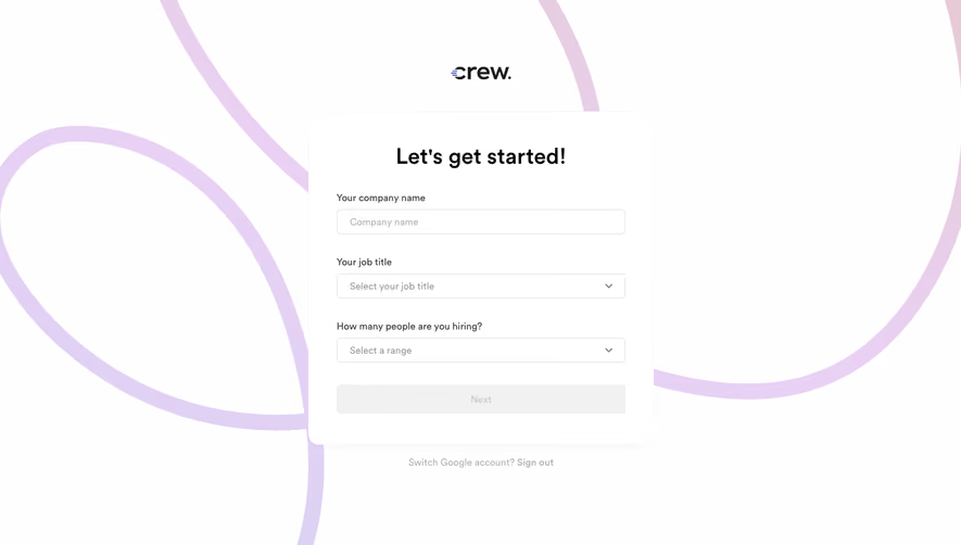


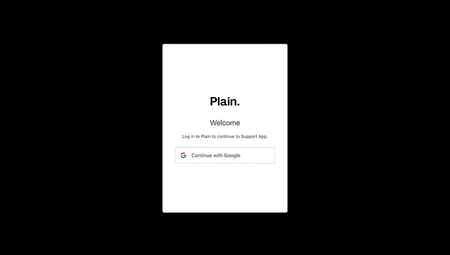



Upgrade to SaaSFrame Pro now to see similar examples.
Monthly
$18 /month
Billed $18 monthly
Browse all screens & flows
Filter and search screens & flows
Search text in screenshots
Access Figma files
Access mobile versions
Join now
Quarterly
$16 /month
Billed $48 quarterly
Browse all screens & flows
Filter and search screens & flows
Search text in screenshots
Access Figma files
Access mobile versions
Join now
Yearly
$15 /month
Billed $180 yearly
Browse all screens & flows
Filter and search screens & flows
Search text in screenshots
Access Figma files
Access mobile versions
Join now