Design with AI
Generate a new design based on this screen using your own content.
# Design from Reference: Guru Onboarding
Create an original, high-fidelity visual design inspired by the reference. Prioritize composition, typography, colors, spacing, and component styling over technical implementation.
## Reference
- **Product:** Guru
- **Category:** User Onboarding
- **Screenshot:** https://cdn.prod.website-files.com/5e9dc792e1210c5325f7ebbc/6acbc0797ce271b12870b76d_6acbbfd24f59d5c94389c19e_cms-5694613b2a5397857e96675c.webp
Analyze the screenshot first. If inaccessible, request it rather than guessing.
## Content
{{content.instructions}}
{{content.data}}
Preserve essential messaging and factual accuracy. Adapt structure and copy length for visual balance; never invent product claims.
## Visual Design
### Overall aesthetic
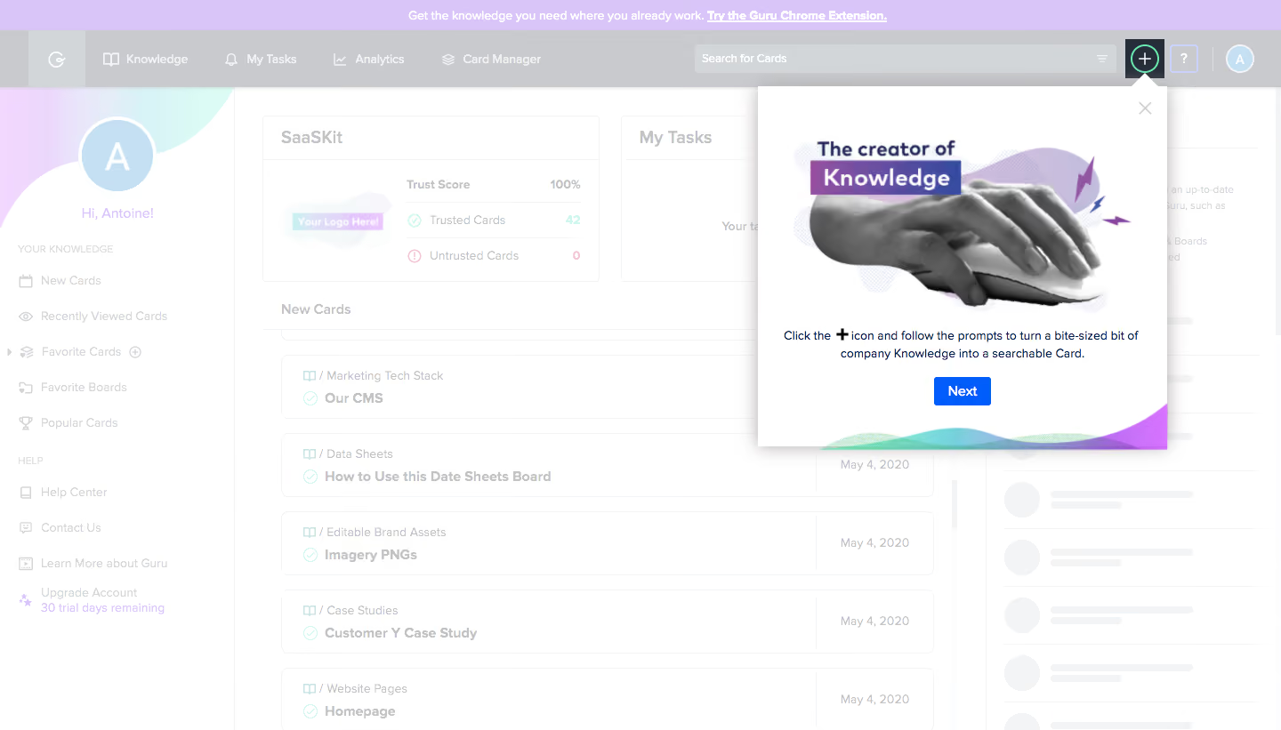
- **Character:** A knowledge-dashboard tour with a washed-out background and a white illustrated popover anchored to a highlighted plus control.
- **Evidence scale:** Original 1440 × 821 pixels. Dimensions are image-pixel estimates; CSS scale is unverified.
### Page composition
- **Shell:** Announcement strip, top navigation/search, left knowledge sidebar and central card list.
- **Target:** Plus icon near upper right remains highlighted.
- **Popover:** Approximately 460 × 410 px white panel below the plus, with an upward pointer.
- **Content:** Large collage illustration, short centered instruction and blue Next button.
### Information hierarchy
- **Spotlight:** Plus control and popover are the strongest visible elements.
- **Illustration:** Hand-on-mouse image with purple title strips explains creation.
- **Instruction:** Short body text includes an emphasized plus symbol.
- **Action:** Blue Next is the only prominent popover button.
### Typography
- **Illustration heading:** Unverified bold sans-serif around 24 px.
- **Popover body:** Approximately 14 px regular, 20 px line height.
- **Button:** Around 14 px bold.
- **Background:** Navigation and card labels around 14–16 px, visually muted by overlay.
### Colors & surfaces
- **Foreground:** White #FFFFFF.
- **Overlay:** Pale gray #C8CACD/#D3D6D9 family in dimmed shell.
- **Brand:** Lavender #D9C5F8 announcement and collage accents.
- **Secondary:** Pale #F3F4F6 panels and #C5E0F2 avatar.
- **Action:** Saturated blue button; mint outline highlights the plus.
### Components
- **Popover:** Square-ish white panel with shadow, small pointer and close cross.
- **Collage:** Grayscale hand/mouse cutout, purple abstract shapes and label strips.
- **Next:** Approximately 64 × 32 px blue rectangle with slight rounding.
- **Target:** Dark square area around circular plus, mint ring.
- **Background cards:** Ruled list rows, trust summary and task panel; skeleton-like gray marks at right.
- **Decoration:** Colored wave forms along the popover's bottom edge.
### Visual rhythm
- **Stack:** Illustration occupies most of the upper panel, followed by compact copy/action.
- **Anchor:** Pointer connects panel directly to plus control.
- **Depth:** White popover/shadow contrast with a uniformly faded dashboard.
### Responsive
- **Observed limit:** Desktop only.
- **Recommendation:** Reposition the tour panel within viewport bounds and reduce illustration height on small screens.
- **Accessibility:** Manage focus and provide keyboard dismissal/progression.
### Adaptation guidance
- **Retain:** Teach one creation action with a clear anchor and short explanation.
- **Implement:** Use a strong target outline, concise panel and single next action.
- **Verify:** Confirm fonts, scale and tour behavior separately; no knowledge card was created.
Use this context to reproduce the reference's visual language: layout, typography, colors, spacing, borders, radii, and distinctive elements. The screenshot takes priority if descriptions conflict.
## Direction
{{preferences.fidelityInstructions}}
## Output
{{output.instructions}}
Deliver a polished, cohesive design with precise alignment, hierarchy, and spacing. Produce the requested visual artifact, not just a description. If unsupported, explain the limitation.