Design with AI
Generate a new design based on this screen using your own content.
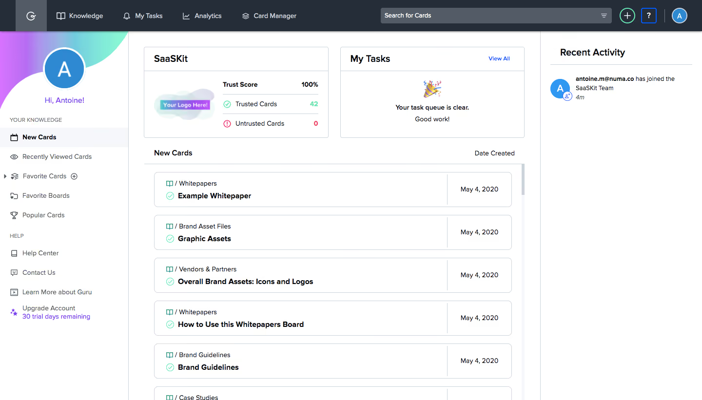
# Design from Reference: Guru Dashboard
Create an original, high-fidelity visual design inspired by the reference. Prioritize composition, typography, colors, spacing, and component styling over technical implementation.
## Reference
- **Product:** Guru
- **Category:** Dashboard
- **Screenshot:** https://cdn.prod.website-files.com/5e9dc792e1210c5325f7ebbc/6acbd604e891fd1c9ba1d33e_6acbd3388fba92542f03ce35_cms-4381a8872f7469f4c39c66e2.webp
Analyze the screenshot first. If inaccessible, request it rather than guessing.
## Content
{{content.instructions}}
{{content.data}}
Preserve essential messaging and factual accuracy. Adapt structure and copy length for visual balance; never invent product claims.
## Visual Design
### Overall aesthetic
- **Character:** Structured knowledge-management dashboard with dark top navigation, bordered white panels and modest colorful status accents.
### Page composition
- **Capture:** 1440 × 821 screenshot pixels; estimated CSS scale approximately 1×.
- **Structure:** Full-width toolbar, left personal navigation, central trust/task summary pair and new-card list, plus a right Recent Activity column.
### Information hierarchy
- **Priority:** Summary cards establish team trust and task state; bold knowledge-card titles and right-aligned creation dates drive scanning. Activity remains secondary.
### Typography
- **Family:** Sans serif; exact family unverified.
- **Estimated CSS sizes:** Panel headings 18px, card titles/body 14px, navigation 14px and metadata 12px.
### Colors & surfaces
- **Measured palette:** White #FFFFFF, toolbar #242D38, secondary text #525B66, borders #CED2DA, selected surface #F5F7FA and dark text #090B0E.
- **Accents:** Mint trust indicators, pink untrusted count, violet account links and a small mint-purple profile decoration.
### Components
- **Elements:** Toolbar search, add/help/profile controls, avatar greeting, trust score/counts, task empty state, bordered card rows and activity avatar.
- **Estimated geometry:** Left sidebar 264px, right activity column 332px, 24–32px content padding, 6px card radii and 72px list rows.
### Visual rhythm
- **Spacing:** Compact toolbar contrasts with evenly spaced panels and list cards. Vertical dividers establish three distinct working areas.
### Responsive
- **Suggested adaptation:** Collapse personal navigation, stack summary panels and move activity below cards. Mobile layout is not shown.
### Adaptation guidance
- **Transfer:** Preserve the trust/task/content hierarchy and clear creation-date alignment. Use meaningful status colors with labels.
Use this context to reproduce the reference's visual language: layout, typography, colors, spacing, borders, radii, and distinctive elements. The screenshot takes priority if descriptions conflict.
## Direction
{{preferences.fidelityInstructions}}
## Output
{{output.instructions}}
Deliver a polished, cohesive design with precise alignment, hierarchy, and spacing. Produce the requested visual artifact, not just a description. If unsupported, explain the limitation.