Generate a new design based on this screen using your own content.
Thank you! Your submission has been received!
Oops! Something went wrong while submitting the form.
# Design from Reference: Greenly Press Page
Create an original, high-fidelity visual design inspired by the reference. Prioritize composition, typography, colors, spacing, and component styling over technical implementation.
## Reference
- **Product:** Greenly
- **Category:** Press Page
- **Screenshot:** https://cdn.prod.website-files.com/5e9dc792e1210c5325f7ebbc/6acadbead05a3f53c0a86328_6acadb3dd05a3f53c0a82b37_cms-2b3a6dacd562d9d36b7934fe.webp
Analyze the screenshot first. If inaccessible, request it rather than guessing.
## Content
{{content.instructions}}
{{content.data}}
Preserve essential messaging and factual accuracy. Adapt structure and copy length for visual balance; never invent product claims.
## Visual Design
Use this context to reproduce the reference's visual language: layout, typography, colors, spacing, borders, radii, and distinctive elements. The screenshot takes priority if descriptions conflict.
## Direction
{{preferences.fidelityInstructions}}
## Output
{{output.instructions}}
Deliver a polished, cohesive design with precise alignment, hierarchy, and spacing. Produce the requested visual artifact, not just a description. If unsupported, explain the limitation.
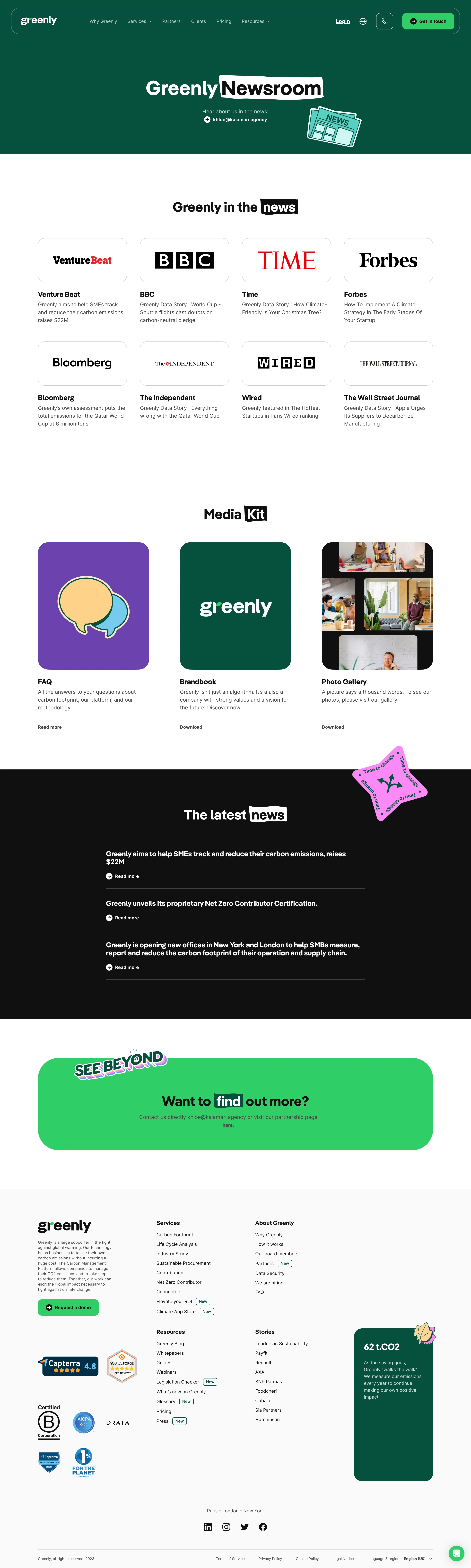
Greenly’s Press Kit page embraces a clean, modern, and professional aesthetic with a distinctly eco-friendly vibe. The design strikes a balance between minimalism and approachability, using generous white space and soft shapes to create an inviting atmosphere. Subtle touches—a rounded logo, lightly colored cards—lend the site an understated personality that feels both innovative and credible.
Layout and Structure
The layout is intuitive and highly focused. The hero section immediately communicates purpose, featuring a prominent headline, concise description, and a well-placed call to action front-and-center. Content is organized into digestible sections—logo downloads, media resources, team photographs—each visually separated for clarity and ease of navigation. The absence of distracting elements keeps attention on the content, streamlining the user journey from top to bottom.
Visual Elements
Organic illustrations and polished icons reinforce Greenly’s sustainability messaging, adding visual interest without clutter. High-quality photography of the team injects authenticity and approachability, while carefully crafted asset previews make resource selection effortless. Hover interactions on assets subtly guide user attention.
Color Palette and Typography
The color scheme employs soft greens, whites, and light grays, connecting the brand to its environmental mission. Accent greens highlight calls to action and important details. Typography is clean and contemporary, likely using a geometric sans-serif with clearly defined font sizes for hierarchy—emphasizing clarity, scannability, and professionalism.
User Experience Patterns & Unique Choices
Navigation is smooth, using a sticky header for quick access. Prominent download buttons and clear section headings reduce cognitive load. The cohesive, trust-building tone is enhanced by team imagery and the subtle interplay of color and whitespace. Notable: The direct, single-purpose structure ensures users can find and download press materials in seconds—demonstrating efficiency and elite SaaS UX principles.