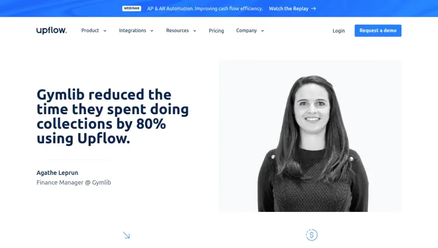
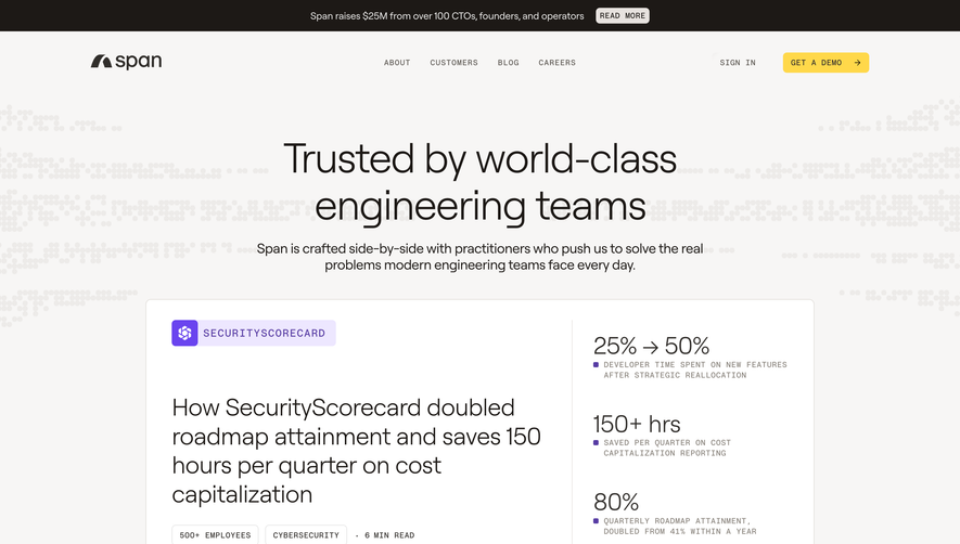
Generate a new design based on this screen using your own content.
Thank you! Your submission has been received!
Oops! Something went wrong while submitting the form.
# Design from Reference: Greenly Customer Stories
Create an original, high-fidelity visual design inspired by the reference. Prioritize composition, typography, colors, spacing, and component styling over technical implementation.
## Reference
- **Product:** Greenly
- **Category:** Customer Stories
- **Screenshot:** https://cdn.prod.website-files.com/5e9dc792e1210c5325f7ebbc/6acadbecd05a3f53c0a86355_6acadb3ec6c5c12a38e6d22f_cms-a94d54b465fd80d01b1c9bc3.webp
Analyze the screenshot first. If inaccessible, request it rather than guessing.
## Content
{{content.instructions}}
{{content.data}}
Preserve essential messaging and factual accuracy. Adapt structure and copy length for visual balance; never invent product claims.
## Visual Design
Use this context to reproduce the reference's visual language: layout, typography, colors, spacing, borders, radii, and distinctive elements. The screenshot takes priority if descriptions conflict.
## Direction
{{preferences.fidelityInstructions}}
## Output
{{output.instructions}}
Deliver a polished, cohesive design with precise alignment, hierarchy, and spacing. Produce the requested visual artifact, not just a description. If unsupported, explain the limitation.
Greenly’s PayFit case study page embodies a sleek, modern aesthetic with a clear focus on professionalism and approachability. The design communicates trust and innovation through careful use of whitespace and structured content blocks, balancing a lighthearted tone with corporate credibility.
Layout and Structure
The page opens with a visually engaging hero section that features the client’s logo and a succinct value proposition, setting expectations immediately. Content flows in a logical sequence—problem, solution, outcome—supported by clear section divisions. You’ll find elegantly integrated testimonial highlights, before-and-after stats, and customer impact stories, all guiding the visitor’s attention seamlessly from top to bottom.
Visual Elements
Illustrations are clean and brand-aligned, adding visual interest and clarifying key concepts without overwhelming the content. Subtle iconography and occasional authentic team photography build trust and humanize the SaaS offering. Animated transitions as you scroll help sustain user engagement and emphasize important points.
Color Palette and Typography
The palette is dominated by calming greens and soft grays, with bright accents that draw attention to CTAs and key metrics. Crisp, sans-serif typography provides clarity, leveraging font weight and size for hierarchy—headlines are bold and inviting, while body text remains highly legible.
User Experience Patterns
Navigation is streamlined: sticky headers, well-placed CTAs (“Learn More,” “Request a Demo”), and in-content links empower smooth journeys. Scroll-triggered animations add dynamism without distracting. The page avoids friction—there are no intrusive forms, only clear pathways to deeper engagement.
Unique or Notable Design Choices
Noteworthy are the alternating background shades that segment sections and guide the eye, plus personable pull quotes that amplify authenticity. The subtle blend of brand visuals and storytelling delivers a page that’s as delightful to browse as it is informative—inspiring confidence and curiosity at every scroll.