Overall Style and Aesthetic
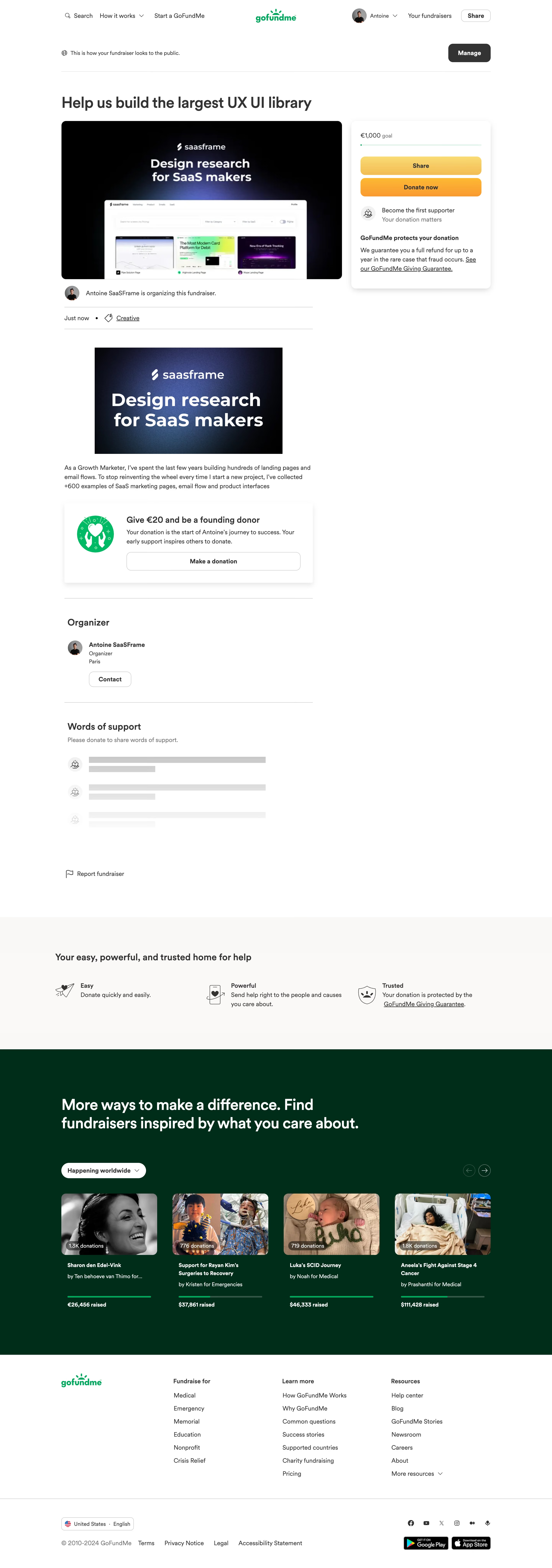
The page channels a clean, modern sensibility with a laser focus on clarity and approachability. Its minimalist design strips away excess, letting crisp visuals and concise copy take center stage. The overall effect is polished yet welcoming, projecting both professionalism and accessibility—qualities that appeal directly to SaaS founders and designers seeking creative inspiration. Layout and Structure
A classic single-column layout guides users smoothly from a bold hero section—complete with a prominent project title and mission statement—down through clearly delineated sections for updates, progress, and calls to action. Everything is neatly compartmentalized, ensuring a distraction-free reading experience. Key information, such as project goals and user support options, is positioned above the fold, driving immediate engagement. Visual Elements
Custom illustrations and simple UI mockups communicate the project’s value proposition with vivid clarity. These visuals, paired with clean line icons and occasional screenshots, provide tangible glimpses of the anticipated product. Absence of stock photography keeps the focus on original, context-rich graphics. Color Palette and Typography
A restrained palette dominated by white space, soft greys, and brand-accent greens breathes calm and focus into the layout. Large, readable sans-serif fonts establish hierarchy and legibility, with headings standing out in weight and size, while body text supports effortless scanning. User Experience Patterns & Notable Choices
Frictionless navigation is achieved through sticky headers and concise, clearly labeled CTAs such as "Donate now." Subtle scroll transitions and information blocks ensure users are never overwhelmed. Notably, the open, crowdfunding-based approach is itself a standout—transparently sharing project status and progress while fostering community trust. Tone and Feel
Above all, the tone is earnest, trustworthy, and designer-focused: every element is crafted to build credibility and energize users to contribute or draw inspiration, perfectly aligning with the SaaS and design-savvy audience.