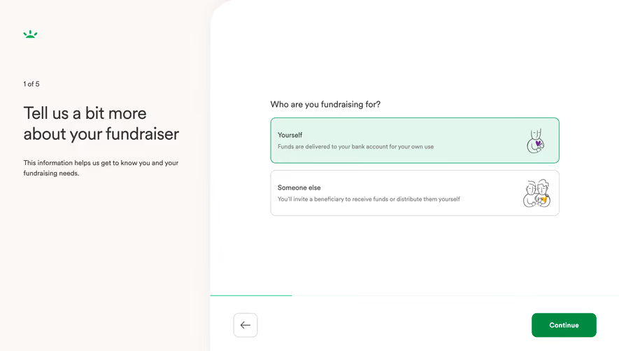
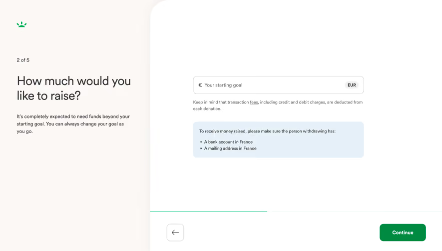
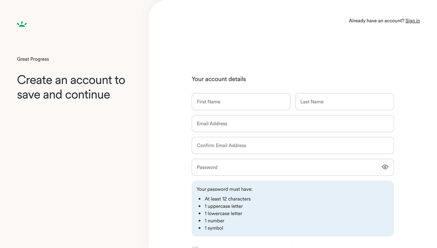
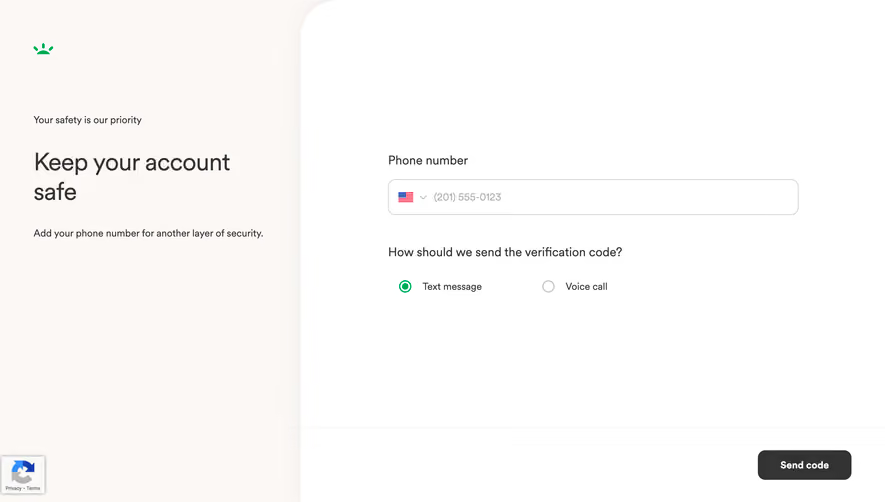
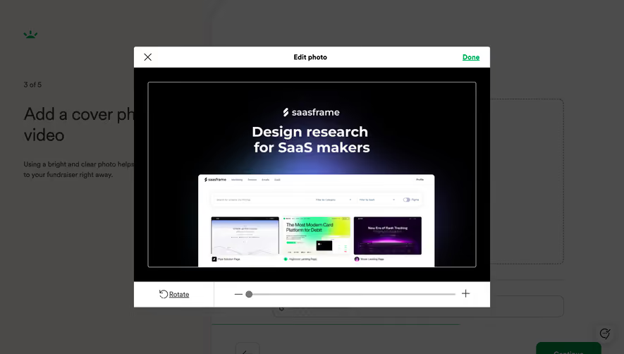
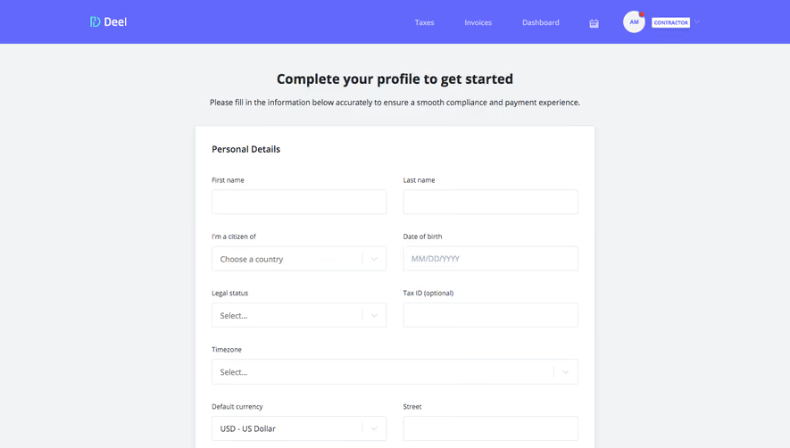
Generate a new design based on this screen using your own content.
Thank you! Your submission has been received!
Oops! Something went wrong while submitting the form.
# Design from Reference: GoFundMe Foundraiser Details Setup
Create an original, high-fidelity visual design inspired by the reference. Prioritize composition, typography, colors, spacing, and component styling over technical implementation.
## Reference
- **Product:** GoFundMe
- **Category:** Account Setup
- **Screenshot:** https://cdn.prod.website-files.com/5e9dc792e1210c5325f7ebbc/6acad5215a5fdf4c30310ea1_6acad448053419932ab5c37c_cms-2ba00a56f3157f5b73f04f08.webp
Analyze the screenshot first. If inaccessible, request it rather than guessing.
## Content
{{content.instructions}}
{{content.data}}
Preserve essential messaging and factual accuracy. Adapt structure and copy length for visual balance; never invent product claims.
## Visual Design
Use this context to reproduce the reference's visual language: layout, typography, colors, spacing, borders, radii, and distinctive elements. The screenshot takes priority if descriptions conflict.
## Direction
{{preferences.fidelityInstructions}}
## Output
{{output.instructions}}
Deliver a polished, cohesive design with precise alignment, hierarchy, and spacing. Produce the requested visual artifact, not just a description. If unsupported, explain the limitation.
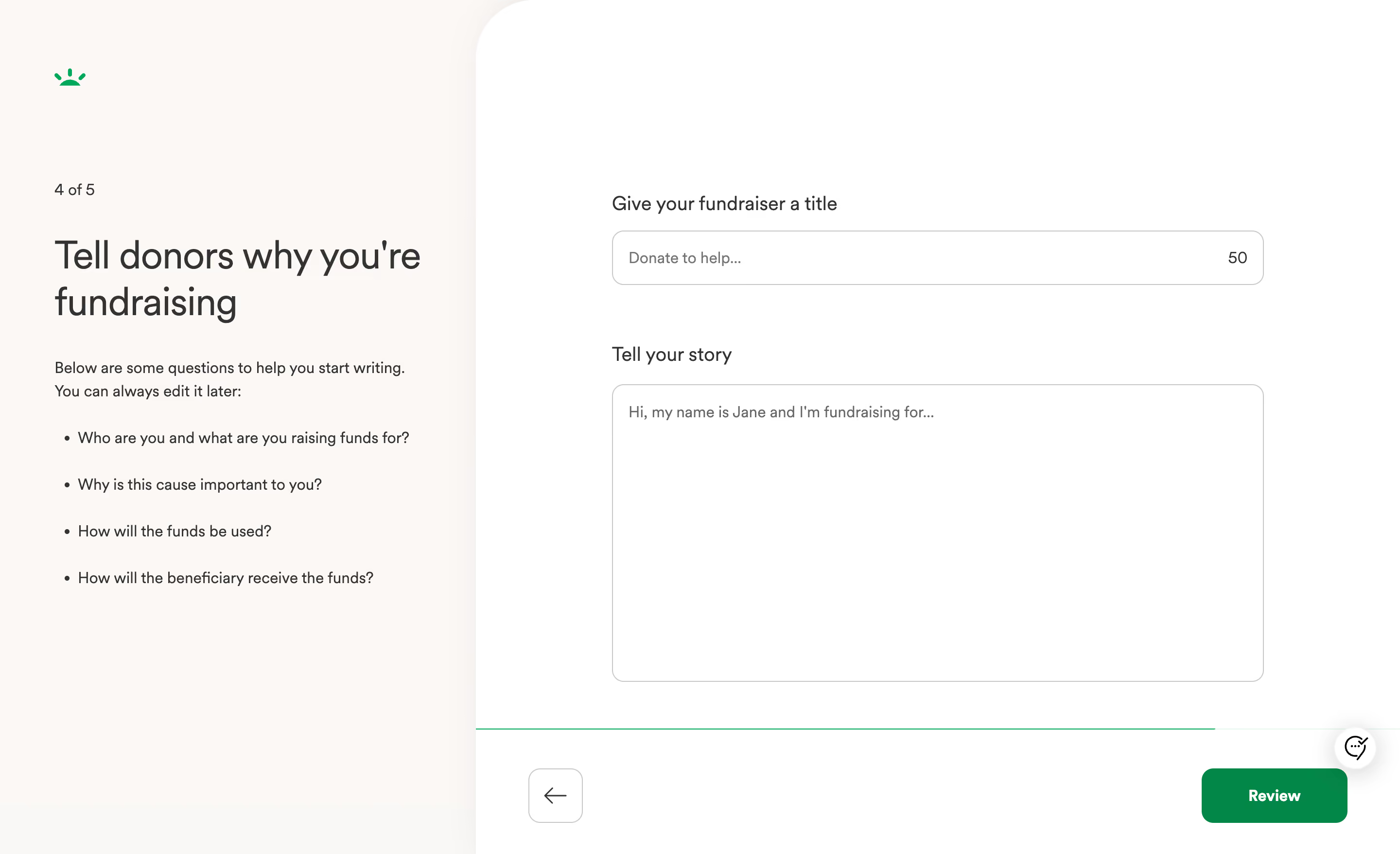
GoFundMe's fundraiser creation flow nails the art of doing less. The split layout immediately draws you in. Left side: warm beige background with guiding questions. Right side: clean white with just two input fields. That's it. No clutter, no overwhelming options.
Typography That Does the Heavy Lifting
The large serif heading "Tell donors why you're fundraising" feels human and approachable. Then the body copy switches to a smaller sans-serif for the helper text. That contrast creates a clear visual hierarchy without shouting. The bullet points are genuinely useful, not filler. They act like a gentle writing coach sitting beside you.
What Makes It Stand Out
The character counter (50) on the title field is a subtle but smart touch. The single green "Review" button anchors the bottom right, pulling your eye forward. Love the lone back arrow on the opposite side for balance. Step indicator "4 of 5" up top keeps anxiety low. The whole page feels like a conversation, not a form. That's hard to pull off.