Design with AI
Generate a new design based on this screen using your own content.
# Design from Reference: Glide CRM app dashboard preview
Create an original, high-fidelity visual design inspired by the reference. Prioritize composition, typography, colors, spacing, and component styling over technical implementation.
## Reference
- **Product:** Glide
- **Category:** Dashboard
- **Screenshot:** https://cdn.prod.website-files.com/5e9dc792e1210c5325f7ebbc/6acacffd7796407cec14172b_6acacf875de9841cab63a635_cms-d728f35142cb70d8bbacbcc6.webp
Analyze the screenshot first. If inaccessible, request it rather than guessing.
## Content
{{content.instructions}}
{{content.data}}
Preserve essential messaging and factual accuracy. Adapt structure and copy length for visual balance; never invent product claims.
## Visual Design
### Overall aesthetic
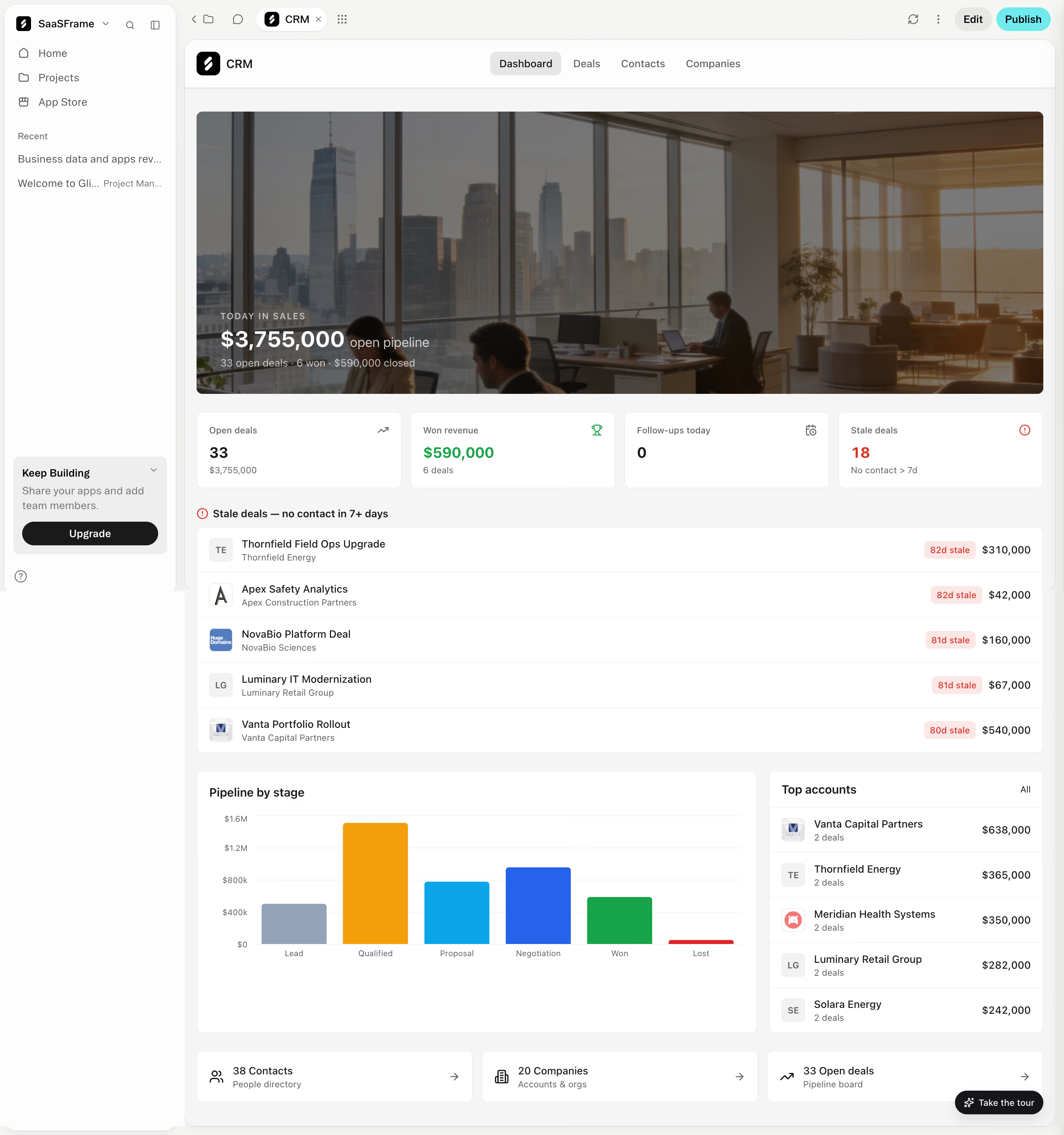
- **Style:** Light CRM dashboard preview with white cards, gray canvas, office photography and semantic metric colors.
- **Scale:** Source 2880 × 3072px; sizes estimate a 1440px-wide CSS layout at 2× capture scale.
### Page composition
- **Builder shell:** Workspace sidebar and top Edit/Publish controls surround an embedded CRM app.
- **App navigation:** CRM branding sits left of Dashboard, Deals, Contacts and Companies tabs.
- **Dashboard:** Wide office-photo hero precedes four metrics, stale-deal list, pipeline chart/top-accounts split and three bottom shortcut cards.
### Information hierarchy
- **Summary:** Hero overlays a large pipeline value and short deal summary.
- **Metrics:** Open deals, Won revenue, Follow-ups today and Stale deals occupy equal cards.
- **Details:** Five stale-deal rows pair identity, age badge and value. Pipeline bars and ranked accounts provide deeper context.
- **Shortcuts:** Contacts, Companies and Open deals links close the dashboard.
### Typography
- **Family:** Neutral sans-serif; exact font identity is unverified.
- **Roles:** Estimated metric values 22–24px bold, card headings 14–16px, body 14px and metadata 12px.
- **Hero:** Large white value sits over a darkened photograph with small uppercase eyebrow.
### Colors & surfaces
- **Sampled palette:** ICC-aware sRGB samples include white #FFFFFF, warm #FDFDFC/#F5F5F2 and gray #F5F5F5.
- **Semantic colors:** Green marks won revenue, red stale deals, and multicolor bars distinguish pipeline stages.
- **Depth:** Cards use subtle borders and small corners; photo is darkened for text contrast.
### Components
- **Hero:** Broad landscape image with rounded corners and lower-left text overlay.
- **Metric cards:** Four equal white rectangles with compact labels, values and small top-right icons.
- **Lists:** White grouped rows with avatar/logo, two-line identity, red age pill and right-aligned amount.
- **Chart:** Six colored vertical bars with stage labels and faint horizontal value grid.
- **Builder actions:** Gray Edit and cyan Publish pills remain outside the CRM's own navigation.
### Visual rhythm
- **Grid:** Consistent gutters connect four-column metrics, full-width list and two-column analytics.
- **Density:** Photo hero balances compact numeric/card content below.
### Responsive
- **Recommended adaptation:** Only desktop is observed. Collapse builder sidebar, stack metrics and move accounts below the chart.
- **Data:** Allow long deal names to wrap while keeping amounts and stale status legible.
### Adaptation guidance
- **Preserve:** Keep summary-to-exception-to-analysis hierarchy and clear semantic colors.
- **Adapt:** Use actual CRM data and approved imagery; do not treat sample pipeline values as business claims.
Use this context to reproduce the reference's visual language: layout, typography, colors, spacing, borders, radii, and distinctive elements. The screenshot takes priority if descriptions conflict.
## Direction
{{preferences.fidelityInstructions}}
## Output
{{output.instructions}}
Deliver a polished, cohesive design with precise alignment, hierarchy, and spacing. Produce the requested visual artifact, not just a description. If unsupported, explain the limitation.