
Thank you! Your submission has been received!
Oops! Something went wrong while submitting the form.
Get SaaSFrame Pro
Monthly
$18
Quarterly
$48
Yearly
$180
Upgrade to access this feature
Browse all screens & flows
Filter and search screens & flows
Access Figma files
Access mobile versions
Bookmark screens & flows
Join now
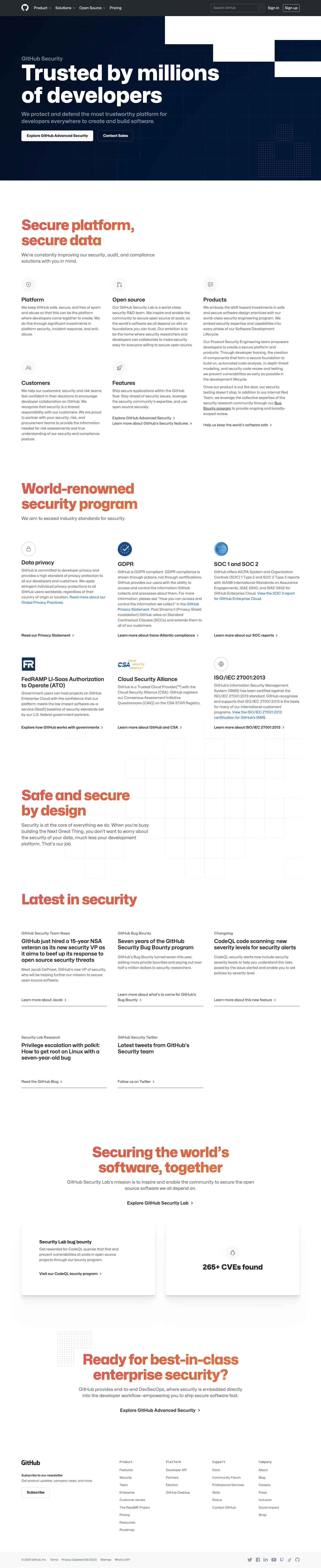

GitHub Security Page

GitHub
Where the world builds software
Designed by
No items found.

Bookmark
Bookmark

Design with AI
Thank you! Your submission has been received!
Oops! Something went wrong while submitting the form.
# Design from Reference: GitHub Security Page
Create an original, high-fidelity visual design inspired by the reference. Prioritize composition, typography, colors, spacing, and component styling over technical implementation.
## Reference
- **Product:** GitHub
- **Category:** Security Page
- **Screenshot:** https://cdn.prod.website-files.com/5e9dc792e1210c5325f7ebbc/6acb6dea0e8221f1308365c3_6acb6bd1b206c0d3f8f2dee4_cms-978841b39578aaedc193cdec.webp
Analyze the screenshot first. If inaccessible, request it rather than guessing.
## Content
{{content.instructions}}
{{content.data}}
Preserve essential messaging and factual accuracy. Adapt structure and copy length for visual balance; never invent product claims.
## Visual Design
### Overall aesthetic
- **Style:** Enterprise security page with a dark navy hero, oversized bold typography and an open white editorial body.
- **Accent:** Coral-to-orange gradient section headings, blue inline links and subtle dotted technical grids create a consistent visual identity.
- **Restraint:** Most content is unboxed; stronger shadows are reserved for two lower feature/statistic cards.
### Page composition
- **Canvas:** Source 1440 × 7020 pixels, inspected throughout in five crops at 1400px width. Measurements use inspection pixels; CSS scale is unverified.
- **Header:** Approximately 70px dark horizontal navigation, with brand icon/menus left and search/account controls right.
- **Hero:** Navy region to about y786, with label, large two-line heading, supporting copy and paired actions at x93. Dotted grid and stepped white geometric cutouts decorate the right/top.
- **Platform section:** Large coral heading and intro precede five icon/text groups arranged in three columns, with the right column carrying longer content.
- **Program section:** Six compliance/privacy groups form a three-column, two-row grid, each with mark/icon, title, body and lower link.
- **Lower content:** Decorative security statement, five-item news grid, centered lab introduction, two elevated cards and a centered final CTA.
- **Footer:** Newsletter block at left, four link columns and a pale legal/social strip.
### Information hierarchy
- **Hero:** Trusted by millions of developers is the largest statement; supporting text and two buttons follow.
- **Section hierarchy:** Coral gradient headings introduce platform security, security program, design approach, news, lab mission and final enterprise action.
- **Groups:** Bold dark subheadings and small circular icons identify capabilities; compliance groups use recognizable marks where supplied.
- **News:** Small category labels precede bold multiline article titles, excerpts and lower links.
- **Closing proof:** A bug-bounty card and large statistic card sit side by side beneath the lab introduction.
### Typography
- **Hero:** Approximately 96px heavy sans serif with around 98px line height and tight tracking.
- **Major headings:** Approximately 64px bold with around 66px line height, often wrapping to two lines.
- **Section intro:** Around 21px medium, roughly 28px line height.
- **Group/news titles:** Approximately 24–25px semibold, around 28px line height.
- **Body:** Approximately 17px regular with 23–24px line height; footer around 14px and legal row around 12px.
- **Font identity:** Neutral sans serif with compact bold headings; exact family is unverified. Footer group labels have a monospaced appearance.
### Colors & surfaces
- **Measured base:** #FFFFFF white body and #F6F8FA pale icon/legal surfaces.
- **Measured dark palette:** #25292F navigation/foreground, #021834 and #011733 navy hero tones, with nearby #031631 and #03142C gradient variations.
- **Accent roles:** Major headings blend coral to orange; inline links are vivid blue. Exact semantic accent hex values are not asserted from the neutral-dominated sample.
- **Decoration:** Pale blue dotted grids appear on white; subdued dotted geometry appears within the dark hero.
- **Depth:** Most content lies directly on the canvas, while the pair of lower cards has soft pronounced shadows.
### Components
- **Hero primary action:** Approximately 313 × 47px, white fill, dark bold text and 5px radius; adjacent outlined sales action about 156 × 47px.
- **Feature icons:** Roughly 63px pale circular backplates with thin gray line icons.
- **Compliance groups:** Unboxed columns around 370px wide, with mark/icon above title and bottom link aligned across rows where possible.
- **News items:** Borderless text groups with a thin bottom rule; three first-row items and two second-row items.
- **Lab cards:** Two broad white elevated panels, approximately half wrapper width each, with a text/action group and a centered icon/statistic treatment.
- **Footer signup:** Small outlined Subscribe button under newsletter copy; four text-link columns align beside it.
- **Captured state:** Menus, search, subscription and linked destinations are static; no expanded controls or interactive states are shown.
### Visual rhythm
- **Wrapper:** Most body content shares roughly 93px outer gutters and a broad centered content width.
- **Section spacing:** Approximately 150–200px separates major regions, with generous whitespace around large coral headings.
- **Grid rhythm:** Three columns use roughly 45–50px gutters; body copy stays narrow enough for scanning.
- **Links:** Bottom action links sit apart from paragraphs, making each group’s next step easy to find.
- **Closing:** Centered CTA regions and shadowed cards create a slower final cadence before the dense footer.
### Responsive
- **Observed scope:** Desktop long page only; mobile behavior is unverified.
- **Recommended hero:** Reduce headline size substantially, simplify decorative cutouts and stack buttons as necessary.
- **Recommended grids:** Reduce capability, compliance and news groups to fewer columns, preserving title/body/link order.
- **Recommended cards:** Stack lower panels and keep statistics readable.
- **Recommended footer:** Wrap navigation groups and keep newsletter action separate from legal/social utilities.
### Adaptation guidance
- **Preserve:** Navy-to-white transition, bold coral section hierarchy, open three-column content and technical dotted motifs.
- **Content fidelity:** Use supplied security/compliance claims, marks, dates and statistics; the screenshot does not establish current certification status.
- **Implementation:** Build reusable icon/text/link groups with responsive grid alignment.
- **Accessibility:** Keep decorative grids out of the reading order, provide focus states and ensure gradient headings maintain sufficient contrast.
Use this context to reproduce the reference's visual language: layout, typography, colors, spacing, borders, radii, and distinctive elements. The screenshot takes priority if descriptions conflict.
## Direction
{{preferences.fidelityInstructions}}
## Output
{{output.instructions}}
Deliver a polished, cohesive design with precise alignment, hierarchy, and spacing. Produce the requested visual artifact, not just a description. If unsupported, explain the limitation.


Category
Patterns
No items found.






Added on
March 16, 2023
Similar screens




Upgrade to SaaSFrame Pro now to see similar examples.
Monthly
$18 /month
Billed $18 monthly
Browse all screens & flows
Filter and search screens & flows
Search text in screenshots
Access Figma files
Access mobile versions
Join now
Quarterly
$16 /month
Billed $48 quarterly
Browse all screens & flows
Filter and search screens & flows
Search text in screenshots
Access Figma files
Access mobile versions
Join now
Yearly
$15 /month
Billed $180 yearly
Browse all screens & flows
Filter and search screens & flows
Search text in screenshots
Access Figma files
Access mobile versions
Join now