Design with AI
Generate a new design based on this screen using your own content.
# Design from Reference: Fullstory Sign Up Flow
Create an original, high-fidelity visual design inspired by the reference. Prioritize composition, typography, colors, spacing, and component styling over technical implementation.
## Reference
- **Product:** Fullstory
- **Category:** Verification Email
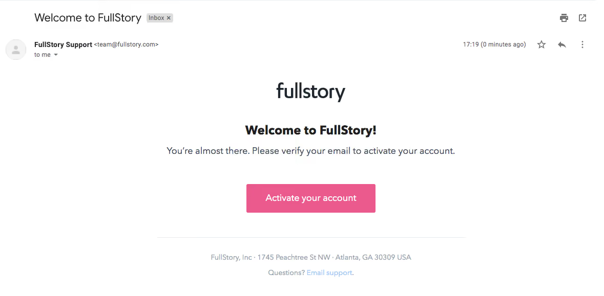
- **Screenshot:** https://cdn.prod.website-files.com/5e9dc792e1210c5325f7ebbc/6acbc693edc235600abc9361_6acbc10bc2a55c243f984199_cms-d2fb1caf36829dc82f698c03.webp
Analyze the screenshot first. If inaccessible, request it rather than guessing.
## Content
{{content.instructions}}
{{content.data}}
Preserve essential messaging and factual accuracy. Adapt structure and copy length for visual balance; never invent product claims.
## Visual Design
### Overall aesthetic
- **Character:** Centered activation email on white with dark typography and a strong pink action.
- **Context:** Mail-client subject/sender controls appear above the branded message and are distinct from the email design.
- **Scale:** The capture measures 1179 × 579 image px. Dimensions below are image estimates; client/CSS scale is unverified.
### Page composition
- **Mail chrome:** Subject, sender metadata and small utility icons occupy the upper portion.
- **Message:** Centered wordmark, bold welcome heading and one-line activation instruction sit above a pink button.
- **Footer:** A thin gray rule separates the action area from muted company/support text.
- **Whitespace:** Broad white margins isolate the compact message.
### Information hierarchy
- **Brand:** Large wordmark identifies the sender.
- **Task:** Welcome heading and instruction explain email verification.
- **Action:** Activate your account is the sole filled message action.
- **Support:** Small footer text provides a secondary support link.
- **State:** No activation link is followed and no activated-account result is visible.
### Typography
- **Family:** Neutral rounded sans-serif; exact identity is unverified.
- **Wordmark:** Large dark brand lettering around 40 px.
- **Heading:** Approximately 25–27 px, bold.
- **Body/action:** Around 18–19 px, regular body and stronger button caption.
- **Footer:** Small muted text around 14 px.
### Colors & surfaces
- **Measured base:** ICC-aware sRGB sampling yields #FFFFFF.
- **Measured action:** Pink #EA5A8C dominates the CTA.
- **Measured text:** #1F1F1F and #1E2730 are dark tones; #354553 appears in secondary foreground.
- **Measured rules:** #ECEFF2 and #DDDDDD define subtle separators.
- **Depth:** Flat message layout with no enclosing colored card.
### Components
- **CTA:** Approximately 252 × 56 image px pink rectangle with small corners and centered white caption.
- **Divider:** A thin gray line spans the narrow message width below the action.
- **Support line:** Muted company text and a light-blue support link sit centered.
- **Client utilities:** Star/reply/menu and print/open symbols belong to mail chrome, not the email content.
### Visual rhythm
- **Center axis:** Brand, heading, instruction, button and footer share central alignment.
- **Spacing:** Large pauses above the button and below it emphasize activation.
- **Compactness:** The message communicates one task with very little copy.
- **Chrome separation:** Mail metadata remains above the branded block.
### Responsive
- **Evidence limit:** Only this rendering is shown; recommendations follow.
- **Message:** Use fluid width and allow instruction/footer text to wrap.
- **Action:** Retain a large touch target and readable caption.
- **Client independence:** Do not bake mail-client chrome into the email template.
### Adaptation guidance
- **Reusable pattern:** Use a concise verification instruction and one obvious activation action.
- **State clarity:** Distinguish activation request from verified completion.
- **Accessibility:** Provide meaningful link text and adequate pink/white contrast.
- **Privacy:** Keep sender/account-specific details out of reusable examples.
Use this context to reproduce the reference's visual language: layout, typography, colors, spacing, borders, radii, and distinctive elements. The screenshot takes priority if descriptions conflict.
## Direction
{{preferences.fidelityInstructions}}
## Output
{{output.instructions}}
Deliver a polished, cohesive design with precise alignment, hierarchy, and spacing. Produce the requested visual artifact, not just a description. If unsupported, explain the limitation.