Generate a new design based on this screen using your own content.
Thank you! Your submission has been received!
Oops! Something went wrong while submitting the form.
# Design from Reference: FullEnrich Billing
Create an original, high-fidelity visual design inspired by the reference. Prioritize composition, typography, colors, spacing, and component styling over technical implementation.
## Reference
- **Product:** FullEnrich
- **Category:** Billing
- **Screenshot:** https://cdn.prod.website-files.com/5e9dc792e1210c5325f7ebbc/6acad39cc2028efdec71aec3_6acad140610f0f51f4ed7772_cms-a01f782374a0053f0c264872.webp
Analyze the screenshot first. If inaccessible, request it rather than guessing.
## Content
{{content.instructions}}
{{content.data}}
Preserve essential messaging and factual accuracy. Adapt structure and copy length for visual balance; never invent product claims.
## Visual Design
Use this context to reproduce the reference's visual language: layout, typography, colors, spacing, borders, radii, and distinctive elements. The screenshot takes priority if descriptions conflict.
## Direction
{{preferences.fidelityInstructions}}
## Output
{{output.instructions}}
Deliver a polished, cohesive design with precise alignment, hierarchy, and spacing. Produce the requested visual artifact, not just a description. If unsupported, explain the limitation.
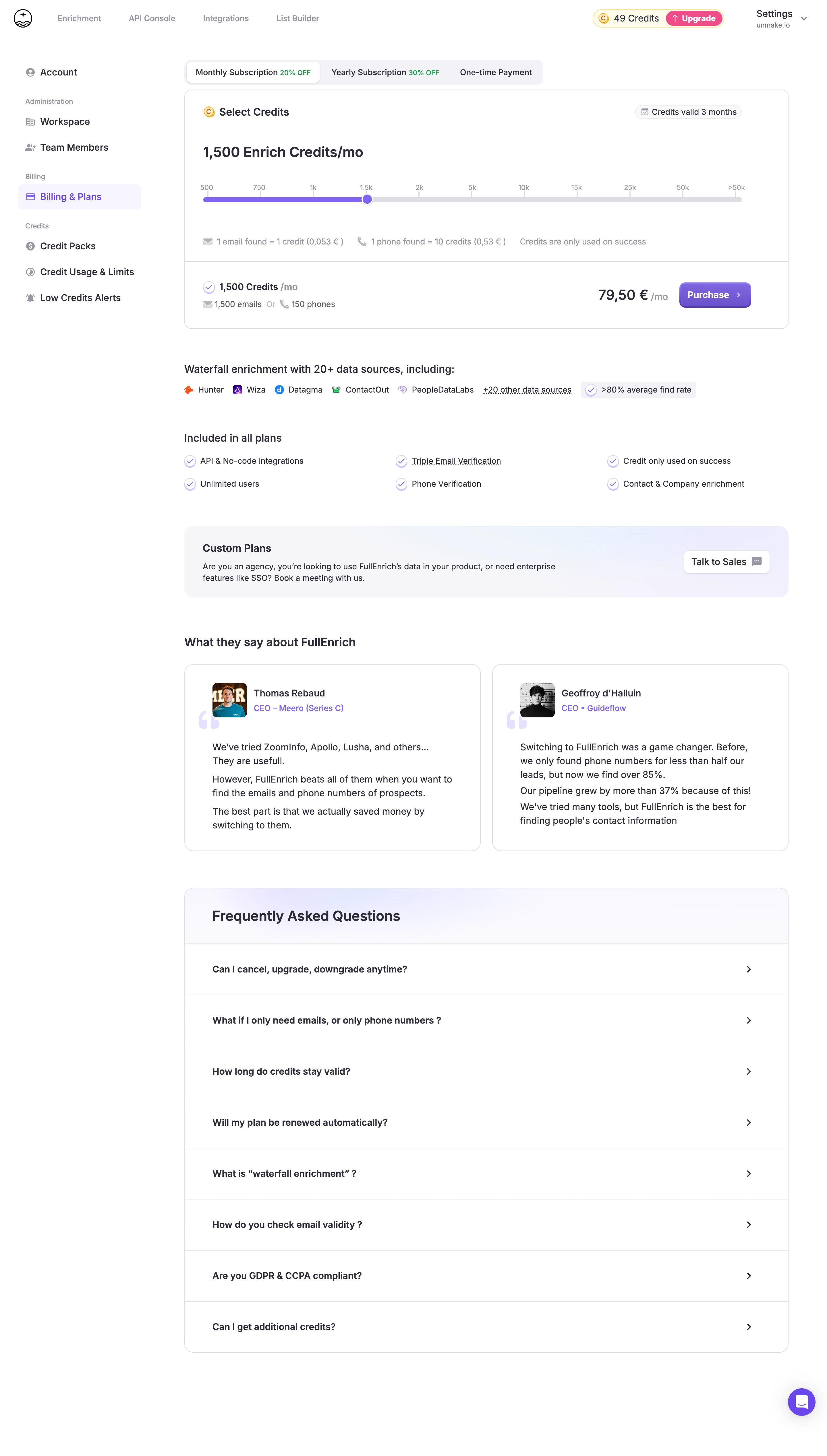
The interactive credit slider is the first thing that grabs you. It's clean, uses a bold purple accent, and immediately communicates flexibility. The math breakdown below it (1 email = 1 credit, 1 phone = 10 credits) is super transparent. No hidden nonsense.
Smart Layout, Zero Clutter
Left sidebar keeps navigation tight. The main content flows naturally: select credits, see the price, hit purchase. That green "Purchase" button pops hard against the white and purple palette. The "Included in all plans" section uses simple checkmark rows that scan in seconds. Testimonials from real founders with titles and company stages add credibility without feeling forced.
What Makes It Stand Out
The waterfall enrichment section with 20+ data source logos is a trust builder that most competitors skip. The FAQ accordion at the bottom catches stragglers. Typography is minimal, likely Inter or similar, with clear hierarchy through weight and size rather than decorative choices. Everything feels intentional and approachable. The tab switcher for monthly, yearly, and one-time payment is understated but effective.