
Thank you! Your submission has been received!
Oops! Something went wrong while submitting the form.
Get SaaSFrame Pro
Monthly
$18
Quarterly
$48
Yearly
$180
Upgrade to access this feature
Browse all screens & flows
Filter and search screens & flows
Access Figma files
Access mobile versions
Bookmark screens & flows
Join now
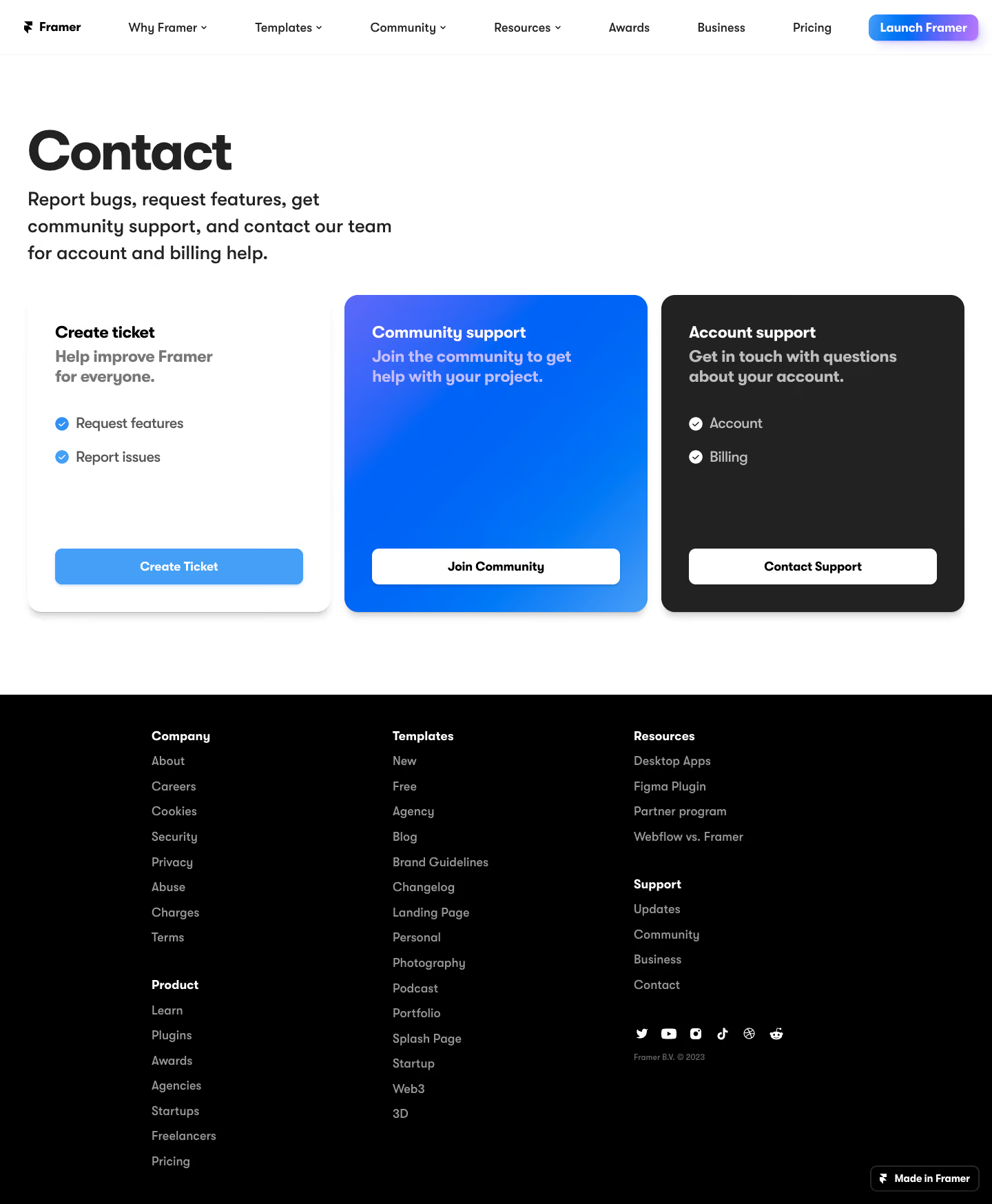

Framer Contact Page

Framer
The web builder for creative pros.
Designed by
No items found.

Bookmark
Bookmark

Design with AI
Thank you! Your submission has been received!
Oops! Something went wrong while submitting the form.
# Design from Reference: Framer Contact Page
Create an original, high-fidelity visual design inspired by the reference. Prioritize composition, typography, colors, spacing, and component styling over technical implementation.
## Reference
- **Product:** Framer
- **Category:** Contact Page
- **Screenshot:** https://cdn.prod.website-files.com/5e9dc792e1210c5325f7ebbc/6acb6de00e8221f13083645f_6acb6ba7994832179b56d438_cms-2d3fd0cfd8a710968ca4c758.webp
Analyze the screenshot first. If inaccessible, request it rather than guessing.
## Content
{{content.instructions}}
{{content.data}}
Preserve essential messaging and factual accuracy. Adapt structure and copy length for visual balance; never invent product claims.
## Visual Design
### Overall aesthetic
- **Style:** A bold contact-routing page with oversized black typography and three contrasting support cards on white.
- **Character:** Direct and product-focused. A vivid blue-gradient middle card and charcoal right card distinguish support paths without illustrations.
### Page composition
- **Capture and scale:** The screenshot measures 1440 × 1747 pixels. Following dimensions are approximate screenshot pixels; CSS scale is unverified.
- **Header:** A shallow white navigation bar contains the Framer logo, multiple text/dropdown links, and a small blue-to-violet Launch Framer control at right.
- **Intro:** A large left-aligned Contact heading and a compact three-line explanation occupy the upper-left region, leaving substantial white space to the right.
- **Routing cards:** Three equal-width cards run across nearly the full page: Create ticket on white, Community support on blue gradient, and Account support on charcoal. Each places its action at the bottom.
- **Footer:** A broad black footer contains three main link columns, with some columns holding two grouped sections, a social row, small copyright, and a Made in Framer badge at lower right.
### Information hierarchy
- **Primary routing:** The large page title introduces the task; three card headings then divide ticket creation, community help, and account/billing support.
- **Card content:** A bold summary sits immediately under each title. Ticket and account cards include two short checkmarked topics; community remains simpler.
- **Actions:** Equal-width bottom buttons make each route explicit and comparable despite different amounts of copy.
### Typography
- **Family:** A rounded geometric sans serif is visible; exact family identity is unverified.
- **Display:** The Contact heading is approximately 76–80 px, very bold, with tight tracking and line-height.
- **Intro and cards:** Intro copy is about 27–29 px semibold with 38 px line-height. Card titles and summaries are approximately 23–24 px bold, with 28–30 px line-height.
- **Utilities:** Topic lists are around 20 px, buttons approximately 17–18 px bold, and footer links/navigation about 16–17 px.
### Colors & surfaces
- **Foundation:** Sampled sRGB #FFFFFF forms the main page, #000000 the footer, and #222222 the account-support card.
- **Blue system:** Sampled #0063F7, #0065F7, #0067F7, and lighter #469FF7 appear across the gradient/community region and ticket action.
- **Hierarchy:** White card uses dark text with medium-gray summaries. Blue and charcoal cards use white titles with softer translucent-looking supporting text.
- **Header accent:** The launch control adds a small blue-to-violet gradient with a soft colored shadow; exact violet endpoint is unverified.
### Components
- **Cards:** Approximately 440 px wide and 460 px tall, with roughly 20 px radii, 40 px padding, and soft shadows. Tops and bottoms align.
- **Action buttons:** Approximately 360 × 52 px with 9–10 px radii. Ticket uses blue with white text; community/account use white with black text.
- **Topic markers:** Small filled circular checkmarks precede list items, blue on white and white on charcoal.
- **Footer groups:** Bold white group labels precede muted gray links in a steady vertical list. Social icons form a compact horizontal row; the lower-right builder badge has a fine border and rounded corners.
### Visual rhythm
- **Spacing:** Use around 100 px between header and intro, 45–50 px before cards, and generous lower white padding before the footer.
- **Card rhythm:** Keep title/summary at top, list content beneath with 20–25 px row spacing, and actions bottom aligned.
- **Footer density:** A narrower centered footer grid contrasts with the broad three-card row, preserving comfortable line spacing.
### Responsive
- **Observed state:** Only desktop is visible.
- **Recommended reflow:** Stack support cards, reduce the display title to roughly 44–48 px CSS, and allow intro copy to span the available width.
- **Navigation and footer:** Collapse long navigation into a menu and stack footer groups. Preserve one clear action per support route.
### Adaptation guidance
- **Preserve:** Retain the oversized intro, equal support-path cards, white/blue/charcoal contrast, and consistent bottom actions.
- **Adapt:** Map the new organization's actual support channels and eligibility to the cards. Vary topic lists to fit each route without forcing identical content.
- **Avoid:** Do not invent community access or support promises. Keep the page a routing decision rather than adding an unnecessary form to every card.
Use this context to reproduce the reference's visual language: layout, typography, colors, spacing, borders, radii, and distinctive elements. The screenshot takes priority if descriptions conflict.
## Direction
{{preferences.fidelityInstructions}}
## Output
{{output.instructions}}
Deliver a polished, cohesive design with precise alignment, hierarchy, and spacing. Produce the requested visual artifact, not just a description. If unsupported, explain the limitation.


Category
Patterns
No items found.


Added on
March 17, 2023
Similar screens
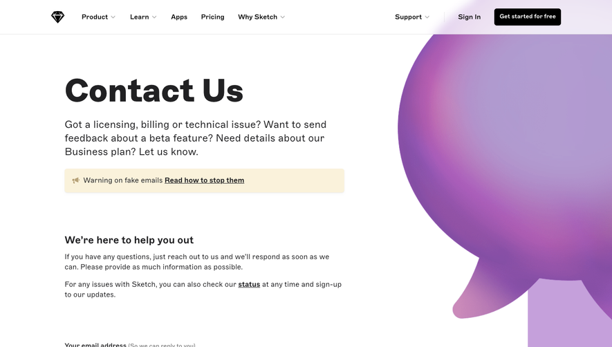


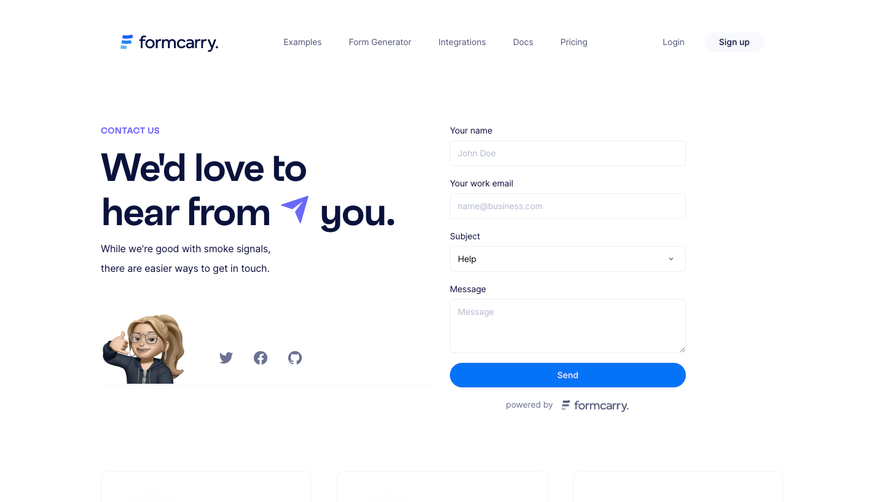

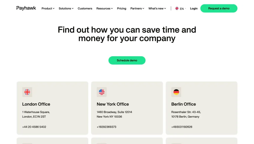

Upgrade to SaaSFrame Pro now to see similar examples.
Monthly
$18 /month
Billed $18 monthly
Browse all screens & flows
Filter and search screens & flows
Search text in screenshots
Access Figma files
Access mobile versions
Join now
Quarterly
$16 /month
Billed $48 quarterly
Browse all screens & flows
Filter and search screens & flows
Search text in screenshots
Access Figma files
Access mobile versions
Join now
Yearly
$15 /month
Billed $180 yearly
Browse all screens & flows
Filter and search screens & flows
Search text in screenshots
Access Figma files
Access mobile versions
Join now