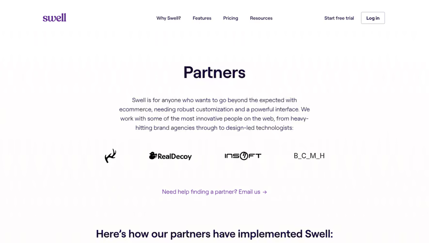
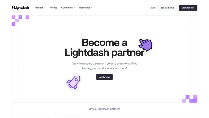
Generate a new design based on this screen using your own content.
Thank you! Your submission has been received!
Oops! Something went wrong while submitting the form.
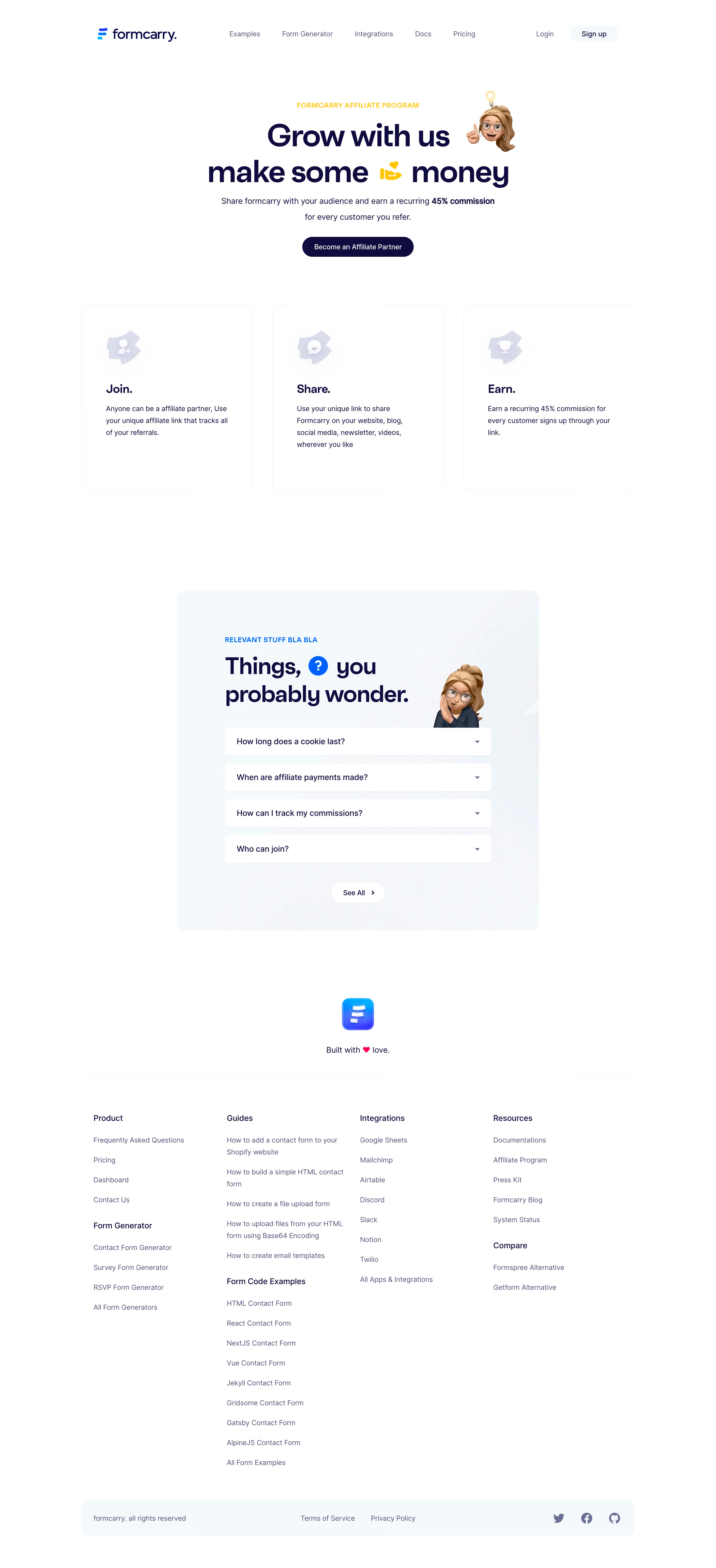
# Design from Reference: Formcarry Affiliate Page
Create an original, high-fidelity visual design inspired by the reference. Prioritize composition, typography, colors, spacing, and component styling over technical implementation.
## Reference
- **Product:** Formcarry
- **Category:** Affiliate Page
- **Screenshot:** https://cdn.prod.website-files.com/5e9dc792e1210c5325f7ebbc/6acbcc50e13ab9df8f05331b_6acbcafc862bf04f5624985b_cms-60caeb35e0f7817d0a87d3ed.webp
Analyze the screenshot first. If inaccessible, request it rather than guessing.
## Content
{{content.instructions}}
{{content.data}}
Preserve essential messaging and factual accuracy. Adapt structure and copy length for visual balance; never invent product claims.
## Visual Design
Use this context to reproduce the reference's visual language: layout, typography, colors, spacing, borders, radii, and distinctive elements. The screenshot takes priority if descriptions conflict.
## Direction
{{preferences.fidelityInstructions}}
## Output
{{output.instructions}}
Deliver a polished, cohesive design with precise alignment, hierarchy, and spacing. Produce the requested visual artifact, not just a description. If unsupported, explain the limitation.
Formcarry’s affiliate program page radiates a clean, modern, and welcoming professionalism. The aesthetic embraces whitespace and airy layout, presenting content with clarity and balance. Subtle drop shadows and softly rounded corners lend a friendly, approachable vibe, while generous padding and spacing help each section breathe.
Layout and Structure
The structure is intuitive, guiding visitors smoothly from a concise hero section—crisp headline and benefit statement paired with an inviting call-to-action—to clearly segmented content blocks. Key sections include a “How it Works” stepper, commission details, a persuasive Q&A, and a visually distinct CTA strip near the scroll’s end. This layout supports an effortless scanning experience and logical information flow.
Visual Elements
Vector-style illustrations with simple, rounded characters and light linework add visual interest while reinforcing approachability. Icons are line-based and consistent, supporting quick comprehension of features and steps. There is no reliance on stock photos or video—visual storytelling is achieved through graphics, not photography.
Color Palette and Typography
The palette merges cool, inviting blues with gradients, punctuated by vibrant accent tones (like purple and turquoise) that draw attention to CTAs and headings. Typography is modern and geometric—headlines feature a bold weight, while supporting text remains clean and highly legible. There’s a strong, clear hierarchy that guides the eye without clutter.
User Experience Patterns & Notable Choices
Navigation is minimal yet sticky, keeping the primary menu accessible as users scroll. CTAs stand out thanks to color contrast and strategic button sizing. Engaging micro-interactions—like hover states on buttons—add subtle delight. The “step-by-step” diagram for the affiliate process stands out for its clarity and visual rhythm. Overall, the tone balances trustworthy transparency with an energetic optimism, ideal for converting curious visitors into partners.