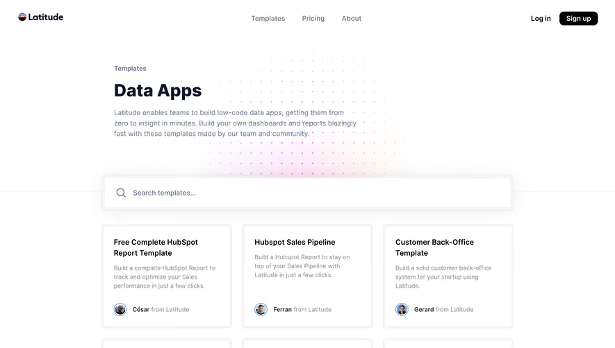
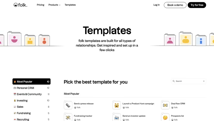
Generate a new design based on this screen using your own content.
Thank you! Your submission has been received!
Oops! Something went wrong while submitting the form.
# Design from Reference: Flowrite Templates Library
Create an original, high-fidelity visual design inspired by the reference. Prioritize composition, typography, colors, spacing, and component styling over technical implementation.
## Reference
- **Product:** Flowrite
- **Category:** Templates Library
- **Screenshot:** https://cdn.prod.website-files.com/5e9dc792e1210c5325f7ebbc/62ecbb5dbf75bb26a1d01095_1659680831413-screenshot-device-cc4677466dfa22be8867a045c77d5715-1659680489157.webp
Analyze the screenshot first. If inaccessible, request it rather than guessing.
## Content
{{content.instructions}}
{{content.data}}
Preserve essential messaging and factual accuracy. Adapt structure and copy length for visual balance; never invent product claims.
## Visual Design
Use this context to reproduce the reference's visual language: layout, typography, colors, spacing, borders, radii, and distinctive elements. The screenshot takes priority if descriptions conflict.
## Direction
{{preferences.fidelityInstructions}}
## Output
{{output.instructions}}
Deliver a polished, cohesive design with precise alignment, hierarchy, and spacing. Produce the requested visual artifact, not just a description. If unsupported, explain the limitation.
Flowrite’s templates page embodies a distinctly modern and minimalist aesthetic, exuding professional clarity with a subtle energetic undertone. Crisp white backgrounds paired with soft gradients and minimal distractions create a clean, breathable interface that supports content without overwhelming the user.
Layout and Structure
The page structure is instantly approachable: a welcoming hero section with a succinct value proposition leads directly into a gallery-style grid of categorized templates. Each template module is self-contained and interactively responsive on hover. Key CTAs are positioned intuitively to guide users toward action, and a persistent navigation bar ensures effortless movement across the site. A compact footer grounds the page without detracting from the focus above.
Visual Elements
Generic icons are eschewed in favor of custom, line-drawn illustrations and subtle animations that highlight interaction points. Soft drop shadows and layered cards create depth, while concise iconography adds visual hierarchy. The lack of stock photography maintains a seamless, product-centric experience and avoids visual clutter.
Color Palette and Typography
The color scheme is based on calming off-white tones, cool blues, and high-contrast blacks for text, lending an air of both reliability and modernity. Flowrite opts for high-legibility sans-serif headings, paired with a slightly more neutral typeface for body copy, enhancing readability and establishing clear typographical hierarchy.
User Experience Patterns and Notable Choices
Navigation is frictionless, with quick-access template filters and a standout CTA always visible. The interactive preview cards give an immediate taste of the product’s capabilities, inviting users to explore before committing. Micro-animations on interactions lend a tactile, polished sensation. The overall tone balances trustworthy professionalism with an innovative, empowering vibe, providing design inspiration for anyone seeking refined, user-first SaaS websites.