Overall Style and Aesthetic
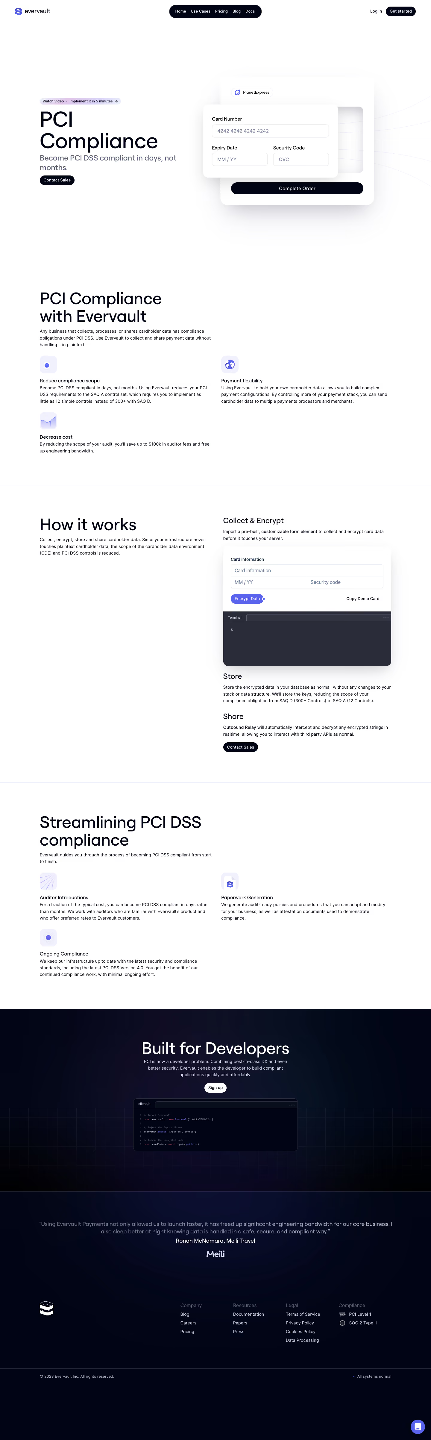
Evervault’s PCI use case page exemplifies a modern, ultra-minimalist SaaS design with a professional and innovative feel. The interface uses generous white space to create a sense of sophistication and clarity, instantly instilling trust in the visitor. Every element feels intentional, with a restrained approach that puts focus on content and utility. Layout and Structure
The page flows in a single, vertically stacked structure starting with a succinct hero section: a bold headline introduces the value proposition, supported by concise, high-impact copy. Following sections are seamless, pairing clearly defined feature descriptions with supporting visuals. Instead of overloaded content blocks, information is elegantly chunked for scannability. The navigation remains sticky and understated, while the footer maintains the clean aesthetic, offering essential links without distractions. Visual Elements
Subtle, geometric illustrations and soft animations add a futuristic energy, reinforcing the product’s tech-forward brand. Custom icons signal features without clutter, while a discreet use of movement guides attention without overwhelming. The imagery feels bespoke—no stock photos—enhancing credibility and uniqueness. Color Palette and Typography
The design leverages a cool, monochromatic palette dominated by whites, charcoals, and hints of electric blue. This palette radiates security and innovation. Typography is sharp and modern—likely using a sans-serif font with high legibility and clear hierarchy, making skimming effortless but engagement high. User Experience Patterns
Primary CTAs are strategically placed and consistently styled, offering clear next steps. Navigation is frictionless, and scroll-based interactions reveal subtle transitions. There’s a low cognitive load thanks to intentional whitespace, progressive disclosure of detail, and interactive elements that only appear as needed. Unique or Notable Choices
A standout aspect is the way complex topics (like PCI compliance) feel digestible and non-threatening. The layering of soft animation, detailed iconography, and concise microcopy makes technical trustworthiness feel inviting. The site’s confident restraint—never shouting, always guiding—cements its tone as both trustworthy and forward-thinking, perfect for SaaS founder inspiration looking to balance style and substance.