Design with AI
Generate a new design based on this screen using your own content.
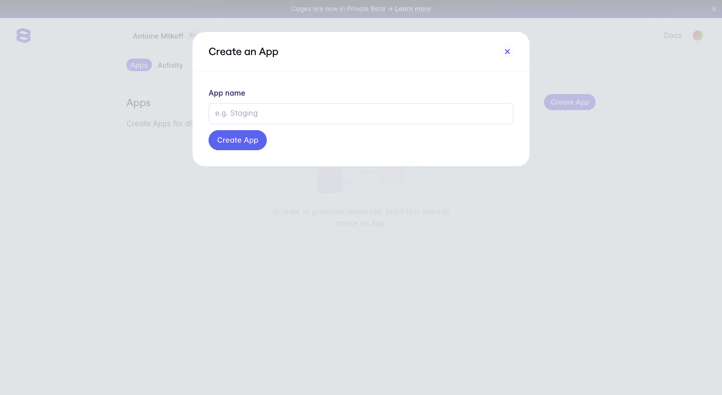
# Design from Reference: Evervault Create app
Create an original, high-fidelity visual design inspired by the reference. Prioritize composition, typography, colors, spacing, and component styling over technical implementation.
## Reference
- **Product:** Evervault
- **Category:** Add & Edit
- **Screenshot:** https://cdn.prod.website-files.com/5e9dc792e1210c5325f7ebbc/6acbc5492488d2f8f7d36788_6acbbce507a85b98c47c9f3c_cms-5c7b44321101ab6896df2f6f.webp
Analyze the screenshot first. If inaccessible, request it rather than guessing.
## Content
{{content.instructions}}
{{content.data}}
Preserve essential messaging and factual accuracy. Adapt structure and copy length for visual balance; never invent product claims.
## Visual Design
### Overall aesthetic
- **Style:** Simple app-creation modal on a dimmed developer dashboard.
- **Character:** White surface, violet action, rounded shape.
### Page composition
- **Canvas:** 1440 × 789 screenshot px.
- **Modal:** Approximately 670 × 270px near top center.
- **Sequence:** Title/close, single app-name input, Create App.
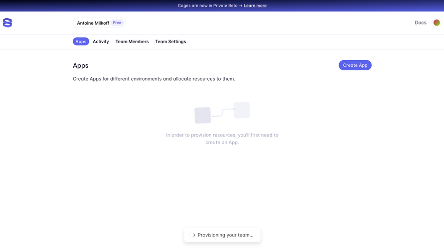
- **Backdrop:** Apps empty state visible through pale overlay.
### Information hierarchy
- **Primary:** Create an App title.
- **Input:** App name.
- **Action:** Violet Create App.
### Typography
- **Family:** Rounded sans serif; exact identity unverified.
- **Title:** Approximately 22px.
- **Labels/input:** 16px.
- **Action:** 14px.
- **Precision:** Screenshot estimates.
### Colors & surfaces
- **Modal:** #FFFFFF.
- **Backdrop:** #E1E4E6.
- **Action:** #5A63EB.
- **Dimmed accent:** #BEBAE1.
- **Muted:** #AEB1B6.
- **Precision:** Background samples include overlay.
### Components
- **Modal radius:** Approximately 24px.
- **Input:** Full-width thin violet-gray border.
- **Action:** Compact violet pill.
- **Close:** Circled violet X.
- **Header:** Fine divider.
### Visual rhythm
- **Spacing:** Approximately 32px insets, compact vertical stack.
- **Alignment:** Title/input/action left edges match.
### Responsive
- **Observed:** Desktop only.
- **Recommendation:** Fluid width and viewport margins; keep input/action readable.
### Adaptation guidance
- **Preserve:** Single-field creation and clear dismissal.
- **Content:** Use intended app-name rules.
- **Behavior:** Validation/creation unverified.
Use this context to reproduce the reference's visual language: layout, typography, colors, spacing, borders, radii, and distinctive elements. The screenshot takes priority if descriptions conflict.
## Direction
{{preferences.fidelityInstructions}}
## Output
{{output.instructions}}
Deliver a polished, cohesive design with precise alignment, hierarchy, and spacing. Produce the requested visual artifact, not just a description. If unsupported, explain the limitation.