
Thank you! Your submission has been received!
Oops! Something went wrong while submitting the form.
Get SaaSFrame Pro
Monthly
$18
Quarterly
$48
Yearly
$180
Upgrade to access this feature
Browse all screens & flows
Filter and search screens & flows
Access Figma files
Access mobile versions
Bookmark screens & flows
Join now
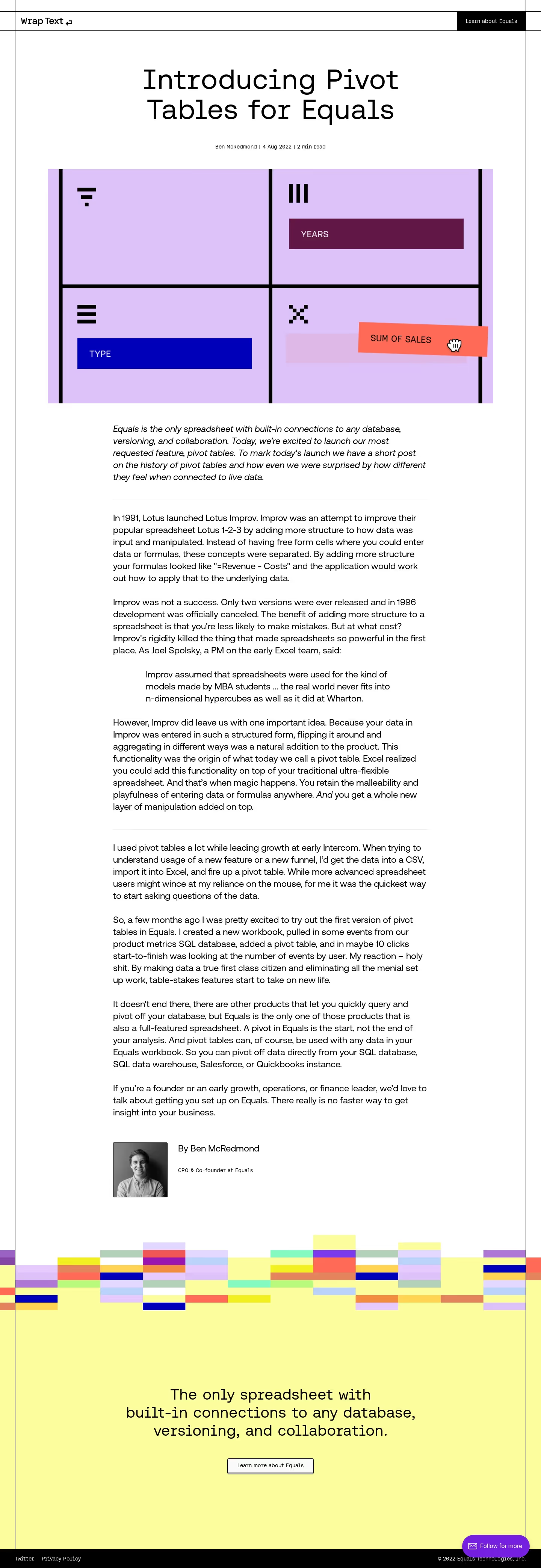

Equals Blog Post

Equals
The fastest way for startups to do any analysis
Designed by
No items found.

Bookmark
Bookmark

Design with AI
Thank you! Your submission has been received!
Oops! Something went wrong while submitting the form.
# Design from Reference: Equals Blog Post
Create an original, high-fidelity visual design inspired by the reference. Prioritize composition, typography, colors, spacing, and component styling over technical implementation.
## Reference
- **Product:** Equals
- **Category:** Blog Post
- **Screenshot:** https://cdn.prod.website-files.com/5e9dc792e1210c5325f7ebbc/62f3ccdfbb866a2bfa662d0e_1660143328280--1660142949314.webp
Analyze the screenshot first. If inaccessible, request it rather than guessing.
## Content
{{content.instructions}}
{{content.data}}
Preserve essential messaging and factual accuracy. Adapt structure and copy length for visual balance; never invent product claims.
## Visual Design
### Overall aesthetic
- **Style:** Graphic editorial product-announcement article with a monospaced display title, thin black page frame and bold spreadsheet-inspired artwork.
- **Character:** White reading canvas, black typography, lavender hero illustration and a pale acid-yellow closing band. Rectangular colored blocks echo spreadsheet cells.
- **Surface treatment:** Flat, sharply defined geometry dominates. Rounded cards and soft shadows are largely absent; the bottom CTA uses a small outlined button.
### Page composition
- **Capture scale:** 1440 × 4171 image px. CSS reconstruction estimates assume an unverified 1× capture.
- **Page frame:** Thin black vertical rules sit approximately 40 px from the viewport edges and continue down the page.
- **Header:** A narrow horizontal band contains Wrap Text and a return-arrow mark at left, with a black Learn about Equals block at right.
- **Title area:** A very large centered two-line headline sits well below the header. A small centered author/date/reading-time line follows.
- **Hero artwork:** A broad approximately 1185 × 625 px illustration shows a lavender four-cell grid with heavy black dividers, simple pixel-like symbols and colored data-field strips.
- **Reading column:** Approximately 840 px wide, centered, beginning beneath the illustration with an italic introductory paragraph.
- **Article body:** Long paragraphs, two fine horizontal rules and an indented quotation create the reading structure. There are no prominent subsection headings in the captured body.
- **Author block:** A small square grayscale portrait sits beside author name and role near the end of the reading column.
- **Closing CTA:** A full-width pale-yellow band is introduced by uneven stacks of colorful rectangular strips. A large centered statement and small bordered product link sit within the band.
- **Footer:** A shallow black strip contains social/privacy links left and copyright right. A floating purple Follow for more pill overlaps its upper edge at the lower right.
### Information hierarchy
- **Headline emphasis:** Oversized monospaced title is the strongest typographic element, visually distinct from the proportional article copy.
- **Artwork role:** The large grid illustration previews the pivot-table topic using abstract fields and operators rather than a literal application screenshot.
- **Reading emphasis:** Italic introduction distinguishes the summary from the main essay. Body hierarchy comes from paragraph breaks, separators and quotation indentation.
- **Attribution:** Metadata provides immediate authorship context; the larger portrait/name block closes the article.
- **Conversion:** Header and bottom CTA both offer a route to learn about Equals, while the floating follow control is a separate subscription-style action.
### Typography
- **Display family:** Monospaced headline with rounded, even-width letterforms. Exact font identity is unverified.
- **Article family:** Clean proportional sans serif for paragraphs and attribution; exact identity is also unverified.
- **Headline:** Approximately 70–74 px, regular weight, with 78–82 px leading and centered alignment.
- **Body:** Approximately 23–24 px with 32 px leading, regular weight. The opening paragraph uses matching scale in italic.
- **Indented quote:** Similar size to body text, with a narrower measure and roughly 85 px additional left inset.
- **Metadata:** Approximately 14 px with compact leading. Header wordmark is around 24 px; the black header action uses smaller text.
- **Closing statement:** Approximately 38–40 px with 48 px leading, centered across several lines. All sizes are visual estimates under the assumed 1× scale.
### Colors & surfaces
- **Canvas and text:** Sampled sRGB #FFFFFF forms the reading surface; #000000 supplies text, frame and hero grid lines.
- **Hero field:** Sampled #DDC2F9 is the principal lavender illustration background.
- **Data strips:** Sampled #0000BA provides saturated deep blue, #621847 a dark plum and #FF6B56 a coral strip.
- **Closing surface:** Sampled #FCFE9D forms the pale yellow CTA region.
- **Additional cells:** Related pastel lavender, mint, yellow, orange and blue rectangles appear along the closing band's upper boundary. These are decorative image accents rather than required interface status colors.
- **Secondary text:** Sampled #585858 provides a medium-gray reference among smaller text details.
### Components
- **Header action:** Black rectangular block at the far right, white compact label, no pill silhouette.
- **Hero grid:** Thick black vertical/horizontal lines divide the illustration into four large fields. Small black glyphs sit near cell corners; colored text strips overlap parts of the grid.
- **Article separators:** Very pale thin horizontal rules span the reading column and provide understated essay breaks.
- **Author portrait:** Approximately 145 × 145 px, grayscale, with a fine dark edge and nearly square corners.
- **Author text:** Name appears to the right on the upper line; smaller role sits beneath with substantial vertical spacing.
- **Closing button:** Approximately 230 × 42 px, light fill, thin black border, small radius and subtle lower shadow.
- **Follow pill:** Purple rounded capsule with a small outlined envelope icon and light text, floating over the bottom-right region.
- **Footer links:** Small light text on black with ample horizontal separation; no multi-column navigation is visible.
### Visual rhythm
- **Editorial pacing:** Large title, broad illustration, narrower essay and bold closing band create clear changes in scale.
- **Reading rhythm:** Long paragraphs are separated by moderate whitespace; rules and the indented quotation provide occasional pauses.
- **Graphic continuity:** Hero grid cells and closing stacked rectangles share spreadsheet-like geometry despite different color treatments.
- **Frame continuity:** Thin outer rules hold the composition together through both white and yellow regions.
- **Contrast:** The pale-yellow ending and black footer create a stronger visual finish after the long white article.
### Responsive
- **Evidence limit:** Only desktop is shown; the following are recommendations.
- **Title recommendation:** Reduce display size to approximately 36–44 px on phones and allow natural wrapping without horizontal overflow.
- **Reading recommendation:** Use 20–24 px side padding, reduce body size toward 18–20 px and retain comfortable leading.
- **Artwork recommendation:** Scale or deliberately crop the grid illustration; preserve its strong black structure and avoid illegibly shrinking embedded labels.
- **Attribution recommendation:** Stack portrait and author text if necessary; reduce the quotation inset on narrow screens.
- **Floating-control recommendation:** Keep the follow pill clear of legal text and safe-area insets.
### Adaptation guidance
- **Preserve editorial distinction:** Use a bold display title, graphic topic illustration, readable essay column and a separate product CTA.
- **Match topic imagery:** Replace pivot-table symbols and field labels with visual metaphors relevant to the supplied article.
- **Use authentic content:** Populate author information, publication metadata, quotations and product claims from verified target material.
- **Retain the system:** Combine thin black framing, flat colored cells, restrained body typography and a strong closing color band.
- **Scale to content:** Let paragraph count and article length follow the source; do not add filler to match the screenshot height.
- **Accessibility recommendation:** Provide meaningful image alternatives, readable contrast and descriptive subscription/action links; behavior is not verified by the static image.
Use this context to reproduce the reference's visual language: layout, typography, colors, spacing, borders, radii, and distinctive elements. The screenshot takes priority if descriptions conflict.
## Direction
{{preferences.fidelityInstructions}}
## Output
{{output.instructions}}
Deliver a polished, cohesive design with precise alignment, hierarchy, and spacing. Produce the requested visual artifact, not just a description. If unsupported, explain the limitation.


Category
Patterns
No items found.
Tech Stack

Added on
August 10, 2022
Similar screens



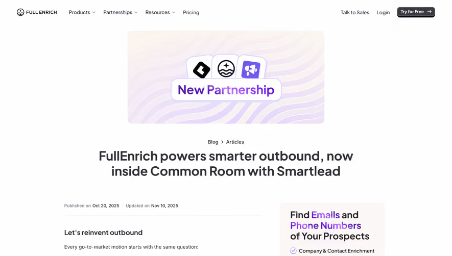

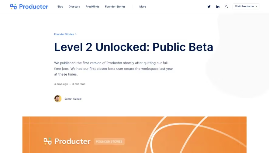

Upgrade to SaaSFrame Pro now to see similar examples.
Monthly
$18 /month
Billed $18 monthly
Browse all screens & flows
Filter and search screens & flows
Search text in screenshots
Access Figma files
Access mobile versions
Join now
Quarterly
$16 /month
Billed $48 quarterly
Browse all screens & flows
Filter and search screens & flows
Search text in screenshots
Access Figma files
Access mobile versions
Join now
Yearly
$15 /month
Billed $180 yearly
Browse all screens & flows
Filter and search screens & flows
Search text in screenshots
Access Figma files
Access mobile versions
Join now