Overall Style and Aesthetic
Dynaboard’s careers page epitomizes modern SaaS minimalism with crisp lines, ample white space, and a subtle playfulness. The aesthetic balances professionalism and approachability, using inviting microinteractions and a friendly layout that feels both “designed” and welcoming. Layout and Structure
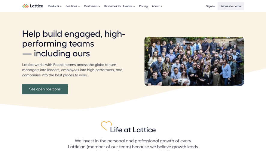
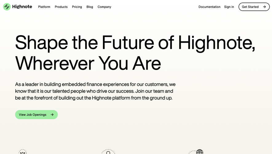
The layout begins with a concise hero section featuring a bold headline and supportive subtext, instantly communicating the company’s mission. Clean content sections follow, highlighting culture, values, and open roles, each separated by generous breathing room. There’s no clutter—each block of content serves a clear purpose. Visual Elements
Custom illustrations and subtle vector graphics bring energy and unity to the page, eschewing stock photography for thoughtfully branded art. Animations are understated but effective—slight fades and hover effects create a sense of interactivity, aiding navigation without distraction. Color Palette and Typography
The palette relies on a crisp, cool white background, deep blues, and assertive accent colors—such as teal and purple—that underscore CTAs and emphasize focus areas. Typography is modern and legible, with generous headings and strong hierarchy, likely using a geometric sans-serif font that reinforces clarity and confidence. User Experience Patterns
Navigation is sticky and effortless, jumping users smoothly between sections. Calls to action, like “See open roles,” are distinct and frequent, encouraging exploration. Scroll behavior is fluid, with content loading seamlessly and a reassuring back-to-top icon appearing as needed. Unique or Notable Design Choices
Notably, Dynaboard avoids clichés like generic team photos, instead spotlighting their culture through philosophy and values, paired with expressive visuals. The tone remains optimistic and innovative, reinforcing that this is a creative, fast-moving team excited for new talent.