Design with AI
Generate a new design based on this screen using your own content.
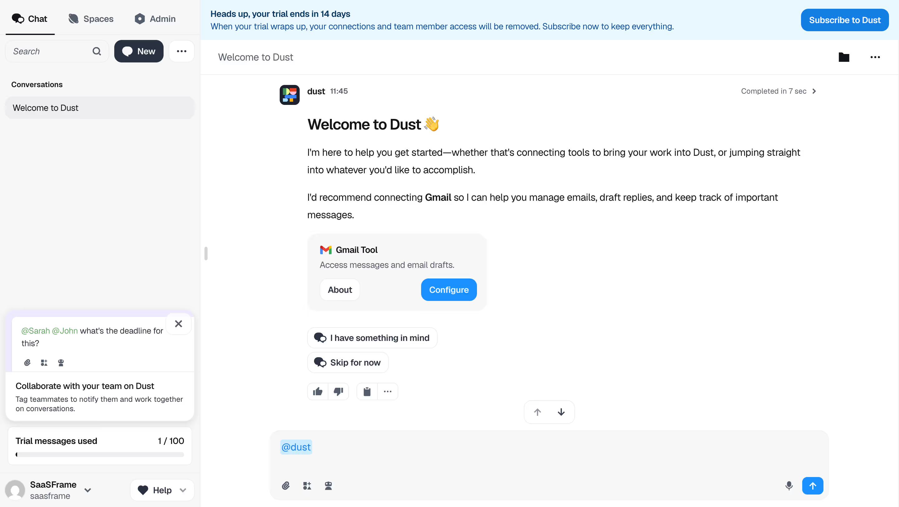
# Design from Reference: Dust Welcome Screen
Create an original, high-fidelity visual design inspired by the reference. Prioritize composition, typography, colors, spacing, and component styling over technical implementation.
## Reference
- **Product:** Dust
- **Category:** Welcome Screen
- **Screenshot:** https://cdn.prod.website-files.com/5e9dc792e1210c5325f7ebbc/6980862270f255b79d7a7c25_G-7maHr4fD9ucd5C1Is_Pl81ATVImAGSISaAoDkN6iI.avif
Analyze the screenshot first. If inaccessible, request it rather than guessing.
## Content
{{content.instructions}}
{{content.data}}
Preserve essential messaging and factual accuracy. Adapt structure and copy length for visual balance; never invent product claims.
## Visual Design
### Overall aesthetic
- **Character:** Friendly conversational workspace with a practical sidebar, pale trial notice and an approachable assistant welcome.
### Page composition
- **Capture:** 2880 × 1624 screenshot pixels; estimated 2× CSS scale.
- **Structure:** Sidebar occupies approximately 22% of the width. Main area contains trial banner, conversation header, welcome message, integration card, suggestions and bottom composer.
### Information hierarchy
- **Priority:** Welcome heading leads into explanatory paragraphs and Gmail configuration; suggestion chips offer a secondary path. The composer anchors the next action.
### Typography
- **Family:** Sans serif; exact family unverified.
- **Estimated CSS sizes:** Welcome heading 24px, message body 16px with approximately 28px line height, helper text 14px.
### Colors & surfaces
- **Measured palette:** White #FFFFFF, sidebar/composer gray #F7F7F7, trial blue #E9F7FF, subtle border #EEEEEF, dark text #111418 and secondary text #2A3241.
- **Action color:** Blue #147FE3 emphasizes configuration and send actions.
### Components
- **Elements:** Sidebar tabs and conversation list, collaboration tip, trial usage, Gmail tool card with About/Configure actions, two suggestion chips and message feedback icons.
- **Composer:** Broad rounded input with @dust mention, attachment/tool icons, microphone and blue send button; estimated radii 12–16px and action height 36px.
### Visual rhythm
- **Spacing:** Compact sidebar rows contrast with airy message paragraphs and a wide empty reading area. The bottom composer provides a stable horizontal endpoint.
### Responsive
- **Suggested adaptation:** Convert sidebar to a drawer, allow suggestions to wrap, and keep the composer accessible above the mobile keyboard. Narrow-screen behavior is not evidenced.
### Adaptation guidance
- **Transfer:** Keep one prominent onboarding recommendation and a clear conversational starting point. Use restrained blue accents and preserve readable message line lengths.
Use this context to reproduce the reference's visual language: layout, typography, colors, spacing, borders, radii, and distinctive elements. The screenshot takes priority if descriptions conflict.
## Direction
{{preferences.fidelityInstructions}}
## Output
{{output.instructions}}
Deliver a polished, cohesive design with precise alignment, hierarchy, and spacing. Produce the requested visual artifact, not just a description. If unsupported, explain the limitation.