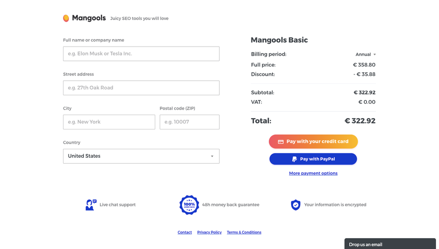
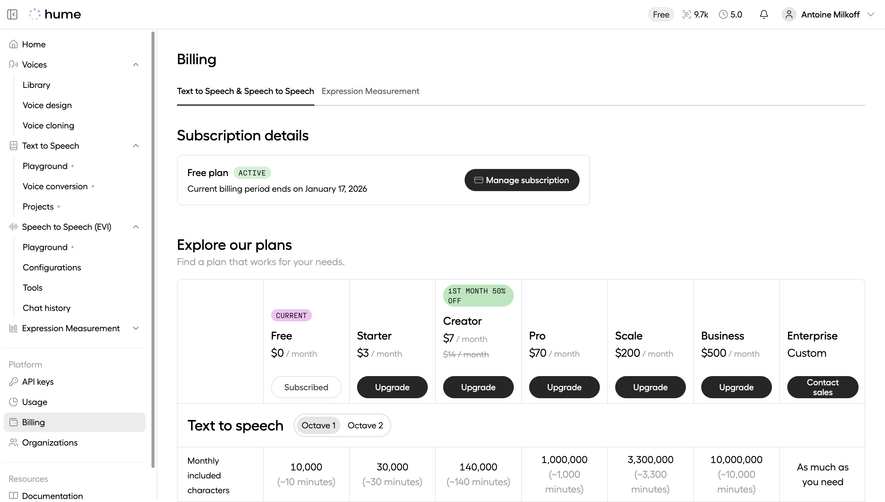
Generate a new design based on this screen using your own content.
Thank you! Your submission has been received!
Oops! Something went wrong while submitting the form.
# Design from Reference: Dust Subscription
Create an original, high-fidelity visual design inspired by the reference. Prioritize composition, typography, colors, spacing, and component styling over technical implementation.
## Reference
- **Product:** Dust
- **Category:** Billing
- **Screenshot:** https://cdn.prod.website-files.com/5e9dc792e1210c5325f7ebbc/6980863525aed130dc266477_txMk-ZYIsq0NtIXePksi-8G8HvgKGRmvBu90EWZe5wQ.avif
Analyze the screenshot first. If inaccessible, request it rather than guessing.
## Content
{{content.instructions}}
{{content.data}}
Preserve essential messaging and factual accuracy. Adapt structure and copy length for visual balance; never invent product claims.
## Visual Design
Use this context to reproduce the reference's visual language: layout, typography, colors, spacing, borders, radii, and distinctive elements. The screenshot takes priority if descriptions conflict.
## Direction
{{preferences.fidelityInstructions}}
## Output
{{output.instructions}}
Deliver a polished, cohesive design with precise alignment, hierarchy, and spacing. Produce the requested visual artifact, not just a description. If unsupported, explain the limitation.
The pink cancellation banner at the top is the first thing that grabs you. Smart move. It creates urgency without being aggressive, and the soft rose background keeps it feeling informative rather than alarming. That "Free Trial" button sitting right below feels intentionally placed to catch users reconsidering their options.
Two Plans, No Decision Fatigue
Just Pro and Enterprise side by side. No confusing three or four tier grid. The Pro card leads with a bold "29€" in heavy weight type while Enterprise goes with "Custom" in the same scale. Blue checkmarks create a consistent visual rhythm down both columns. The left column is clearly the action path with that fat blue "Subscribe to Pro" CTA. Enterprise gets a quieter outlined "Contact sales" button. Hierarchy is doing all the work here.
What Makes It Stand Out
The left sidebar navigation is dead simple. Trial usage counter at the bottom left is a subtle but effective nudge. Monthly/yearly toggle uses a pill selector that feels native and expected. Typography is restrained throughout. Nothing flashy, just functional.