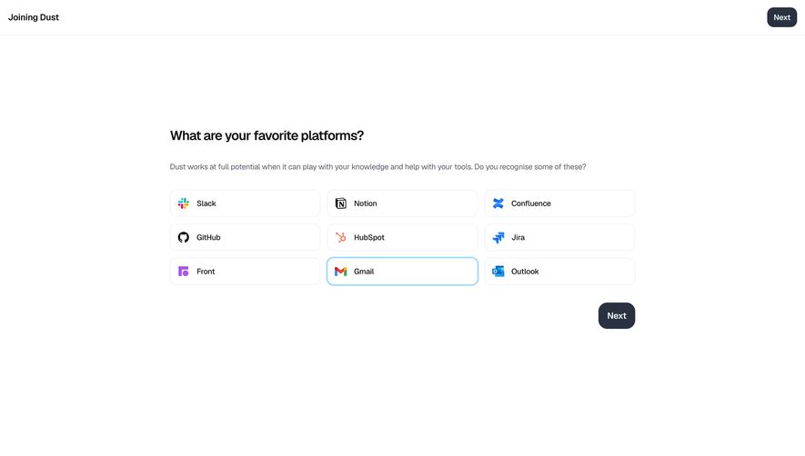
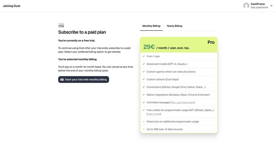
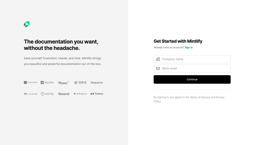
Generate a new design based on this screen using your own content.
Thank you! Your submission has been received!
Oops! Something went wrong while submitting the form.
# Design from Reference: Dust Signup
Create an original, high-fidelity visual design inspired by the reference. Prioritize composition, typography, colors, spacing, and component styling over technical implementation.
## Reference
- **Product:** Dust
- **Category:** Signup
- **Screenshot:** https://cdn.prod.website-files.com/5e9dc792e1210c5325f7ebbc/6980861ef026cc4b35d66cef_dDmKdti3k01gRcFGzrjc4UpgSB7Otjf5kqmwEukpCwo.avif
Analyze the screenshot first. If inaccessible, request it rather than guessing.
## Content
{{content.instructions}}
{{content.data}}
Preserve essential messaging and factual accuracy. Adapt structure and copy length for visual balance; never invent product claims.
## Visual Design
Use this context to reproduce the reference's visual language: layout, typography, colors, spacing, borders, radii, and distinctive elements. The screenshot takes priority if descriptions conflict.
## Direction
{{preferences.fidelityInstructions}}
## Output
{{output.instructions}}
Deliver a polished, cohesive design with precise alignment, hierarchy, and spacing. Produce the requested visual artifact, not just a description. If unsupported, explain the limitation.
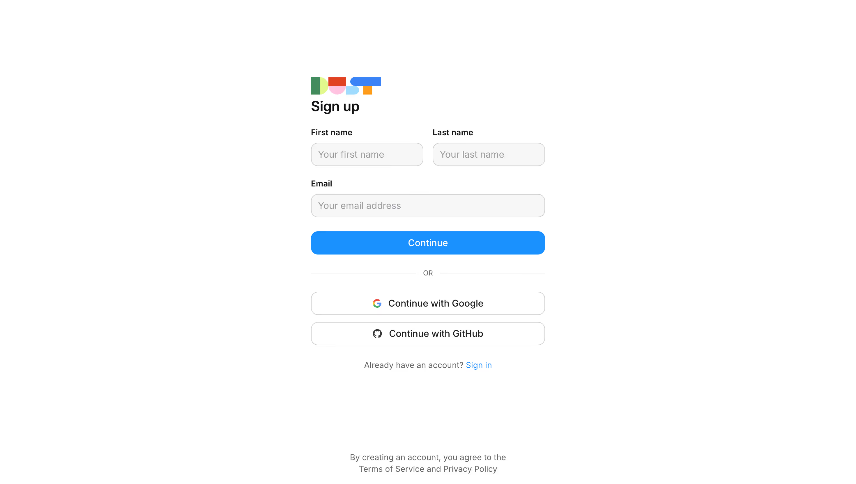
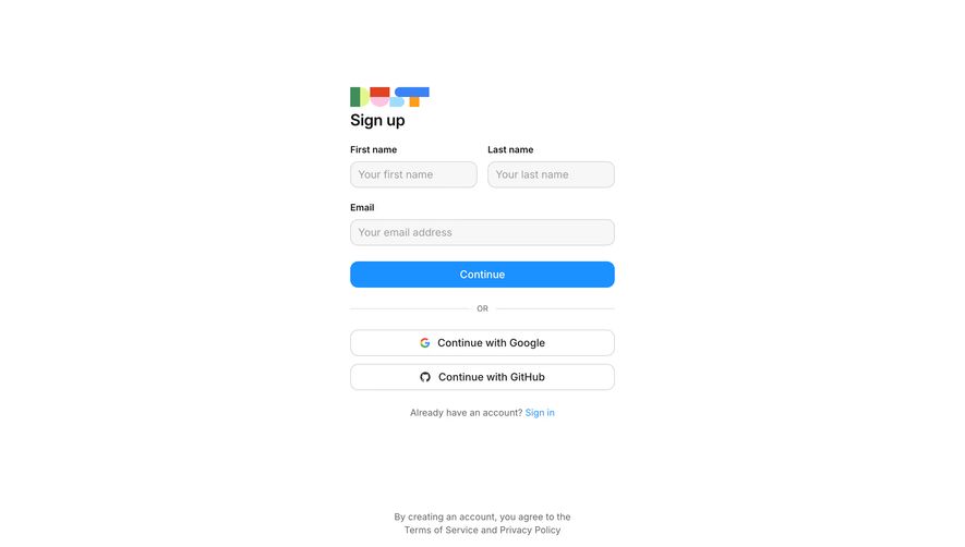
This is a sign-up page that gets out of your way. White background, minimal fields, zero distractions. The form asks for first name, last name, and email. That's it. No password step yet, which keeps the barrier low and the momentum high.
The Little Logo Cluster Does a Lot
Those four small colorful icons at the top left are doing heavy lifting. They inject personality into what would otherwise be a completely sterile page. Green, red, pink-blue, and orange. They hint at a multi-product suite without spelling it out. Smart branding move.
Layout That Funnels You Down
Everything is center-aligned and stacked vertically. Your eye moves naturally from heading to fields to the bright blue "Continue" button. The OR divider separates email signup from Google and GitHub OAuth options. The "Already have an account? Sign in" link sits right where you'd expect it.
What Makes It Work
Typography is simple and well-spaced. The blue CTA button has real contrast against the white. No clutter, no marketing copy, no hero image competing for attention. It's confident enough to just be a form.