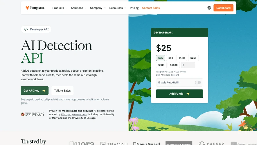
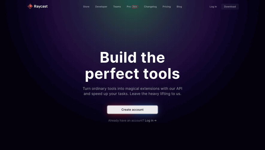
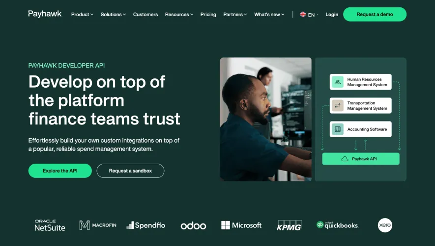
Generate a new design based on this screen using your own content.
Thank you! Your submission has been received!
Oops! Something went wrong while submitting the form.
# Design from Reference: Dust Developers Page
Create an original, high-fidelity visual design inspired by the reference. Prioritize composition, typography, colors, spacing, and component styling over technical implementation.
## Reference
- **Product:** Dust
- **Category:** Developers Page
- **Screenshot:** https://cdn.prod.website-files.com/5e9dc792e1210c5325f7ebbc/6acad347d5603a17eba5b787_6acad10d135f2125f428f8b8_cms-77f0c1c6f8838bedd6c16016.webp
Analyze the screenshot first. If inaccessible, request it rather than guessing.
## Content
{{content.instructions}}
{{content.data}}
Preserve essential messaging and factual accuracy. Adapt structure and copy length for visual balance; never invent product claims.
## Visual Design
Use this context to reproduce the reference's visual language: layout, typography, colors, spacing, borders, radii, and distinctive elements. The screenshot takes priority if descriptions conflict.
## Direction
{{preferences.fidelityInstructions}}
## Output
{{output.instructions}}
Deliver a polished, cohesive design with precise alignment, hierarchy, and spacing. Produce the requested visual artifact, not just a description. If unsupported, explain the limitation.
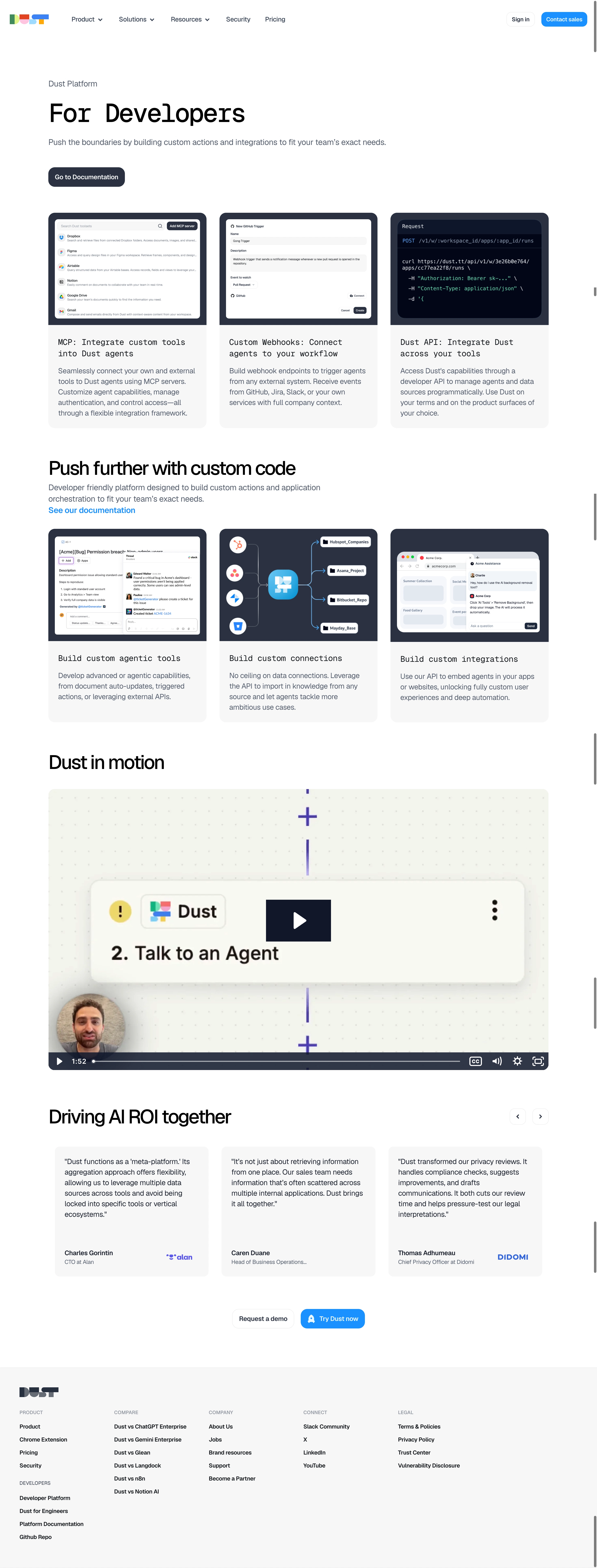
Dust's developer page opens with a bold monospace headline that instantly signals "this is for builders." The three-column card layout below it does a great job of showing the integration paths without overwhelming. Each card has a real screenshot, not a generic illustration, which adds credibility fast.
Structure That Actually Guides You
The page flows in clear sections. Hero, then integration options, then a "push further" block with documentation links, then a video, then social proof. It's textbook SaaS structure but executed with enough restraint that nothing feels bloated. The whitespace is generous. You breathe between sections.
Typography Carries the Whole Thing
The mix of monospace for technical headings and a clean sans-serif for body text creates a subtle code-meets-product vibe. Smart choice. The blue accent links and CTA buttons are the only real color pops against a mostly white and light gray palette.
What Makes It Stand Out
The testimonial carousel at the bottom pairs real names with company logos. That's trust-building done right. And embedding an actual video walkthrough mid-page breaks up the text density perfectly.