Overall Style and Aesthetic
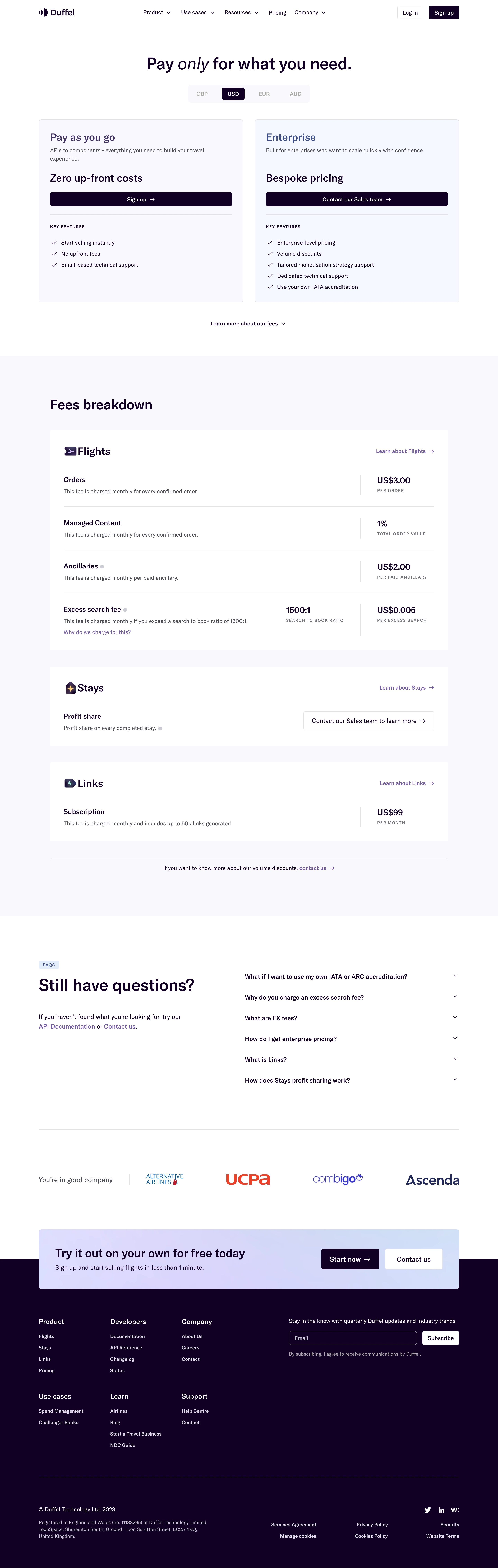
Duffel’s pricing page embodies a clean, modern, and professional vibe. The minimalist design leverages abundant white space, conveying transparency and trust. Subtle yet vibrant accent colors create points of visual interest without overwhelming the user, establishing a refined, digital-forward atmosphere ideal for SaaS audiences. Layout and Structure
The structure is crisp and predictable, guiding the eye logically: a succinct, above-the-fold hero highlights the “Pricing” headline, followed by a horizontally-aligned, card-based pricing table that presents tiers for easy comparison. Each pricing card features a bold plan name, summary text, and a concise call to action. Supporting sections, like feature summaries and FAQs, are placed lower on the page, while a clear, comprehensive footer ensures relevant links are always within reach. Visual Elements
Careful iconography supports feature highlights within each pricing tier, adding instant clarity and breaking up text-heavy areas. Simple vector illustrations add warmth and personality, with no reliance on photography or video, maintaining focus on the offer. Hover effects and micro-interactions (such as buttons and tooltips) subtly engage the user and reinforce the page’s interactive, tech-driven feel. Color Palette and Typography
Duffel opts for a primarily white and soft-gray backdrop with lively blues and purples for calls to action and highlights. Typography is web-optimized and elegant: clean sans-serif fonts create visual hierarchy, with clear sizing variations for headings, body copy, and callouts, enhancing scannability. User Experience Patterns
Navigation is sticky, minimal, and distraction-free, keeping the path to sign-up prominent. Strategic CTAs (“Get Started”/“Contact Sales”) are well-placed and highly visible. Pricing toggles and feature popovers streamline exploration. The tone throughout is transparent, competent, and quietly innovative, reassuring users and prompting confident action.