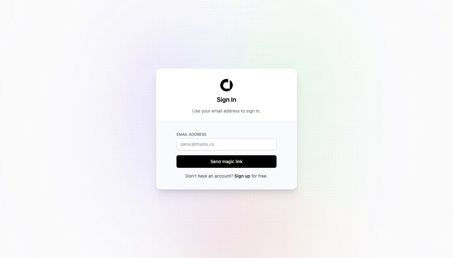
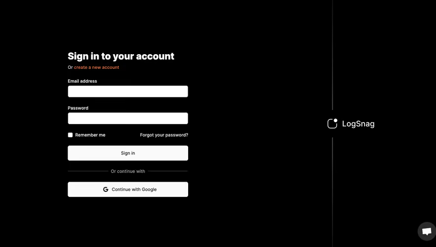
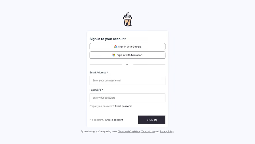
Generate a new design based on this screen using your own content.
Thank you! Your submission has been received!
Oops! Something went wrong while submitting the form.
# Design from Reference: Dub Login
Create an original, high-fidelity visual design inspired by the reference. Prioritize composition, typography, colors, spacing, and component styling over technical implementation.
## Reference
- **Product:** Dub
- **Category:** Login
- **Screenshot:** https://cdn.prod.website-files.com/5e9dc792e1210c5325f7ebbc/6acb6f553156cd8dbc4713c3_6acb6e7a55968e6fef896f7a_cms-64526c1e33159537e9f9b186.webp
Analyze the screenshot first. If inaccessible, request it rather than guessing.
## Content
{{content.instructions}}
{{content.data}}
Preserve essential messaging and factual accuracy. Adapt structure and copy length for visual balance; never invent product claims.
## Visual Design
Use this context to reproduce the reference's visual language: layout, typography, colors, spacing, borders, radii, and distinctive elements. The screenshot takes priority if descriptions conflict.
## Direction
{{preferences.fidelityInstructions}}
## Output
{{output.instructions}}
Deliver a polished, cohesive design with precise alignment, hierarchy, and spacing. Produce the requested visual artifact, not just a description. If unsupported, explain the limitation.
Dub.sh’s login page embodies a sleek, minimalist, and modern design sensibility. The uncluttered experience showcases a hyper-focused single screen, removing distractions and funneling user attention to the login process. Whitespace is boldly leveraged, creating a sense of patience and professionalism, while subtle rounded corners on containers hint at an approachable and friendly personality.
Layout and Structure
The structure is sharply vertical: the logo centers at the top, immediately establishing brand presence, followed by the login form at the heart of the page. There are no unnecessary sections (hero, features, testimonials), maintaining a pure functional focus suitable for authentication. Footer elements are lightly present, indicating legal and language options without visual noise.
Visual Elements
Visuals are clean and purposeful. The absence of large illustrations or background images keeps the environment distraction-free. The brand icon adds a touch of identity; soft input shadows and gentle button transitions create a refined sense of interactivity.
Color Palette and Typography
A cool neutral palette dominates, with crisp whites and soft grays forming the backdrop. The call-to-action button introduces a vivid pop of blue, directing attention without overwhelming. Typography leans modern and geometric, using a sans-serif font that promotes clarity and readability, while clear hierarchy ensures instant orientation.
User Experience Patterns
Navigation is minimal—just the logo, with gentle prompts for “sign up” and “forgot password.” The primary CTA is unmistakable, while form fields are generously sized and visibly accessible. Overall, every touchpoint feels intentional, reducing cognitive load and supporting swift, seamless user flow.
Unique or Notable Design Choices
The standout is a disciplined dedication to simplicity: Dub.sh makes logging in as effortless as possible without sacrificing personality. This blend of functional minimalism and subtle branding creates an experience that’s both reassuringly trustworthy and subtly energized—ideal inspiration for SaaS login design.