Design with AI
Generate a new design based on this screen using your own content.
# Design from Reference: Dub Choose a custom domain setup
Create an original, high-fidelity visual design inspired by the reference. Prioritize composition, typography, colors, spacing, and component styling over technical implementation.
## Reference
- **Product:** Dub
- **Category:** Account Setup
- **Screenshot:** https://cdn.prod.website-files.com/5e9dc792e1210c5325f7ebbc/6acd72345727b72ef709ea13_gH1B1CT9xcciyHZg_B6Zff5TDbRtx_GwnJuVPOlMPyU.png
Analyze the screenshot first. If inaccessible, request it rather than guessing.
## Content
{{content.instructions}}
{{content.data}}
Preserve essential messaging and factual accuracy. Adapt structure and copy length for visual balance; never invent product claims.
## Visual Design
### Overall aesthetic
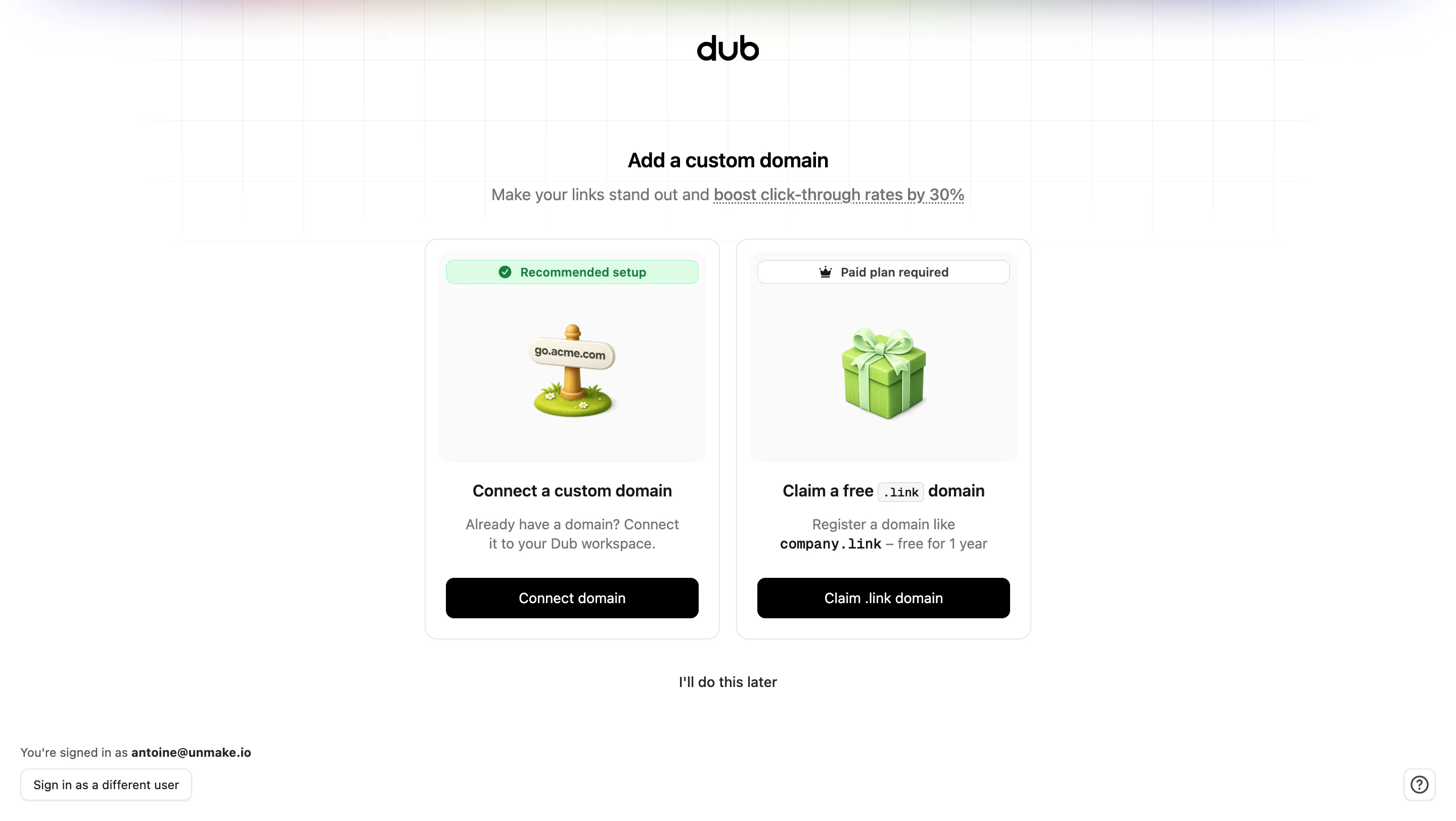
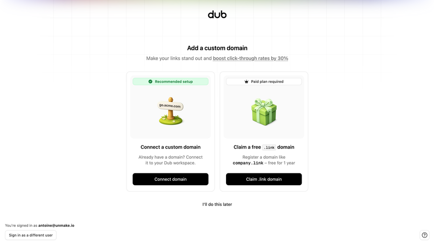
- **Character:** A minimal domain-setup choice screen, with two equal white cards, friendly three-dimensional illustrations and a faint grid/gradient backdrop.
- **Evidence scale:** Original 2880 × 1624 pixels; CSS estimates assume an unverified 2× scale. Sampled colors are converted sRGB pixels.
### Page composition
- **Top:** Centered black Dub wordmark sits above a compact heading and gray explanatory line.
- **Choices:** Two approximately 292 × 396 px cards sit side by side with a 16 px gap in a centered roughly 600 px group.
- **Secondary path:** A centered defer link sits beneath the cards.
- **Account/utilities:** Signed-in context and an outlined switch-user button sit at bottom left; a small help control sits at bottom right.
### Information hierarchy
- **Task:** The heading introduces custom-domain setup; the supporting line contains a dotted-underlined benefit phrase.
- **Options:** One card offers connection of an existing domain, the other a complimentary .link registration path.
- **Conditions:** A green Recommended setup badge tops the first illustration; a white Paid plan required badge with crown icon tops the second.
- **Actions:** Equal-width black buttons provide each choice, while the defer link is visually quieter. No domain connection or claim result is visible.
### Typography
- **Heading:** Unverified sans-serif, approximately 20 px semibold with 28 px line height.
- **Option headings:** Around 16 px semibold, centered.
- **Descriptions:** Approximately 14 px regular, 20 px line height and medium gray.
- **Badges and buttons:** Approximately 12–14 px medium; inline domain examples use a monospaced treatment.
- **Account context:** Small approximately 12 px text, with the account identifier bolded.
### Colors & surfaces
- **Base:** White #FFFFFF page and cards with pale #FAFAFA illustration areas.
- **Type/actions:** Black #000000 anchors the wordmark, headings and solid buttons; gray #737373 supports descriptions.
- **Borders:** Pale #E5E5E5 outlines cards and secondary controls.
- **Recommendation:** Pale green #DCFCE7 supports darker green badge text.
- **Illustrations:** Green gift box and grass/signpost artwork provide small colorful focal points; a faint multicolor blur appears along the top edge.
### Components
- **Card shells:** Approximately 12 px radii, thin neutral borders and about 20 px internal padding.
- **Illustration panels:** Approximately 266 × 208 px pale rounded areas, with narrow status badges along the top.
- **Illustrative objects:** A dimensional domain signpost on grass appears in the first; a green ribboned gift appears in the second.
- **Choice buttons:** Approximately 250 × 40 px black rounded rectangles, centered white text and 8 px radii.
- **Inline tokens:** Small .link suffix uses a pale outlined code-style chip; the example domain below is bold monospaced text.
- **Utility controls:** Bottom-left white outlined button and a small rounded square question-mark control at bottom right.
### Visual rhythm
- **Vertical grouping:** Approximately 32 px separates explanatory copy from cards; another roughly 32 px separates cards from the defer link.
- **Card alignment:** Badges, illustration bounds, headings and action baselines align across both options.
- **Whitespace:** Broad side margins and a restrained central width keep the decision simple despite the conditions and descriptions.
### Responsive
- **Observed limit:** Only desktop is supplied; mobile card arrangement is unverified.
- **Recommendation:** Stack the two cards below the introduction, preserving badge-to-option association and full-width actions.
- **Utilities:** Move account context into normal flow on short/narrow viewports to avoid overlapping primary content.
### Adaptation guidance
- **Retain:** Present mutually understandable setup paths with visible eligibility conditions before the action.
- **Implement:** Use equal card anatomy, pale illustration surfaces and one consistent black button style.
- **Verify:** Confirm actual fonts, scale, eligibility and domain-registration behavior separately; captured offer text is not a verified current commercial promise.
Use this context to reproduce the reference's visual language: layout, typography, colors, spacing, borders, radii, and distinctive elements. The screenshot takes priority if descriptions conflict.
## Direction
{{preferences.fidelityInstructions}}
## Output
{{output.instructions}}
Deliver a polished, cohesive design with precise alignment, hierarchy, and spacing. Produce the requested visual artifact, not just a description. If unsupported, explain the limitation.