Design with AI
Generate a new design based on this screen using your own content.
# Design from Reference: Dub API keys overview
Create an original, high-fidelity visual design inspired by the reference. Prioritize composition, typography, colors, spacing, and component styling over technical implementation.
## Reference
- **Product:** Dub
- **Category:** Settings
- **Screenshot:** https://cdn.prod.website-files.com/5e9dc792e1210c5325f7ebbc/6acd726ab51551af6235a7e0_Le6Dya6k80mm5lwtTXeo84djzq0lSN2yfkzrAc7-Guk.png
Analyze the screenshot first. If inaccessible, request it rather than guessing.
## Content
{{content.instructions}}
{{content.data}}
Preserve essential messaging and factual accuracy. Adapt structure and copy length for visual balance; never invent product claims.
## Visual Design
### Overall aesthetic
- **Character:** Minimal API-key administration with light neutral navigation, a sparse table and high-contrast black actions.
### Page composition
- **Canvas:** 5760 × 3248 screenshot pixels; CSS estimates assume approximately 4× capture scale, which is inferred rather than verified.
- **Structure:** Narrow global icon rail; wider settings sidebar; large rounded white main pane. Secret keys title/action sit above a broad bordered table.
### Information hierarchy
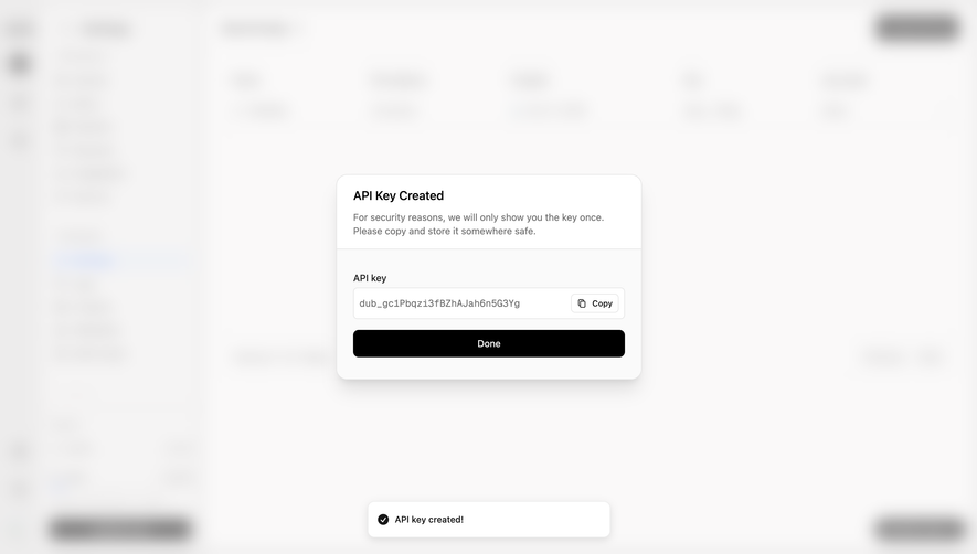
- **Priority:** Create API key appears at upper right. Table columns organize Name, Permissions, Created, Key and Last used; two rows are visible.
- **Secondary:** Per-row overflow menus, record count and subdued pagination sit within the table. Usage meters and Upgrade plan anchor sidebar bottom.
### Typography
- **Family:** Neutral sans-serif; exact font is unverified.
- **Scale:** Estimated CSS heading 18px, table/navigation text 14px, metadata 12px and compact primary action 14px.
### Colors & surfaces
- **Sampled palette:** White #FFFFFF; sidebar #F5F5F5; outer gray #E5E5E5; black #000000; selected-row blue tint #E8EFF9; subtle fills #EBEBEB and #F8F8F8.
- **Contrast:** Blue identifies API Keys navigation; black primary/upgrade controls stand out against soft gray surfaces.
### Components
- **Table:** Rounded outlined container with a compact header, two data rows, large empty body and footer pagination.
- **Details:** Small key icons, masked token strings and three-dot row menus; no full secret values are exposed in the captured table.
- **Geometry:** Estimated 12px pane/table radii, 40–44px row heights and 36px action height. Complete setup pill sits at lower right.
### Visual rhythm
- **Spacing:** Compact navigation/table rows contrast with expansive unused table and page space.
### Responsive
- **Guidance:** Mobile is not shown. Collapse navigation and enable readable horizontal table scrolling or labeled stacked rows.
### Adaptation guidance
- **Transfer:** Preserve key-management hierarchy, masked credentials and clear creation action. Adapt permissions and usage details to the target developer settings.
Use this context to reproduce the reference's visual language: layout, typography, colors, spacing, borders, radii, and distinctive elements. The screenshot takes priority if descriptions conflict.
## Direction
{{preferences.fidelityInstructions}}
## Output
{{output.instructions}}
Deliver a polished, cohesive design with precise alignment, hierarchy, and spacing. Produce the requested visual artifact, not just a description. If unsupported, explain the limitation.