
Thank you! Your submission has been received!
Oops! Something went wrong while submitting the form.
Get SaaSFrame Pro
Monthly
$18
Quarterly
$48
Yearly
$180
Upgrade to access this feature
Browse all screens & flows
Filter and search screens & flows
Access Figma files
Access mobile versions
Bookmark screens & flows
Join now
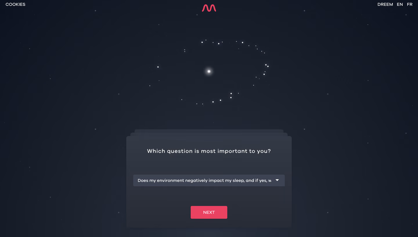
Dreem My Sleep Profile

Dreem
Sleep, finally.
Designed by
No items found.

Bookmark
Bookmark

Design with AI
Thank you! Your submission has been received!
Oops! Something went wrong while submitting the form.
# Design from Reference: Dreem My Sleep Profile
Create an original, high-fidelity visual design inspired by the reference. Prioritize composition, typography, colors, spacing, and component styling over technical implementation.
## Reference
- **Product:** Dreem
- **Category:** Free Side Product
- **Screenshot:** https://cdn.prod.website-files.com/5e9dc792e1210c5325f7ebbc/6acbc77ea4008ddb74793522_6acbc5e1a4008ddb747881d0_cms-c1d44a7c30e262ed38e8ddc6.webp
Analyze the screenshot first. If inaccessible, request it rather than guessing.
## Content
{{content.instructions}}
{{content.data}}
Preserve essential messaging and factual accuracy. Adapt structure and copy length for visual balance; never invent product claims.
## Visual Design
### Overall aesthetic
- **Character:** A nighttime-themed questionnaire places a stacked dark card over a full-screen star field.
- **Mood:** Soft glows, a constellation-like cluster and a coral brand/action accent create an atmospheric, calm interface.
### Page composition
- **Capture:** The source measures 1440 × 817 image pixels. Observed dimensions below approximate CSS only under an unverified 1× capture assumption.
- **Header anchors:** Cookies sits at the upper left, a coral wave-like brand symbol is centered, and site/language links align at the upper right.
- **Upper visual:** A loose circular cluster of bright stars surrounds a central glow above the questionnaire.
- **Question card:** A roughly 570 × 315 px panel is centered horizontally in the lower half, with two offset card silhouettes peeking above it.
- **Content stack:** A centered question, wide populated select and small coral Next button form the panel's vertical sequence.
### Information hierarchy
- **Question:** The centered prompt is the principal text element, with modestly expanded tracking.
- **Answer:** A single selected option appears in the wide dropdown; its long text is visibly clipped before the right-side caret.
- **Progress action:** The coral Next button stands apart from the dark panel as the primary control.
- **Atmospheric focus:** The brighter star cluster provides a secondary focal point above the form without adding text.
### Typography
- **Family:** A geometric-looking sans serif appears throughout; exact identity is unverified.
- **Prompt:** Approximately 18–20 px, medium weight, with expanded letter spacing.
- **Select:** Approximately 15–16 px white text, left aligned within the field.
- **Utilities and action:** Small uppercase labels are approximately 14 px; the Next button uses centered white text.
### Colors & surfaces
- **Measured background:** ICC-aware sRGB sampling yields dark navy tones #161B28, #171C29, #181D2A and #191E2B.
- **Layering:** The card and select use lighter charcoal/navy surfaces, visibly separated from the star field.
- **Highlights:** White and pale blue-gray star pixels provide pinpoint contrast and soft halos.
- **Accent:** Coral pink marks the centered brand symbol and rectangular Next action.
### Components
- **Stacked panel:** The main rounded rectangle has approximately 8 px corners; two narrow offset panels above imply a sequence of questionnaire cards.
- **Dropdown:** A roughly 520 × 40 px observed control uses a lighter slate fill, subtle rounding and a small white downward caret.
- **Next button:** Approximately 126 × 44 px, coral-filled, with small corners and generous separation from the dropdown.
- **Star field:** Many tiny dim points fill the canvas, while a small number of brighter points and blurred glows form the upper central cluster.
- **Header utilities:** Compact text links remain close to the viewport edges with no visible enclosing navigation bar.
### Visual rhythm
- **Vertical balance:** The illustration occupies the upper half and the form the lower half, connected by a generous dark gap.
- **Panel spacing:** The question, select and button have broad vertical intervals, keeping the single-field task uncluttered.
- **Centering:** Brand symbol, constellation glow, prompt and action share a central axis.
- **Depth cues:** Offset card edges and subtle tonal gradients provide depth without heavy borders.
### Responsive
- **Evidence boundary:** Only one desktop state is shown; responsive behaviors are recommendations.
- **Fluid panel:** Reduce side margins and let the questionnaire fit mobile width while preserving readable padding.
- **Answer readability:** Allow long selected options to wrap or expose their full text accessibly rather than relying on clipping.
- **Short screens:** Reduce decorative star-cluster height so the question and Next action remain reachable.
### Adaptation guidance
- **Atmospheric questionnaire:** Reuse the dark star field and stacked-card metaphor for a focused sequence of reflective questions.
- **Control clarity:** Maintain strong contrast between field, panel and backdrop, with clear focus and expanded-select states.
- **Motion boundaries:** Any star or card animation would be an implementation choice; no animation is verified by this still image.
- **Content scope:** Treat the selected sleep-related question as displayed interface content, without inferring health findings or advice.
- **Scale validation:** Confirm the assumed 1× capture scale before implementing CSS dimensions.
Use this context to reproduce the reference's visual language: layout, typography, colors, spacing, borders, radii, and distinctive elements. The screenshot takes priority if descriptions conflict.
## Direction
{{preferences.fidelityInstructions}}
## Output
{{output.instructions}}
Deliver a polished, cohesive design with precise alignment, hierarchy, and spacing. Produce the requested visual artifact, not just a description. If unsupported, explain the limitation.


Category
Patterns
No items found.
Tech Stack
No items found.
Added on
February 4, 2023
Similar screens



Upgrade to SaaSFrame Pro now to see similar examples.
Monthly
$18 /month
Billed $18 monthly
Browse all screens & flows
Filter and search screens & flows
Search text in screenshots
Access Figma files
Access mobile versions
Join now
Quarterly
$16 /month
Billed $48 quarterly
Browse all screens & flows
Filter and search screens & flows
Search text in screenshots
Access Figma files
Access mobile versions
Join now
Yearly
$15 /month
Billed $180 yearly
Browse all screens & flows
Filter and search screens & flows
Search text in screenshots
Access Figma files
Access mobile versions
Join now