Design with AI
Generate a new design based on this screen using your own content.
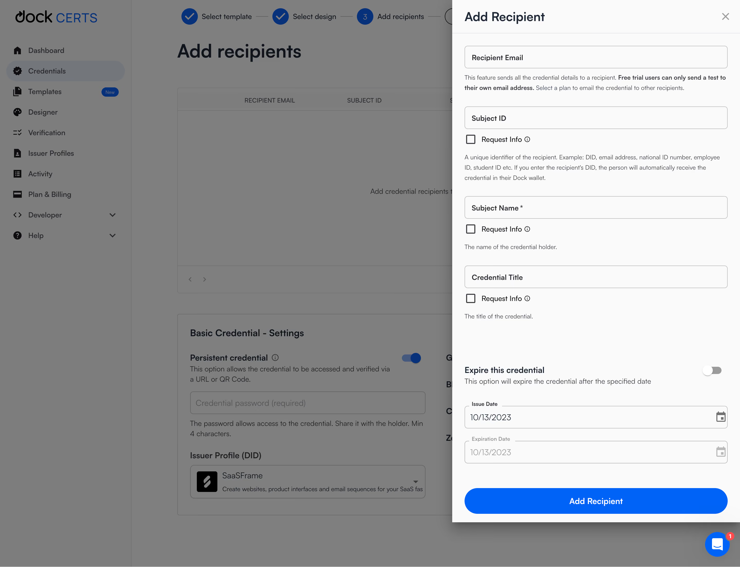
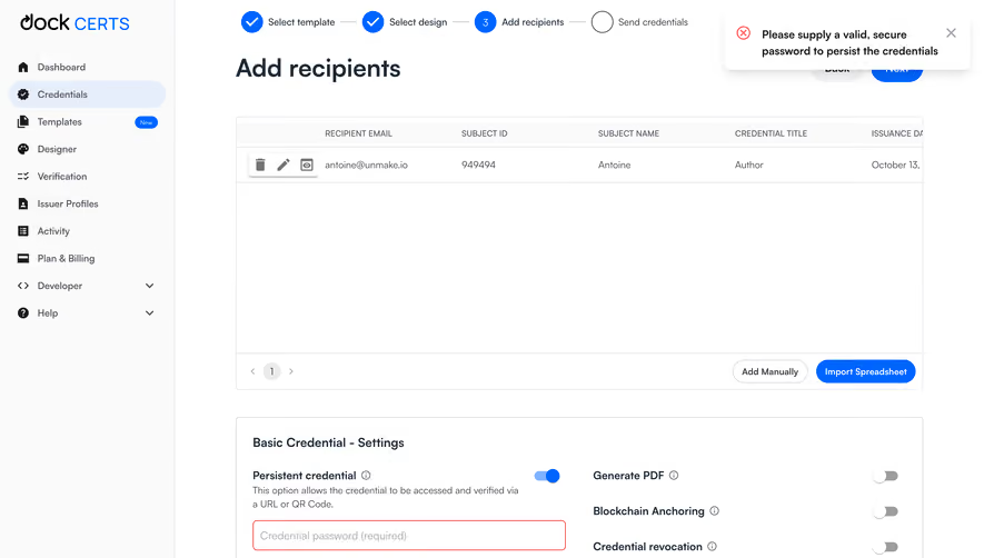
# Design from Reference: Dock Add Credential Recipiend
Create an original, high-fidelity visual design inspired by the reference. Prioritize composition, typography, colors, spacing, and component styling over technical implementation.
## Reference
- **Product:** Dock
- **Category:** Add & Edit
- **Screenshot:** https://cdn.prod.website-files.com/5e9dc792e1210c5325f7ebbc/6acad969bd9ce0e960551e5f_6acad8e29918fda16bb19c60_cms-6988d9c2a1e6f03028b89b07.webp
Analyze the screenshot first. If inaccessible, request it rather than guessing.
## Content
{{content.instructions}}
{{content.data}}
Preserve essential messaging and factual accuracy. Adapt structure and copy length for visual balance; never invent product claims.
## Visual Design
### Overall aesthetic
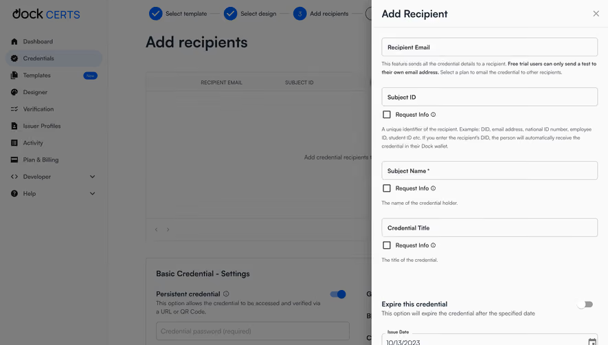
- **Character:** Neutral credential-management workspace with a bright right-side recipient drawer, dimmed background and saturated blue actions.
- **Evidence and scale:** Screenshot measures 2880 × 2206 image pixels. Dimensions estimate a 1440px CSS canvas at 2× capture scale; DPR and exact font family are unverified.
### Page composition
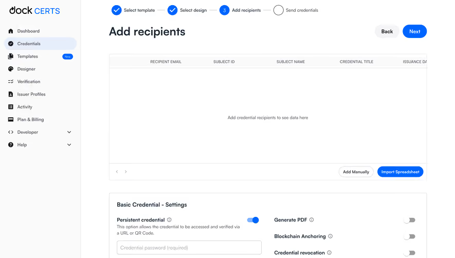
- **Background workspace:** Left navigation, a multi-step credential flow, recipient table and credential-settings panel remain visible beneath a gray overlay.
- **Drawer:** A roughly 560px CSS-wide panel attaches to the right edge, with title/close header, vertically stacked fields and a full-width action near the bottom.
- **Form sequence:** Recipient email, subject identifier, required subject name and credential title appear before expiration/date controls.
- **Support:** Blue chat circle and notification badge sit at the bottom-right outside the form's content stack.
### Information hierarchy
- **Current task:** Add Recipient title and bright drawer surface clearly supersede the dimmed workflow.
- **Field guidance:** Each identity field has helper text; several include Request Info checkboxes and information icons.
- **Conditional dates:** Expiration toggle appears off, issue date populated and expiration date pale/inactive-looking.
- **Primary action:** Large blue Add Recipient pill anchors the drawer; no successful recipient addition is shown.
### Typography
- **Drawer title:** Approximately 24px CSS semibold sans-serif.
- **Field roles:** Input labels around 14px medium; helper copy around 12px with 20px leading.
- **Section/action:** Expiration label around 16px semibold; primary action around 16px medium.
- **Background:** Large workflow heading around 36px and compact navigation around 14px. Exact font family and computed weights remain unverified.
### Colors & surfaces
- **Measured overlay:** Gray #7F7F7F and #7D7D7D dominate the dimmed background.
- **Measured drawer:** Near-white #FAFAFA fills the active panel.
- **Measured action:** Blue #0064FF fills primary action and other active marks; dark #003280 appears in dimmed blue details.
- **Text:** Slate/dark-gray headings, muted helper copy and fine gray input borders create a restrained form hierarchy.
### Components
- **Drawer shell:** Straight right-edge panel with a strong soft left/bottom shadow; header has thin separator and gray close glyph.
- **Fields:** Approximately 510 × 44px CSS, fine gray outline, radius near 5px and internal bold labels/placeholders.
- **Request controls:** Small outlined square checkboxes with adjacent label and circular information symbol.
- **Expiration block:** Right-aligned off toggle, explanatory line and two outlined date fields with calendar icons; expiration field is visibly lighter.
- **Primary action:** Approximately 510 × 50px blue pill, white centered label.
- **Background workflow:** Blue completed-step circles and current numbered step sit above the dimmed recipient table; settings include a visible on toggle and issuer selector.
### Visual rhythm
- **Drawer padding:** Roughly 24px horizontal inset aligns fields, helper text and action.
- **Form grouping:** Larger 28–36px gaps separate identity fields; checkbox/helper stacks remain close to their field.
- **Conditional region:** A broad break before expiration controls separates credential validity from identity information.
- **Depth:** Dimmed background and drawer shadow establish a clear foreground task without hiding workflow context.
### Responsive
- **Observed limit:** Desktop drawer only; validation, toggling, date picking and recipient addition are unobserved.
- **Recommended layout:** Make the drawer full-screen on phones with a reachable close/back route and scrollable form.
- **Recommended controls:** Preserve labels/helper associations, wrap guidance naturally and keep the final action visible without obscuring fields.
- **Recommended dates:** Ensure conditional disabled states are explicit beyond pale color alone.
### Adaptation guidance
- **Preserve context:** Use a side drawer for focused data entry while retaining the underlying workflow visually.
- **Keep grouping clear:** Separate identity fields, optional request-information choices and validity dates.
- **Implementation:** Provide accessible labels, checkbox/toggle semantics, focus trapping and validation. Trial restrictions and credential behavior shown in helper copy require separate verification; the screenshot is not authorization to send credentials.
Use this context to reproduce the reference's visual language: layout, typography, colors, spacing, borders, radii, and distinctive elements. The screenshot takes priority if descriptions conflict.
## Direction
{{preferences.fidelityInstructions}}
## Output
{{output.instructions}}
Deliver a polished, cohesive design with precise alignment, hierarchy, and spacing. Produce the requested visual artifact, not just a description. If unsupported, explain the limitation.