Overall Style and Aesthetic
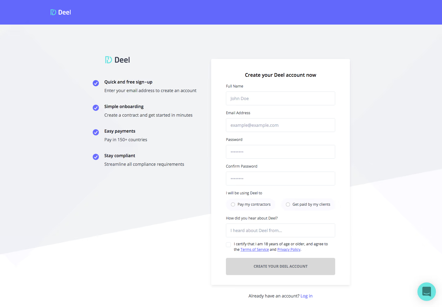
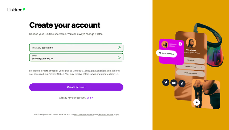
Deel’s signup page embodies a modern, minimalist approach, designed to evoke professionalism and trust. Clean whitespace and well-aligned containers keep attention on the signup process, while subtle geometric backgrounds inject a sense of structure and clarity. The tone is quietly confident—every detail, from concise microcopy to gentle hover effects, reinforces reliability and cutting-edge sophistication. Layout and Structure
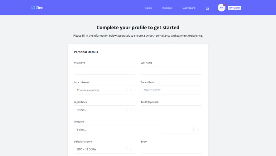
The page’s structure is focused and linear, prioritizing conversion. The top header features a compact navigation with brand logo, leading directly to a prominent signup form occupying center stage. Auxiliary actions for login and help are smartly tucked in the navigation bar. Supporting visual cues—progress indicators and concise instructions—guide users calmly through each step, minimizing distractions and cognitive load. Visual Elements
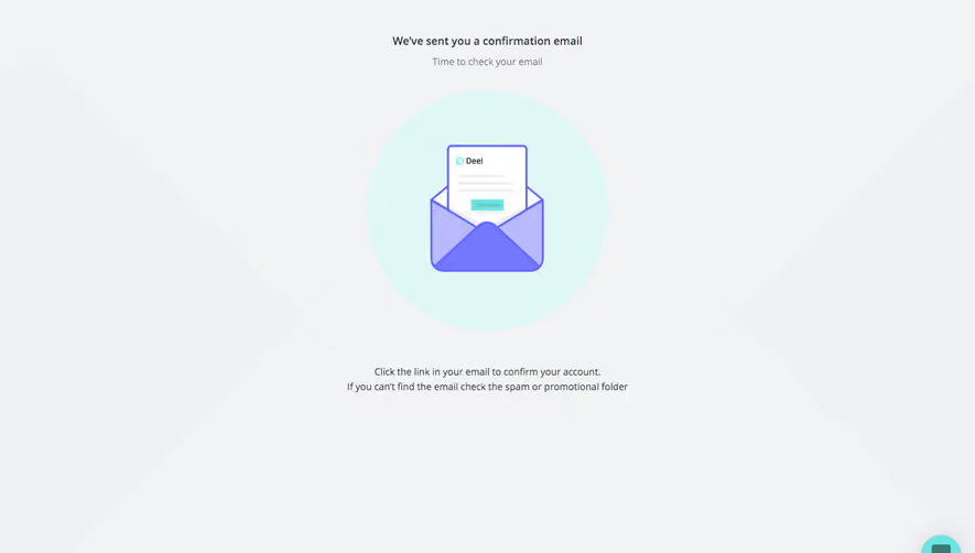
Visual accents are delicate yet purposeful. Illustrations are abstract, relying on linework and simplified forms to soften the experience without overwhelming users. Micro-animations enliven buttons and form fields, offering tactile feedback. Iconography throughout is crisp and line-based, aligning with the professional, international audience. Color Palette and Typography
The palette spotlights Deel’s signature blue for prominent call-to-actions, interspersed with muted grays and subtle gradients to create depth and focus. Ample white space keeps the interface breathable. Typography is sans-serif, favoring readability and hierarchy—bold weights for headings, regular for form labels and guidance, ensuring clarity for all users. User Experience Patterns
Navigation is minimalist, with key actions (Sign up, Log in, Support) highlighted for immediate access. The form streamlines entry, progressively revealing fields based on user type. Call-to-action buttons are large and visually distinct. Feedback is immediate and unambiguous, reinforcing user confidence at every step. Unique or Notable Design Choices
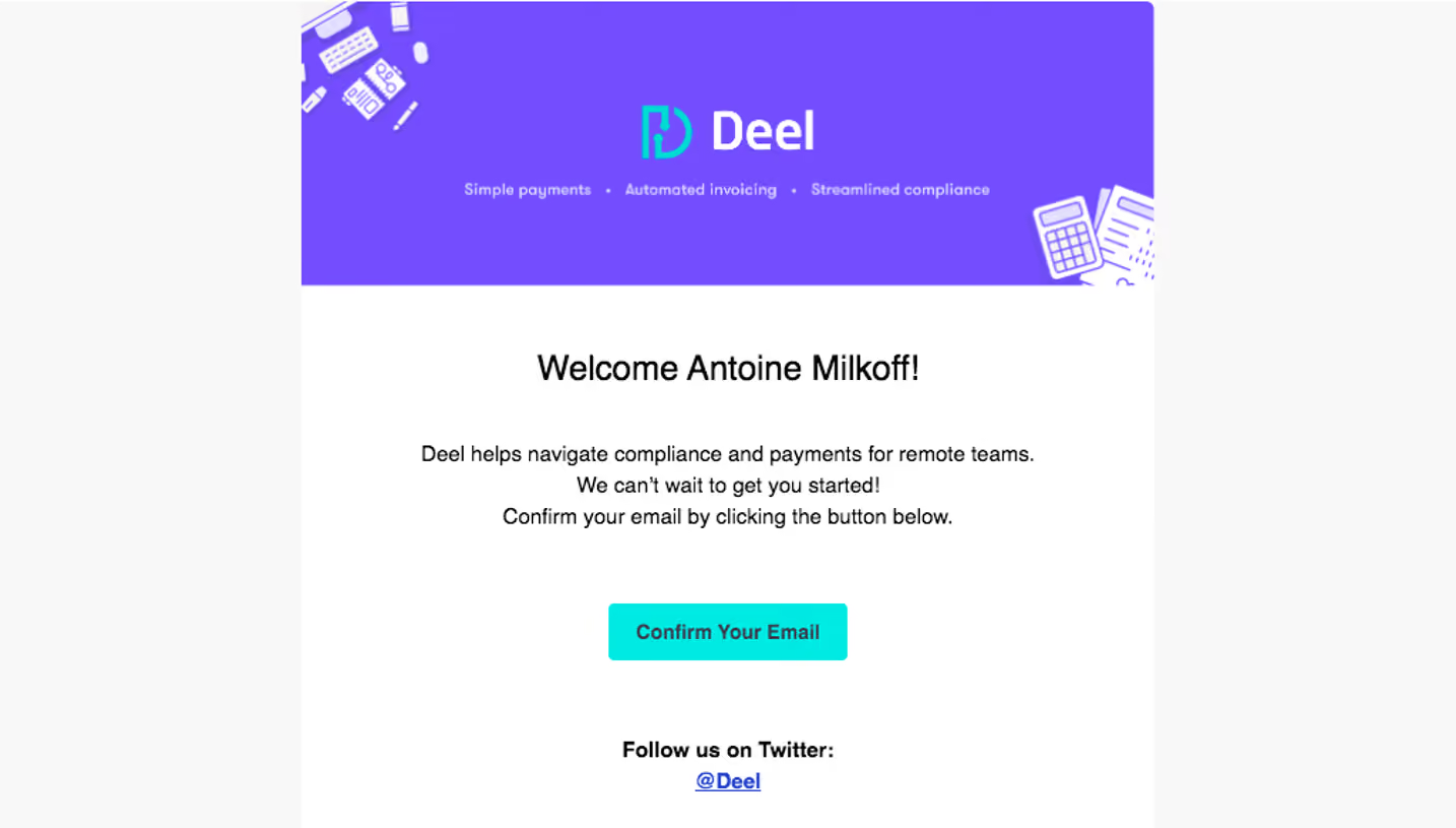
Notably, Deel’s signup experience is fine-tuned for both desktop and mobile, with responsive layouts and touch-friendly targets. The overall feel is global and inclusive, using visuals and copy tailored for a diverse SaaS audience. The experience stands out for its seamless balance between operational efficiency and a welcoming, human tone.