Design with AI
Generate a new design based on this screen using your own content.
# Design from Reference: Cycle Onboarding Email
Create an original, high-fidelity visual design inspired by the reference. Prioritize composition, typography, colors, spacing, and component styling over technical implementation.
## Reference
- **Product:** Cycle
- **Category:** Onboarding Email
- **Screenshot:** https://cdn.prod.website-files.com/5e9dc792e1210c5325f7ebbc/6acb6adabf2e69a0c03b6a04_6acb6a01b8517e813b435a59_cms-86ad6c7ba14b6adad0bb7838.webp
Analyze the screenshot first. If inaccessible, request it rather than guessing.
## Content
{{content.instructions}}
{{content.data}}
Preserve essential messaging and factual accuracy. Adapt structure and copy length for visual balance; never invent product claims.
## Visual Design
### Overall aesthetic
- **Character:** A practical educational onboarding email with conversational copy, large product captures and a vivid blue return action.
- **Focus:** The Inbox feature is explained through examples, short bullets and a highlighted keyboard-shortcut image.
### Page composition
- **Capture:** The source measures 2176 × 2748 image pixels; both readable crops were inspected after proportional reduction. Email CSS scale is unverified.
- **Frame:** A centered white column sits on a very pale gray canvas, with generous inner side padding.
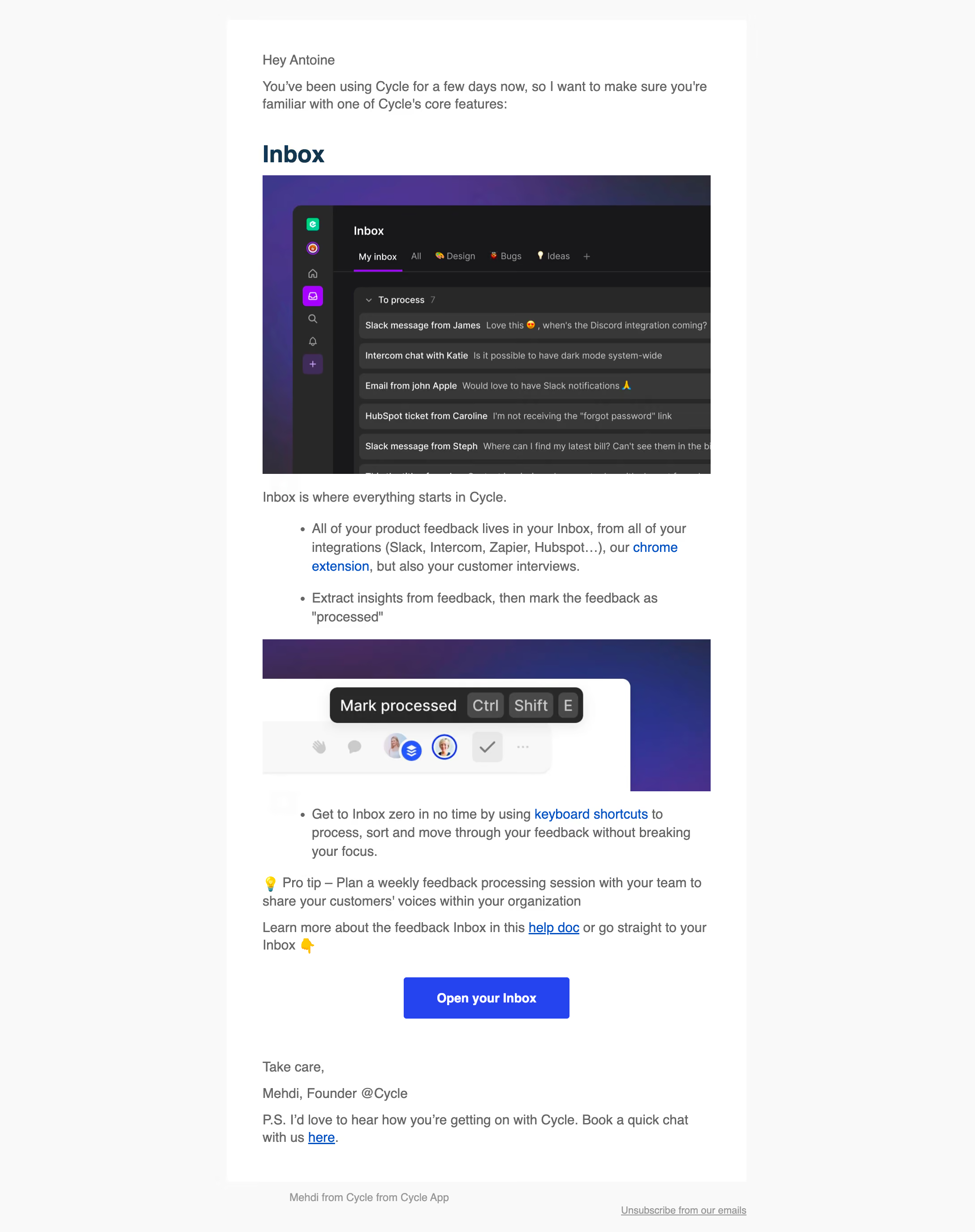
- **Opening:** Greeting and short introduction precede a large Inbox heading and dark interface screenshot.
- **Instruction:** A brief statement and two bullets lead into a second image showing a processing shortcut, followed by another bullet, pro tip and documentation link.
- **Closing:** A centered Open your Inbox button precedes sign-off, postscript chat link and a small external unsubscribe footer.
### Information hierarchy
- **Feature:** Inbox is the strongest email heading.
- **Explanation:** Bullets describe gathering feedback, extracting insights and processing items; inline blue links support extension/shortcut/help resources.
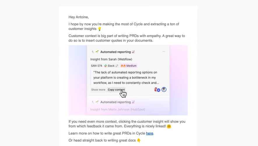
- **Visual proof:** The first image shows the inbox list; the second focuses on a “Mark processed” tooltip and keycaps.
- **Primary action:** Open your Inbox is the only filled email CTA; the postscript's chat link remains secondary.
### Typography
- **Family:** A conventional sans serif is visible; exact identity is unverified.
- **Observed scale:** In the 1400-pixel-wide reading crop, body text is around 20 pixels with 27-pixel line height, and Inbox is around 34 pixels, bold. These are reduced-image measurements, not CSS sizes.
- **Emphasis:** Pro-tip labeling, bullets and blue links organize the body without many heading levels.
- **Action/footer:** CTA text is bold and white; the footer is smaller and muted.
### Colors & surfaces
- **Measured palette:** ICC-aware sRGB sampling yields canvas #F9F9F9, white #FFFFFF, dark screenshot tones #383838/#18181A/#282828 and body gray #666666.
- **Action:** Sampled blue #2544F0 appears in the primary-action family.
- **Image accents:** Purple/blue gradients frame the product imagery, with small colorful integration/status details.
- **Treatment:** The email frame is flat and rectangular, with no prominent outer border or shadow.
### Components
- **Inbox image:** A dark application view includes an icon rail, category tabs and stacked feedback rows, with a purple active underline.
- **Shortcut image:** A cropped toolbar and dark tooltip show a processing command with boxed keyboard keys.
- **Instruction blocks:** Standard bullet lists, a lightbulb pro tip and inline documentation links keep the content text-led.
- **CTA:** A blue rectangular button centers beneath the final instruction.
- **Footer:** Sender context sits left and an underlined unsubscribe link right outside the white message column.
### Visual rhythm
- **Spacing:** Large images alternate with compact prose/list groups; broad gaps distinguish feature introduction, instructions and closing.
- **Alignment:** Copy and image edges share a consistent reading column, while the CTA centers.
- **Density:** The large dark screenshot creates the strongest contrast, balanced by white space and short paragraphs.
### Responsive
- **Recommendation:** Make the email fluid and scale screenshots proportionally, with linked full-size versions or descriptive alternative text.
- **Recommendation:** Preserve readable bullets and a large return action rather than shrinking the whole message. No mobile state is shown.
### Adaptation guidance
- **Preserve:** Retain one feature focus, concrete product imagery and a clear return-to-product action.
- **Implement:** Keep keyboard instructions in live text where essential, rather than relying only on embedded screenshots.
- **Privacy:** Use generic feedback examples and greeting details in reusable content.
Use this context to reproduce the reference's visual language: layout, typography, colors, spacing, borders, radii, and distinctive elements. The screenshot takes priority if descriptions conflict.
## Direction
{{preferences.fidelityInstructions}}
## Output
{{output.instructions}}
Deliver a polished, cohesive design with precise alignment, hierarchy, and spacing. Produce the requested visual artifact, not just a description. If unsupported, explain the limitation.