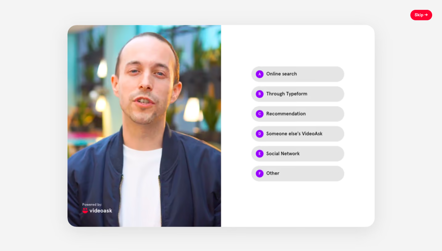
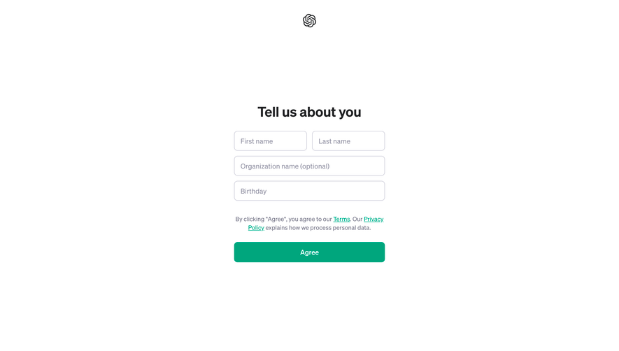
Generate a new design based on this screen using your own content.
Thank you! Your submission has been received!
Oops! Something went wrong while submitting the form.
# Design from Reference: Customer.io Account Setup
Create an original, high-fidelity visual design inspired by the reference. Prioritize composition, typography, colors, spacing, and component styling over technical implementation.
## Reference
- **Product:** Customer.io
- **Category:** Account Setup
- **Screenshot:** https://cdn.prod.website-files.com/5e9dc792e1210c5325f7ebbc/6acad472886583e9d96b708a_6acad37d50cf4647822ccbd7_cms-6a40577e2447c942e2212435.webp
Analyze the screenshot first. If inaccessible, request it rather than guessing.
## Content
{{content.instructions}}
{{content.data}}
Preserve essential messaging and factual accuracy. Adapt structure and copy length for visual balance; never invent product claims.
## Visual Design
Use this context to reproduce the reference's visual language: layout, typography, colors, spacing, borders, radii, and distinctive elements. The screenshot takes priority if descriptions conflict.
## Direction
{{preferences.fidelityInstructions}}
## Output
{{output.instructions}}
Deliver a polished, cohesive design with precise alignment, hierarchy, and spacing. Produce the requested visual artifact, not just a description. If unsupported, explain the limitation.
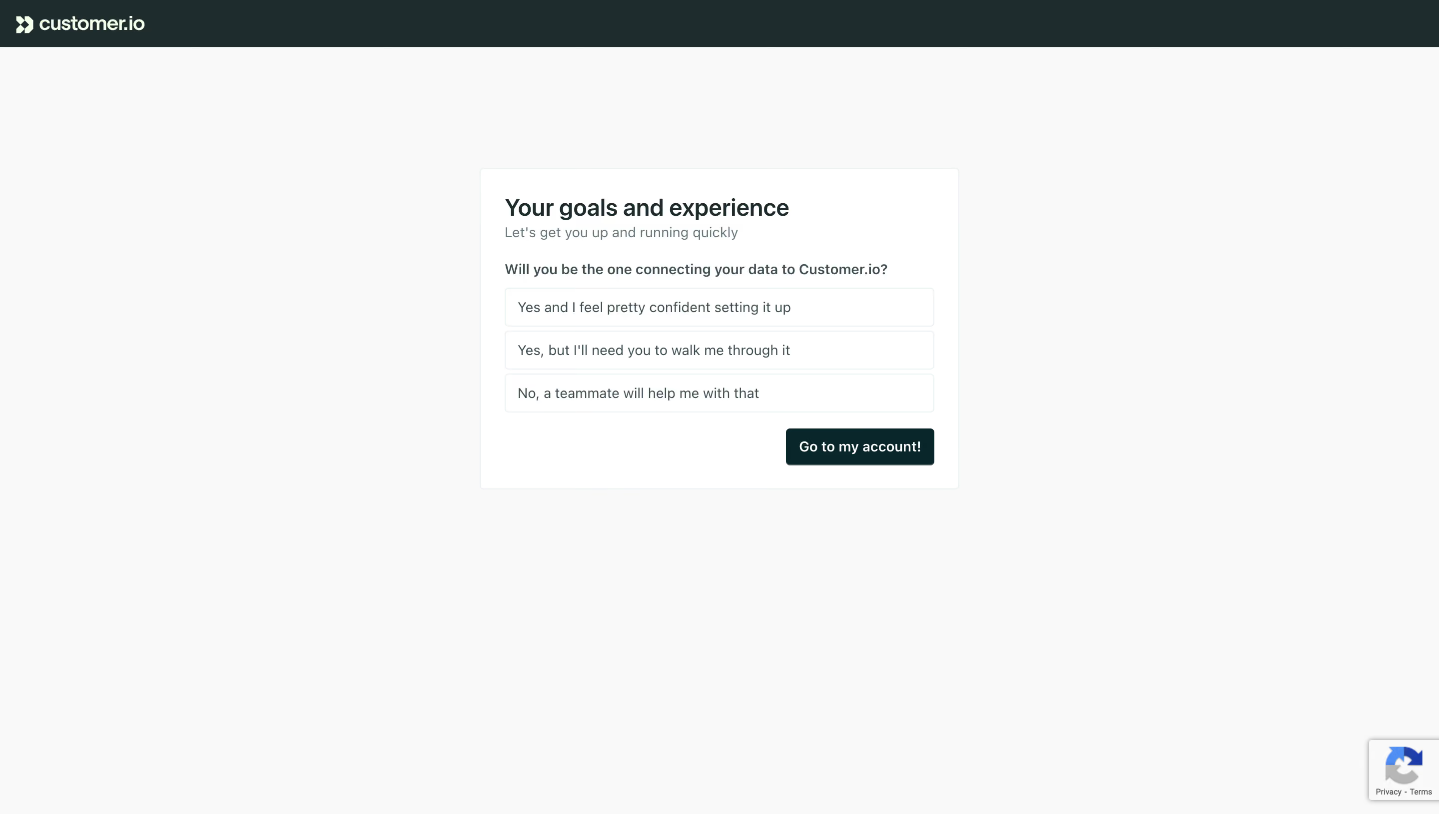
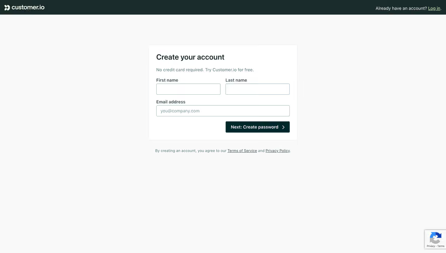
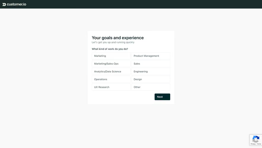
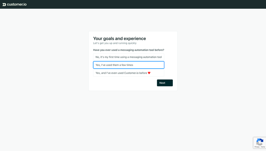
Customer.io keeps their onboarding quiz dead simple. One question, three radio-style options, a single CTA. That's it. No progress bar, no sidebar nav, no distractions. The card sits centered on a light gray background with tons of breathing room, which makes the whole thing feel calm and low-pressure.
Typography That Does the Heavy Lifting
The hierarchy here is tight. Bold heading, a softer gray subline underneath, then the question in a slightly smaller weight. The answer options are plain white rounded rectangles with clean type. Nothing fancy, but it reads instantly. You know exactly what to do the second this loads.
What Makes It Stand Out
That dark teal "Go to my account!" button anchored to the bottom right is the only real pop of color on the entire page. It pulls your eye right where it needs to go. The copy on the options feels human too. "Yes, but I'll need you to walk me through it" is honest and relatable. Small detail but it builds trust early. The dark top nav with the white logo grounds everything without competing for attention.