Design with AI
Generate a new design based on this screen using your own content.
# Design from Reference: Crisp Onboarding Emails
Create an original, high-fidelity visual design inspired by the reference. Prioritize composition, typography, colors, spacing, and component styling over technical implementation.
## Reference
- **Product:** Crisp
- **Category:** Onboarding Email
- **Screenshot:** https://cdn.prod.website-files.com/5e9dc792e1210c5325f7ebbc/6acbc137b7ca13cf70095a7e_6acbc02d405d8e0fbc3a3d80_cms-ae04cf39e27cf597a67f67c1.webp
Analyze the screenshot first. If inaccessible, request it rather than guessing.
## Content
{{content.instructions}}
{{content.data}}
Preserve essential messaging and factual accuracy. Adapt structure and copy length for visual balance; never invent product claims.
## Visual Design
### Overall aesthetic
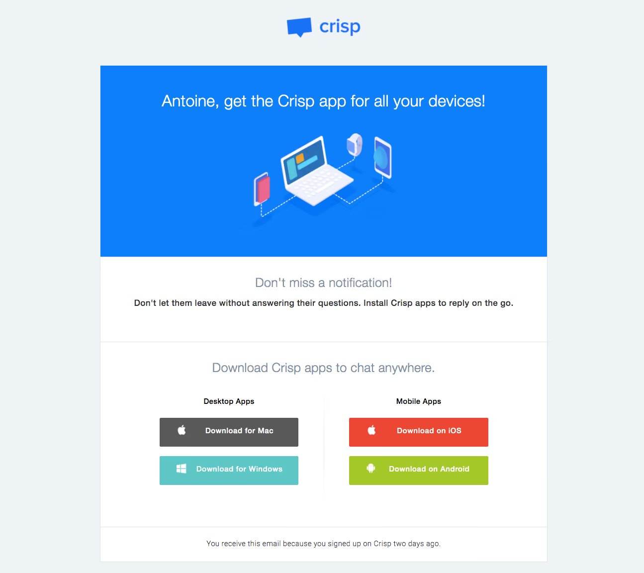
- **Character:** A bright onboarding email encouraging app installation through a blue illustrated hero and clearly grouped platform downloads.
- **Tone:** Friendly and functional, with centered copy, simple rectangular sections and distinct colors for each platform action.
### Page composition
- **Capture:** The source is 1295 × 1152 image pixels. Measurements refer to image pixels; email CSS scale is unverified.
- **Frame:** An approximately 900-pixel-wide email panel is centered on pale blue-gray, with the Crisp logo above it.
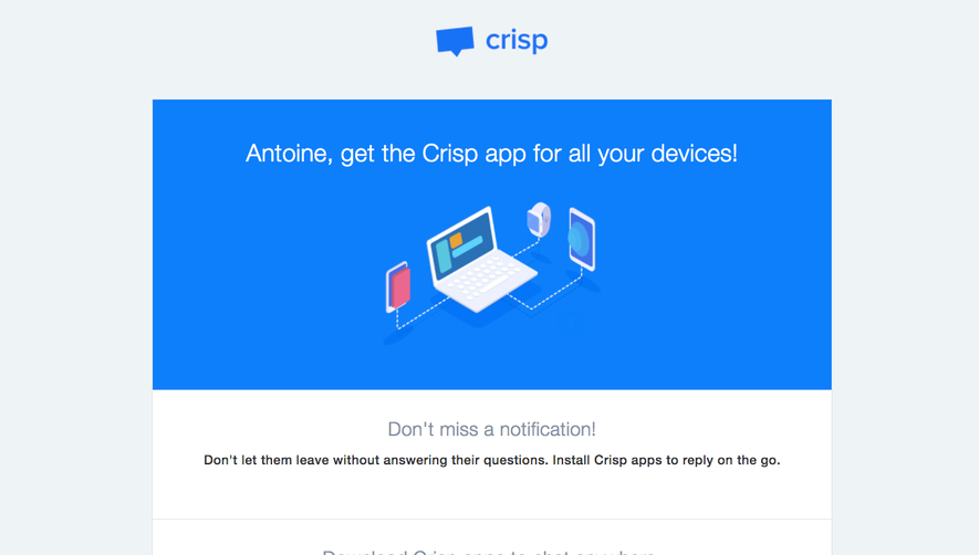
- **Hero:** A blue block around 385 pixels high contains a large one-line greeting/headline and a central device-network illustration.
- **Body:** A white message section precedes a ruled download section split into Desktop Apps and Mobile Apps columns. A narrow explanatory footer closes the panel.
### Information hierarchy
- **Opening:** The blue logo and white hero headline establish the brand and device-installation purpose.
- **Supporting copy:** A muted medium-size heading leads into a darker bold line about replying on the go.
- **Download hierarchy:** A centered section title precedes two platform groups, each with two large icon-and-label buttons.
- **Footer:** A small centered sentence explains why the email was received, separated by a thin rule.
### Typography
- **Family:** A conventional sans serif is visible; exact font identity is unverified.
- **Headings:** The hero line is approximately 32 image pixels, regular. White-section headings are around 25–26 pixels in muted gray-blue.
- **Body:** The supporting sentence is about 18 pixels and bold; platform group labels and button text are around 16 pixels, semibold.
- **Fine text:** The footer is around 15 pixels with a lighter weight.
### Colors & surfaces
- **Measured palette:** ICC-aware sRGB sampling yields #EEF3F6 for the canvas, #FFFFFF for body sections and #0D7FFB for the blue hero.
- **Button colors:** Sampled fills include gray #595959, teal #5EC7C5, red-orange #EA4833 and lime #A3C828.
- **Edges:** Thin light-gray rules and a fine panel outline separate white sections; corners are mostly square with only slight button rounding.
### Components
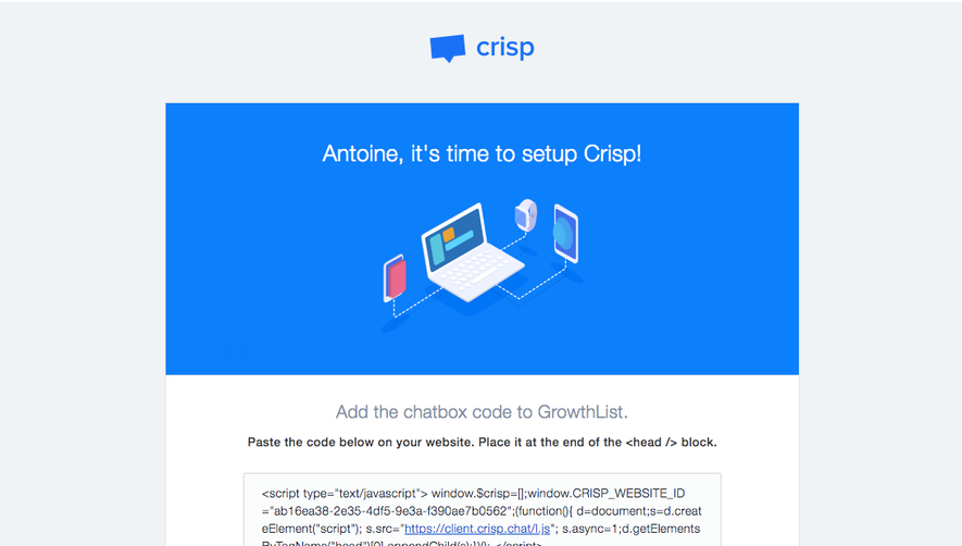
- **Illustration:** An isometric laptop connects by dotted paths to handheld devices and a watch, centered within the blue hero.
- **Download buttons:** Four approximately 280 × 58-pixel rectangles combine white platform icons and bold white labels.
- **Grouping:** Desktop Mac/Windows actions occupy the left column, iOS/Android the right, with a faint vertical divider between them.
- **Brand lockup:** A blue chat-bubble symbol and lowercase wordmark sit centered above the panel.
### Visual rhythm
- **Spacing:** Hero content has broad breathing room; the download area uses consistent button widths and roughly 19-pixel vertical gaps.
- **Alignment:** Headings are centered, while paired action columns create balanced symmetry.
- **Section cadence:** Strong blue gives way to three quieter white bands separated by hairline rules.
### Responsive
- **Recommendation:** Make the panel fluid and allow the hero headline to wrap without reducing text excessively.
- **Recommendation:** Stack desktop and mobile groups on phones, retaining full-width tap targets and their labels. No mobile rendering is visible.
### Adaptation guidance
- **Preserve:** Keep the device illustration, platform grouping and icon-plus-text download buttons.
- **Implement:** Use platform-specific links with accessible names and provide useful illustration alternative text.
- **Clarity:** Maintain distinct group labels so button colors are supplementary rather than the only platform cue.
Use this context to reproduce the reference's visual language: layout, typography, colors, spacing, borders, radii, and distinctive elements. The screenshot takes priority if descriptions conflict.
## Direction
{{preferences.fidelityInstructions}}
## Output
{{output.instructions}}
Deliver a polished, cohesive design with precise alignment, hierarchy, and spacing. Produce the requested visual artifact, not just a description. If unsupported, explain the limitation.