Generate a new design based on this screen using your own content.
Thank you! Your submission has been received!
Oops! Something went wrong while submitting the form.
# Design from Reference: Crisp Download Page
Create an original, high-fidelity visual design inspired by the reference. Prioritize composition, typography, colors, spacing, and component styling over technical implementation.
## Reference
- **Product:** Crisp
- **Category:** Download Page
- **Screenshot:** https://cdn.prod.website-files.com/5e9dc792e1210c5325f7ebbc/6acad45c886583e9d96b6e05_6acad303c5142fbf89235f34_cms-f14bbb676c7059181bf93227.webp
Analyze the screenshot first. If inaccessible, request it rather than guessing.
## Content
{{content.instructions}}
{{content.data}}
Preserve essential messaging and factual accuracy. Adapt structure and copy length for visual balance; never invent product claims.
## Visual Design
Use this context to reproduce the reference's visual language: layout, typography, colors, spacing, borders, radii, and distinctive elements. The screenshot takes priority if descriptions conflict.
## Direction
{{preferences.fidelityInstructions}}
## Output
{{output.instructions}}
Deliver a polished, cohesive design with precise alignment, hierarchy, and spacing. Produce the requested visual artifact, not just a description. If unsupported, explain the limitation.
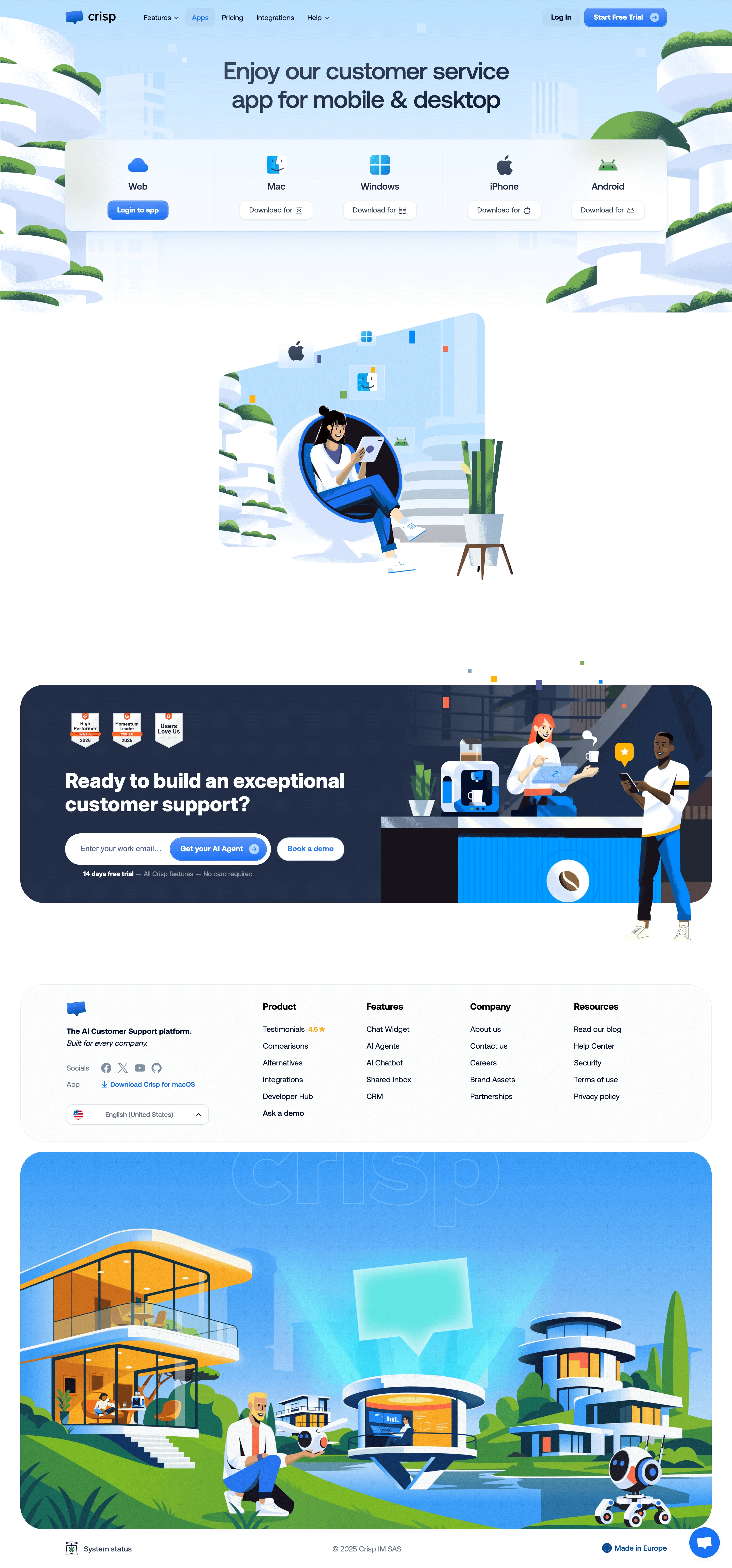
Crisp’s Apps page delivers a fresh, modern visual experience rooted in a playful professionalism. The interface is clean and inviting, balanced by abundant white space and a soft, approachable color palette. The design leans into minimalism without feeling austere, thanks to expressive illustrations and pops of vibrant accent hues.
Layout and Structure
The page structure is highly intuitive and flows seamlessly. An uncluttered hero section quickly states the page’s purpose, leading into a clear grid of app integrations. Each app is visually separated with ample padding and rounded cards, and smart grouping makes for quick scanning. There's no heavy reliance on traditional feature blocks or lengthy copy—brevity wins, matched with clear navigation and a persistent call-to-action button.
Visual Elements
A showcase of custom illustrations, playful mascots, and colorful icons inject personality and guide the eye. Hover animations and card lift effects add interactivity, enhancing discoverability without distraction. Logo-driven cards for each integration reinforce brand recognition, while gentle transitions keep engagement seamless.
Color Palette and Typography
A calm sky-blue sets the tone, supported by bright accent colors for app categories and calls-to-action. Crisp employs a modern sans-serif typeface that’s easy to read, with consistent font weights organizing hierarchy: bold for headings, regular for descriptions, and lighter treatments for secondary details.
User Experience Patterns
Effortless UX shines through sticky navigation and concise CTAs. The search/filter bar enables quick exploration, optimizing discoverability. Micro-interactions—such as subtle hover effects and responsive card animations—create tactile feedback, while the footer succinctly wraps up with navigation and trust elements.
Unique or Notable Design Choices
Crisp’s blend of whimsical illustrations and brand-color logic for integration cards adds memorable character. The page avoids overload by using visual cues, grid uniformity, and clever animation for a dynamic but digestible experience—setting a high bar for SaaS inspiration in both utility and delight.