Design with AI
Generate a new design based on this screen using your own content.
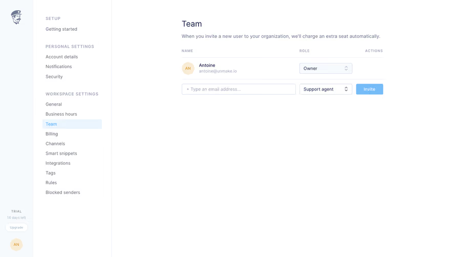
# Design from Reference: Crew Invite Team Members
Create an original, high-fidelity visual design inspired by the reference. Prioritize composition, typography, colors, spacing, and component styling over technical implementation.
## Reference
- **Product:** Crew
- **Category:** Team Members
- **Screenshot:** https://cdn.prod.website-files.com/5e9dc792e1210c5325f7ebbc/6acbbda3d6be908889c4e63f_6acbbccfe04c53f33da0a829_cms-248fcac37abb6335d45389b1.webp
Analyze the screenshot first. If inaccessible, request it rather than guessing.
## Content
{{content.instructions}}
{{content.data}}
Preserve essential messaging and factual accuracy. Adapt structure and copy length for visual balance; never invent product claims.
## Visual Design
### Overall aesthetic
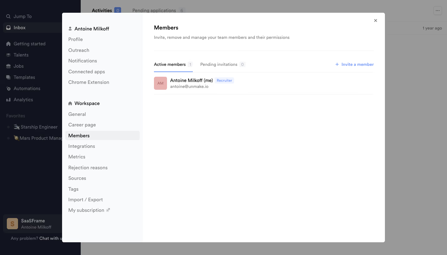
- **Style:** Minimal recruiting-workspace settings presented as a broad white modal over a dimmed dark-sidebar application.
- **Capture scale:** Source is 1440 × 821 pixels. Measurements refer to screenshot pixels; CSS/device scale is unverified.
### Page composition
- **Modal bounds:** The settings panel occupies approximately x200–1240 and y41–780: around 1040 × 739px with small 4–6px corners.
- **Settings navigation:** A roughly 260px pale-gray sidebar groups personal preferences above Workspace settings. The selected Members item is highlighted within that second group.
- **Main region:** The right content region begins near x496, has around 36px side padding, and uses only its upper section for the members header, tabs and a single member row; most of the panel remains empty.
### Information hierarchy
- **Heading:** Members is followed by a short gray explanation about inviting, removing and managing permissions; a horizontal rule separates this from the controls.
- **Navigation and action:** Active members with count 1 is selected; Pending invitations has count 0. A blue plus-prefixed Invite a member action sits at the far right of the same horizontal band.
- **Member identity:** One row combines initials avatar, name with a self indicator, email beneath and a small Recruiter badge. The outer workspace remains context rather than the main focus.
### Typography
- **Family:** Neutral sans-serif; exact font identity is unverified.
- **Hierarchy:** Screenshot estimates: section heading about 18px bold; navigation and member name 16px; description, tabs, email and invitation action about 14px; role badge about 12px.
- **Emphasis:** Selected navigation is dark and medium-weight. Secondary copy is gray; the invitation link and role badge use blue.
### Colors & surfaces
- **Sampled palette:** White #FFFFFF, pale settings surface #F9FAFB, near-black application sidebar #11131E and darker sidebar detail #1A1C25; light divider/selection samples include #EEF0F1 and #F1F1F1.
- **Scrim:** The large #999999 background sample comes from the dimmed application overlay, not the modal surface.
- **Accent use:** A soft pink initials avatar contrasts with restrained periwinkle-blue action text, active-tab underline and pale-blue role badge; these accent identities are visually observed rather than independently sampled here.
### Components
- **Settings groups:** Personal account name precedes six preference links; a separate Workspace heading precedes general, career page, members, integrations, metrics and additional administrative links.
- **Selected item:** The Members navigation row is approximately 240 × 30px with soft corners, pale-gray fill and dark label.
- **Member list:** A roughly 708px-wide row is bounded by fine horizontal rules. The initials tile is approximately 42px square with 5px corners; identity text stacks alongside it.
- **Tabs and close:** The selected tab has a thin blue bottom rule and small light count chip. A small gray close icon sits near the modal's upper-right edge; no invite form is open.
### Visual rhythm
- **Compact header:** Title, helper sentence, divider and tab band form a short sequence before the member row.
- **Whitespace:** The large blank list area keeps the single-member state calm; sidebar links repeat at roughly 34px intervals, with larger space separating personal and workspace groups.
### Responsive
- **Recommended adaptation:** Only a desktop modal is shown. Use full-screen settings on narrow screens, move the navigation to a compact menu and stack the invite action above the list when necessary.
- **Member row:** Allow the name/email block to shrink or wrap while keeping the role badge readable and a generous touch target for navigation.
### Adaptation guidance
- **Preserve:** Keep grouped settings navigation, a clear selected item, count-bearing tabs, an accessible invite action and a restrained member identity row.
- **Adapt:** Populate the list with actual people and roles. Let additional rows extend the existing divider rhythm; avoid filling the intentional empty area with decorative content.
Use this context to reproduce the reference's visual language: layout, typography, colors, spacing, borders, radii, and distinctive elements. The screenshot takes priority if descriptions conflict.
## Direction
{{preferences.fidelityInstructions}}
## Output
{{output.instructions}}
Deliver a polished, cohesive design with precise alignment, hierarchy, and spacing. Produce the requested visual artifact, not just a description. If unsupported, explain the limitation.