Design with AI
Generate a new design based on this screen using your own content.
# Design from Reference: Crew Create automation
Create an original, high-fidelity visual design inspired by the reference. Prioritize composition, typography, colors, spacing, and component styling over technical implementation.
## Reference
- **Product:** Crew
- **Category:** Flowchart
- **Screenshot:** https://cdn.prod.website-files.com/5e9dc792e1210c5325f7ebbc/6acbbda6d6be908889c4e6c3_6acbbcd9d01e3648476645c6_cms-3bc14a0caa1b2032d1217112.webp
Analyze the screenshot first. If inaccessible, request it rather than guessing.
## Content
{{content.instructions}}
{{content.data}}
Preserve essential messaging and factual accuracy. Adapt structure and copy length for visual balance; never invent product claims.
## Visual Design
### Overall aesthetic
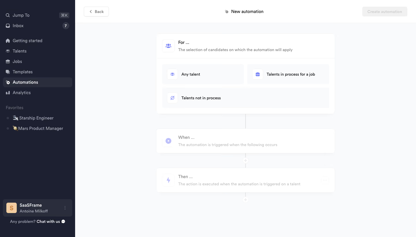
- **Character:** Light recruiting-automation builder with a dark sidebar and a simple vertical workflow.
### Page composition
- **Canvas:** 1440 × 821 screenshot px.
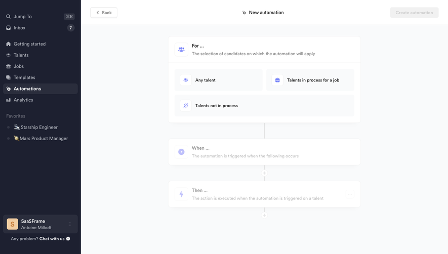
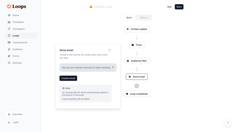
- **Structure:** Dark left navigation; white top bar with Back/title/disabled create action; pale canvas with For, When and Then cards linked vertically.
### Information hierarchy
- **Priority:** Expanded For card exposes three candidate-scope choices. Later trigger/action cards are faded until configuration progresses.
### Typography
- **Family:** Neutral sans serif, exact font unverified.
- **Scale:** Estimated screenshot stage title 16 px, body 14 px, navigation 15 px and helper 13 px.
### Colors & surfaces
- **Sampled palette:** Canvas #F9FAFB, white #FFFFFF, sidebar #1D2030, selected nav #2A2D3C and muted control #F1F1F1.
### Components
- **Workflow:** Rounded white cards with subtle shadow/border; three gray selection tiles and small lavender icons.
- **Connectors:** Thin vertical gray line and circular plus nodes; Then card has an overflow control.
- **Geometry:** Estimated screenshot stage width 620 px, 10 px radius, 20 px padding; sidebar approximately 260 px.
### Visual rhythm
- **Spacing:** Approximately 50 px between stages; expanded selection group is denser than the open surrounding canvas.
### Responsive
- **Observed:** Desktop only.
- **Adaptation:** Collapse navigation, fit stage cards to viewport and retain vertical sequence with clear disabled states.
### Adaptation guidance
- **Preserve:** Scope-trigger-action hierarchy and progressive configuration.
- **Replace:** Use actual candidate conditions and supported automation actions.
Use this context to reproduce the reference's visual language: layout, typography, colors, spacing, borders, radii, and distinctive elements. The screenshot takes priority if descriptions conflict.
## Direction
{{preferences.fidelityInstructions}}
## Output
{{output.instructions}}
Deliver a polished, cohesive design with precise alignment, hierarchy, and spacing. Produce the requested visual artifact, not just a description. If unsupported, explain the limitation.