
Thank you! Your submission has been received!
Oops! Something went wrong while submitting the form.
Get SaaSFrame Pro
Monthly
$18
Quarterly
$48
Yearly
$180
Upgrade to access this feature
Browse all screens & flows
Filter and search screens & flows
Access Figma files
Access mobile versions
Bookmark screens & flows
Join now
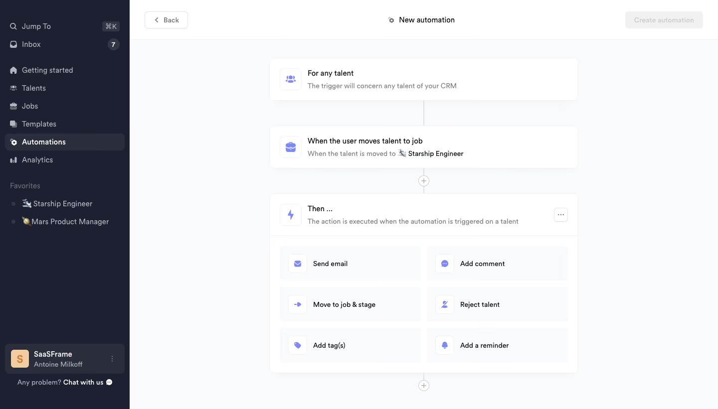
Crew Create automation

Crew
Recruiting CRM built for collaboration
Designed by
No items found.

Bookmark
Bookmark

Design with AI
Thank you! Your submission has been received!
Oops! Something went wrong while submitting the form.
# Design from Reference: Crew Create automation
Create an original, high-fidelity visual design inspired by the reference. Prioritize composition, typography, colors, spacing, and component styling over technical implementation.
## Reference
- **Product:** Crew
- **Category:** Flowchart
- **Screenshot:** https://cdn.prod.website-files.com/5e9dc792e1210c5325f7ebbc/6acbbda6d6be908889c4e6d2_6acbbcdba4008ddb7476724d_cms-b07f03427e7e6de5c30c9028.webp
Analyze the screenshot first. If inaccessible, request it rather than guessing.
## Content
{{content.instructions}}
{{content.data}}
Preserve essential messaging and factual accuracy. Adapt structure and copy length for visual balance; never invent product claims.
## Visual Design
### Overall aesthetic
- **Style:** Light workflow-automation builder inside a recruiting CRM, framed by a dark navy sidebar.
- **Character:** White rounded workflow cards, pale-gray canvas, small violet icons and compact neutral typography.
- **Surface treatment:** Subtle borders and shadows separate cards; fine vertical connector lines show sequence without a complex node canvas.
### Page composition
- **Capture dimensions:** 1440 × 821 image px. CSS reconstruction estimates assume an unverified 1× capture.
- **Sidebar:** Approximately 260 px wide, full height, with search/inbox at top, product navigation below, a favorites list and bottom workspace/support controls.
- **Header:** A roughly 80 px-high white strip contains Back at left, centered New automation title and a disabled-looking Create automation action at right.
- **Workflow column:** Approximately 620 px wide, centered in the remaining content region, beginning around x=540, y=116 px.
- **Scope card:** A short card with people icon, For any talent title and a one-line explanation starts the sequence.
- **Trigger card:** A second card follows after a vertical connector, showing a job-movement trigger and the selected job context.
- **Action block:** A larger Then card contains a heading/explanation row and six action options in two columns and three rows.
- **Connectors:** Small circular plus controls sit on the centerline between the trigger/action block and below the action block.
### Information hierarchy
- **Workflow hierarchy:** Scope, trigger and action appear in a clear top-to-bottom sequence.
- **Card titles:** Dark primary labels identify the configuration; muted descriptions explain their meaning.
- **Action choices:** Send email, Add comment, Move to job & stage, Reject talent, Add tag(s) and Add a reminder share equal option styling.
- **Navigation state:** Automations is the selected sidebar item, with brighter text and a slightly lighter dark row.
- **Captured state:** No action option is visibly selected. Create automation appears disabled; the screenshot does not establish the exact completion conditions.
### Typography
- **Family:** Compact neutral sans serif; exact font identity is unverified.
- **Header:** Approximately 14–16 px medium/semibold; the centered title remains understated.
- **Workflow titles:** Approximately 16 px medium weight with 22 px leading.
- **Descriptions:** Approximately 14 px with 20 px leading, regular weight and muted gray.
- **Action labels:** Approximately 14 px, regular to medium, aligned beside small icons.
- **Sidebar:** Approximately 14–16 px, with favorites and account metadata slightly smaller.
- **Measurement limit:** All values are visual CSS estimates under the assumed 1× scale.
### Colors & surfaces
- **Main canvas:** Sampled sRGB #F9FAFB supplies the pale-gray workflow background.
- **Cards/header:** Sampled #FFFFFF fills the workflow cards and top strip.
- **Sidebar:** Sampled #1D2030 provides the principal dark navy surface; #2A2D3C supplies a lighter selected/account-row reference.
- **Neutral details:** Sampled #F1F1F1 appears among muted controls and pale structural surfaces.
- **Secondary text:** Sampled #B2B5BD provides a light muted-gray reference among sidebar/details.
- **Accent:** Violet icons and symbols distinguish scope, trigger and action types. The exact violet value is not established by the dominant-color sample.
- **Account detail:** Sampled #F2CDA1 appears in the small workspace-avatar tile.
### Components
- **Workflow cards:** Approximately 620 px wide with 10–12 px radii, fine pale border and very soft shadow.
- **Scope/trigger rows:** Roughly 84 px high, about 20 px internal padding, with a rounded outlined icon tile around 44 px square.
- **Action container:** Approximately 620 × 360 px, with a header row separated from the option grid by a fine rule.
- **Action options:** Pale-gray rounded rectangles around 284 × 70 px, each with a small white icon tile and left-aligned label.
- **Overflow control:** Small outlined square with ellipsis at the action-header right.
- **Plus controls:** Small white outlined circles on the vertical connector, with centered gray plus symbols.
- **Back control:** Compact white outlined rectangle with left chevron and label.
- **Create action:** Pale-gray rectangular button with low-contrast label in the captured disabled appearance.
- **Sidebar utilities:** Small inbox-count badge, shortcut hint, favorite-job rows and a bottom workspace selector/support link.
### Visual rhythm
- **Vertical sequence:** Equal-width scope and trigger cards establish a predictable chain before the larger action-selection surface.
- **Spacing:** Approximately 50 px gaps separate the short cards, with connector lines filling the spaces.
- **Grid rhythm:** Six equal action choices use consistent padding and icon alignment.
- **Contrast:** Dark sidebar anchors navigation while the light builder keeps configuration content visually calm.
### Responsive
- **Evidence limit:** Only desktop is visible; the following are recommendations.
- **Navigation recommendation:** Collapse the sidebar while retaining access to automation navigation.
- **Workflow recommendation:** Reduce the column to available width with 16–24 px side margins and preserve the centerline sequence.
- **Actions recommendation:** Stack options into one column when two labels no longer fit comfortably.
- **Header recommendation:** Keep Back and Create accessible without overlapping the title.
- **Touch recommendation:** Provide comfortable hit areas for small plus and overflow controls.
### Adaptation guidance
- **Preserve the logic:** Separate affected entities, trigger condition and resulting action into distinct understandable blocks.
- **Use real options:** Populate action choices from the target system's actual capabilities.
- **Keep state accurate:** Derive creation availability from valid configuration and communicate missing requirements clearly.
- **Retain the visual system:** Use white cards, subtle connectors, one icon accent and restrained secondary text.
- **Accessibility recommendation:** Provide keyboard navigation, labeled add-step controls and accessible disabled-state explanations. These behaviors cannot be verified from the screenshot.
Use this context to reproduce the reference's visual language: layout, typography, colors, spacing, borders, radii, and distinctive elements. The screenshot takes priority if descriptions conflict.
## Direction
{{preferences.fidelityInstructions}}
## Output
{{output.instructions}}
Deliver a polished, cohesive design with precise alignment, hierarchy, and spacing. Produce the requested visual artifact, not just a description. If unsupported, explain the limitation.


Category
Patterns


Added on
February 14, 2023
Found in 1 flow
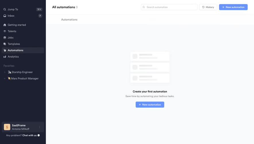
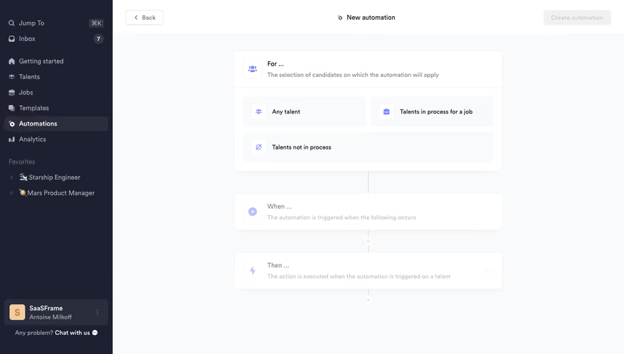

Similar screens
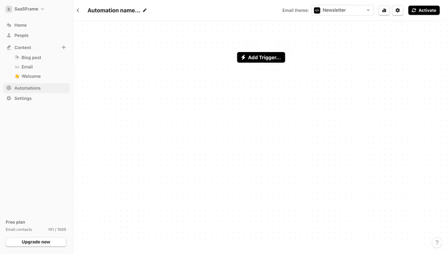




Upgrade to SaaSFrame Pro now to see similar examples.
Monthly
$18 /month
Billed $18 monthly
Browse all screens & flows
Filter and search screens & flows
Search text in screenshots
Access Figma files
Access mobile versions
Join now
Quarterly
$16 /month
Billed $48 quarterly
Browse all screens & flows
Filter and search screens & flows
Search text in screenshots
Access Figma files
Access mobile versions
Join now
Yearly
$15 /month
Billed $180 yearly
Browse all screens & flows
Filter and search screens & flows
Search text in screenshots
Access Figma files
Access mobile versions
Join now